


For the first time in 2025, we're publishing our Data Power Rankings.
These rankings are created completely by a data-based model built by Ben Wright. The model uses several results-based metrics, as well as some underlying performance indicators from our friends at American Soccer Analysis, to try and give an objective and comprehensive insight into how teams are actually performing, not just in the table, but on the pitch.
Overall Performance Index
Our power rankings are solely created by a data-based model we've pretentiously labeled "the Overall Performance Index" (OPI). This new model includes the same factors as the prior edition (points per game, strength of schedule, goal difference and expected goal difference), while adding several other factors to give a more rounded picture. Here’s how it works:
1. Points per game – 25%
We wanted our model to still value actual results above anything else. As a result, points per game are weighted more heavily and comprise 25% of a team's OPI score. These points per game also only include MLS results. Concacaf Champions Cup, US Open Cup and Leagues Cup performance is not a factor.
2. Goals Added – 15%
Goals Added (also known as G+) is a metric created by American Soccer Analysis that essentially measures how every action on the field increases or decreases a team’s chances of scoring a goal. This is yet another data point to help measure how a team is actually performing. G+ gives a valuable look at how teams are actually performing on the pitch, and counters some of the luck-based elements to simple points earned.
3. Form – 15%
We wanted our model to reflect changes in form. If a team has lost four out of five matches, their score should reflect that and not pull equally from a wins at the start of the season. Thus, a team's form in their last four matches is given additional weight.
4. Goal difference – 13%
How many goals a team allows versus how many they score is a usually a good indicator of how good a team actually is.
5. Strength of schedule – 10%
This factor is pretty simple. A 4-0 win over a bad team is worth less than a 1-0 win over a good team. Similarly, losing to a bad team will hurt a score much more than losing to a good team.
6. Expected goal difference – 10%
Expected goals tend to become predictive with over a larger sample size, as well as indicating the quality of chances teams are creating and allowing. Like G+, xG helps show how teams are actually performing, even when the results don't line up.
6. Home and away form – 12%
6% of a team’s OPI score comes from their home points per game compared to a 10 year league average, with another 6% coming from the road. This gives an interesting look at how each team performs home and away compared to the average level of MLS performance over a large sample size. If they're underperforming, their score will be impacted. Similarly, they're rewarded if they're earning more points than typically expected.
Let's dive in!
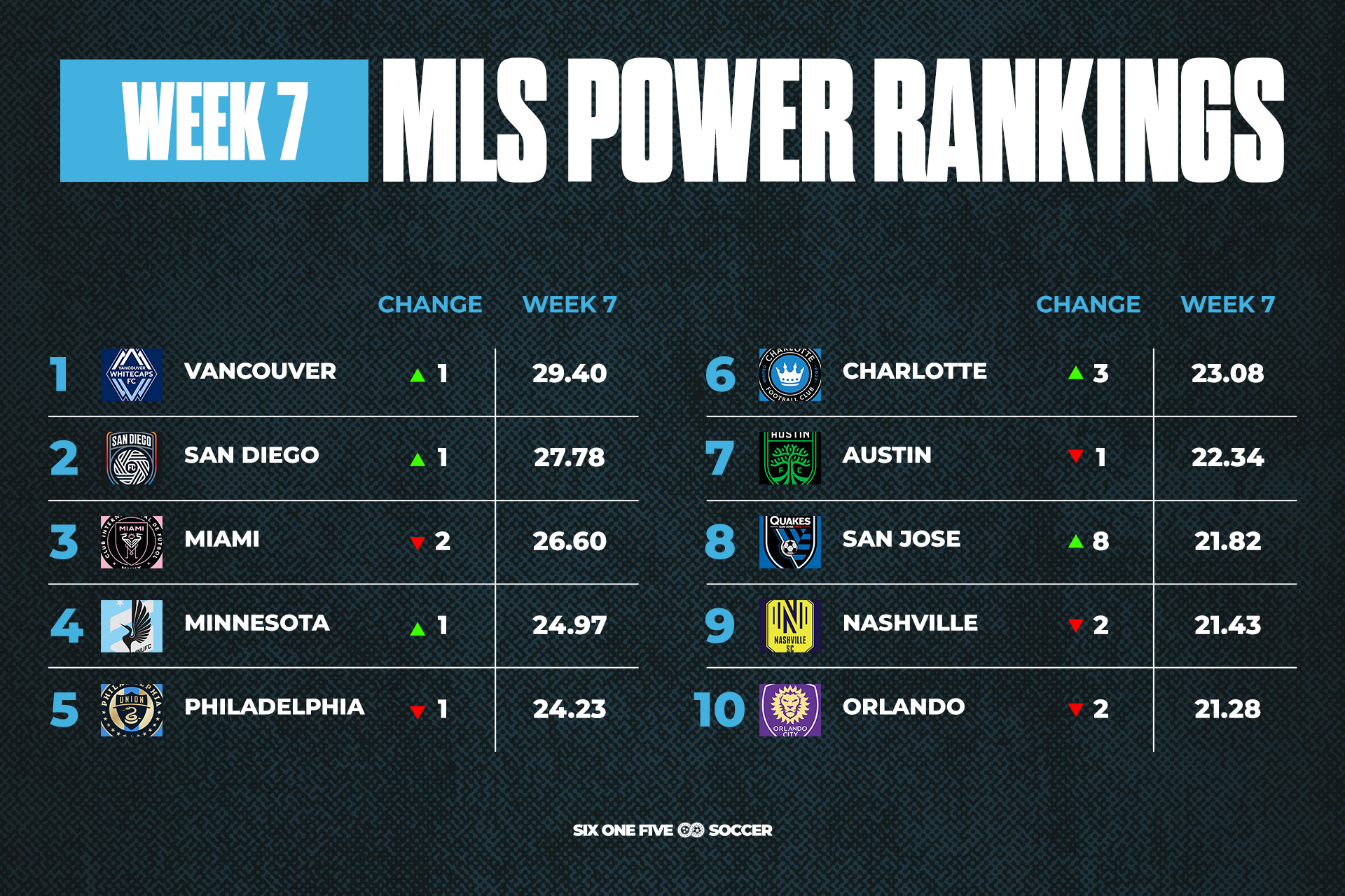
Vancouver Whitecaps claim the top spot after their 2-0 win over Colorado Rapids, while San Diego FC move into second place. They beat Seattle Sounders 3-0 to continue their exceptional debut season.
Inter Miami drop into third after their 1-1 draw at home against Toronto FC, and see their score take a slight hit for failing to take three points at home against one of the lowest-ranked teams. San Jose Earthquakes are the week's big winners, jumping eight spots after thrashing D.C. United 6-1.
Nashville SC drop two spots after their 2-1 road loss to Charlotte FC, but their score holds relatively steady, dropping by just 0.24 points. The underlying numbers really like how Nashville play, and the results should follow if this continues.
We'll have a more in-depth breakdown of these numbers next week.


