

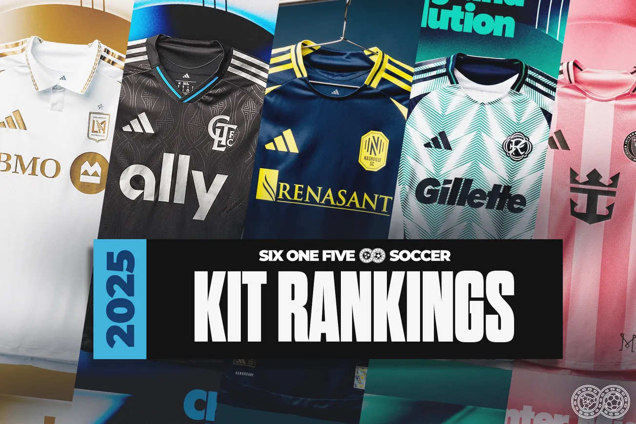
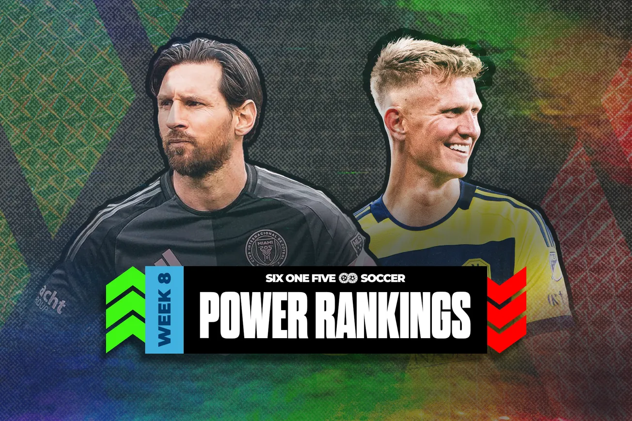
The 2025 MLS regular season is one week away. If you listen closely, you can hear the sounds of the final preseason balls being kicked, the panicked texting of more than one CSO trying to get a last minute transfer over the line, and Lionel Messi calmly sipping on mate somewhere on a sprawling South Florida beach.
It's also MLS jersey week. With every team rolling out (at least) one new kit this week, there are plenty of new looks set to take the field in 2025. And no jersey week would be complete without a comprehensive, scientific and 100% accurate ranking of all the new kits.
These rankings are 100% subjective, yet also guaranteed to be correct. Disagreement is both futile and also welcomed. Hit up the comments section to tell me where I'm wrong.
Let's yeet this wheat.
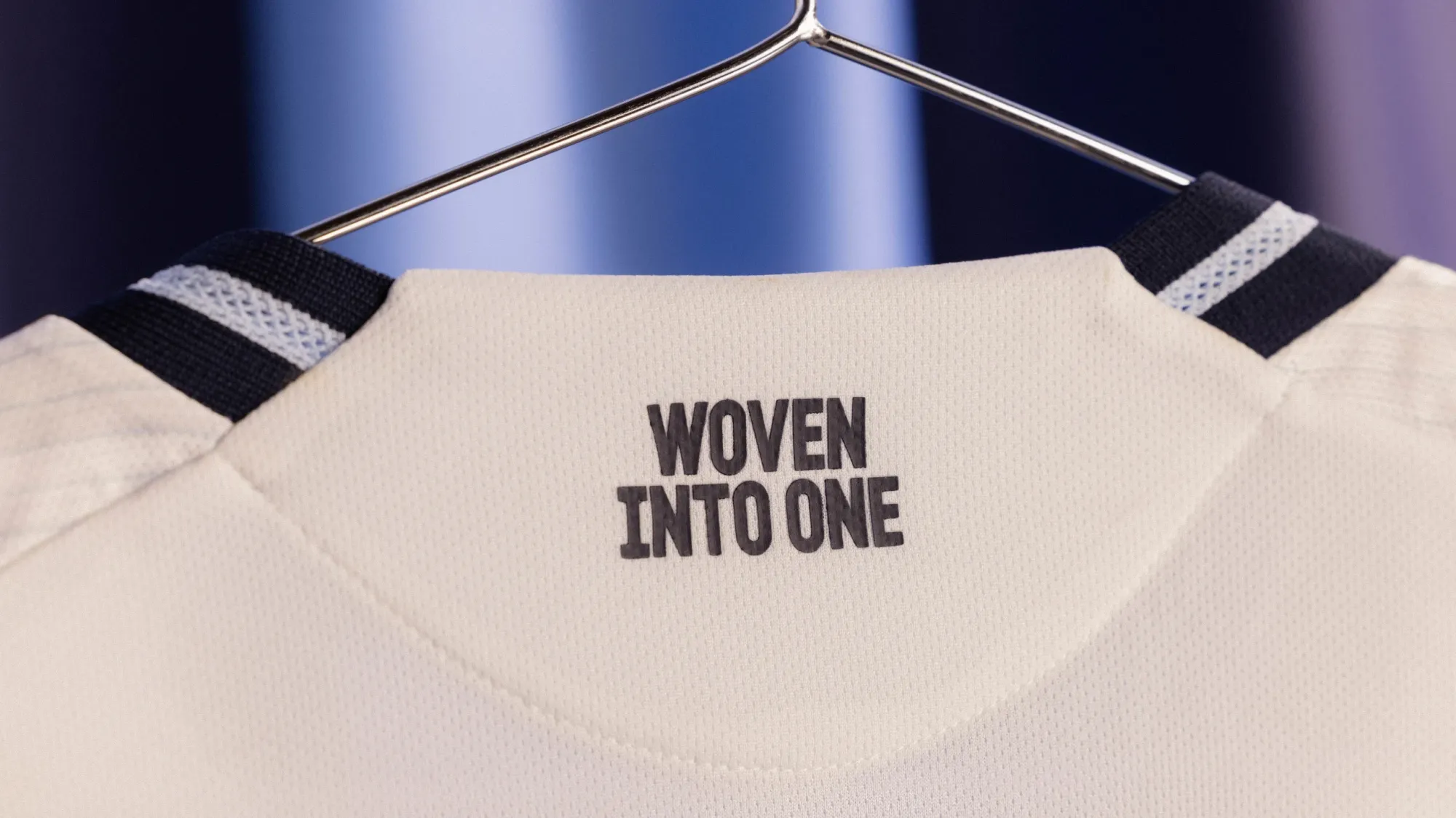
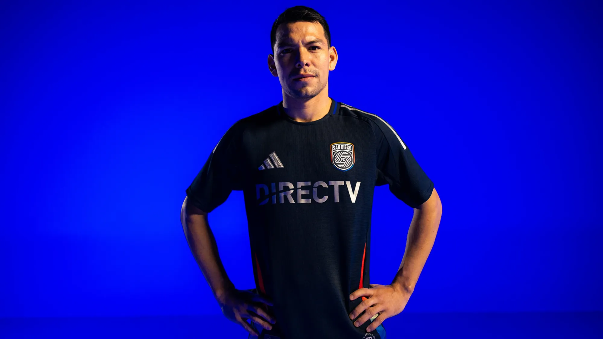
32 – San Diego FC "Woven Into One Kit"
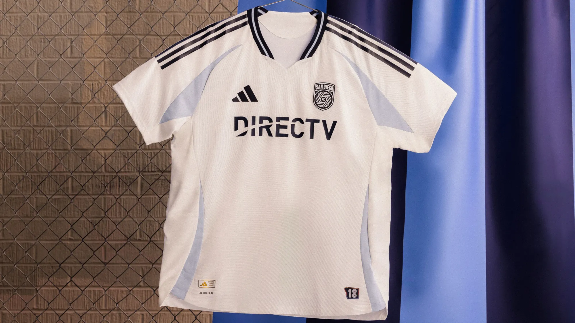
San Diego's first away kit isn't actively back, but it's incredibly bland . To be fair to them, it's really tough for expansion teams to start out with great shirts.
31 – FC Dallas "The Inferno Kit"
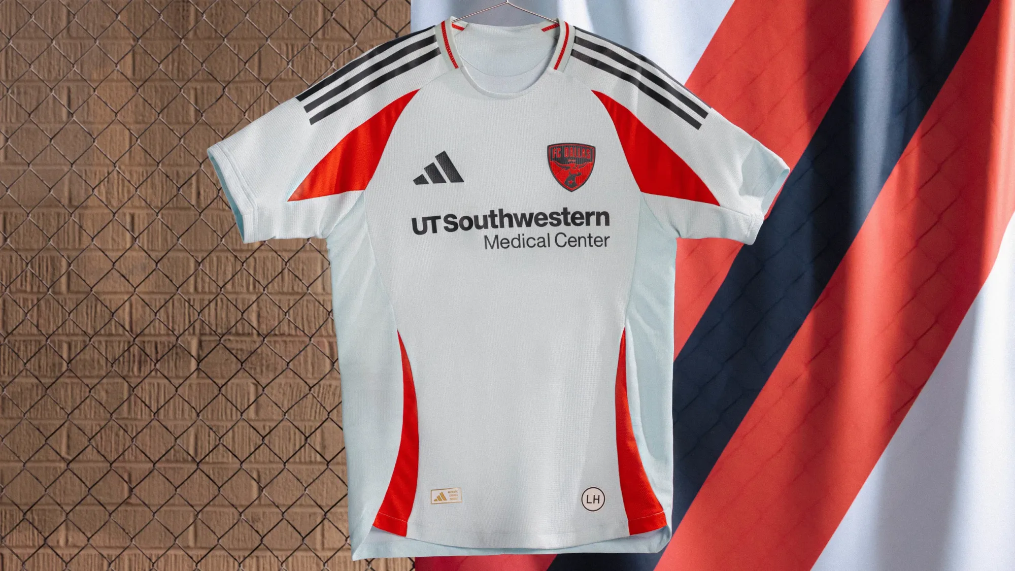
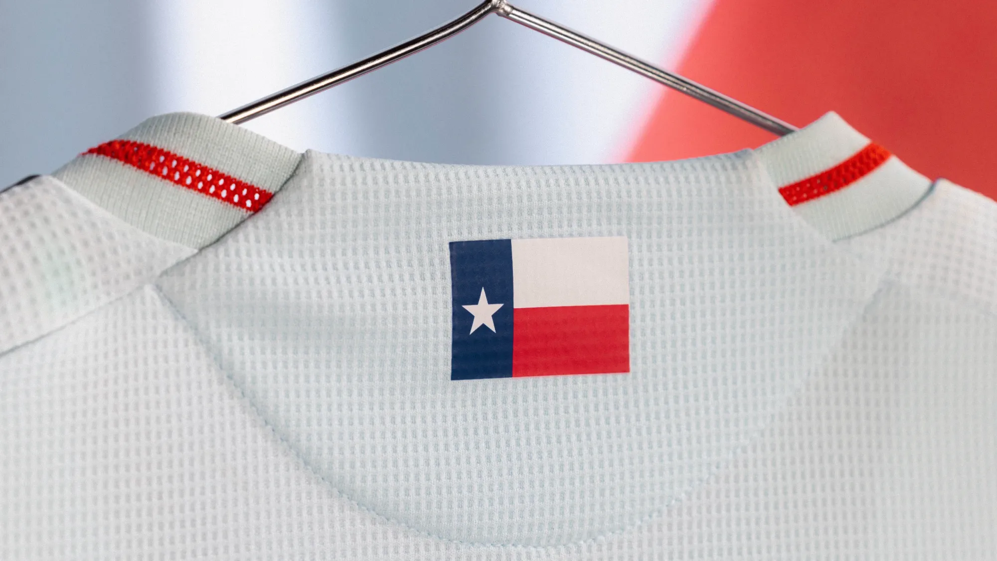
This one is just fine. It's maybe kind of cool that you can't quite tell if it's blue or gray. I doubt anyone will remember next year.
30 – Sporting Kansas City "One KC Jersey"
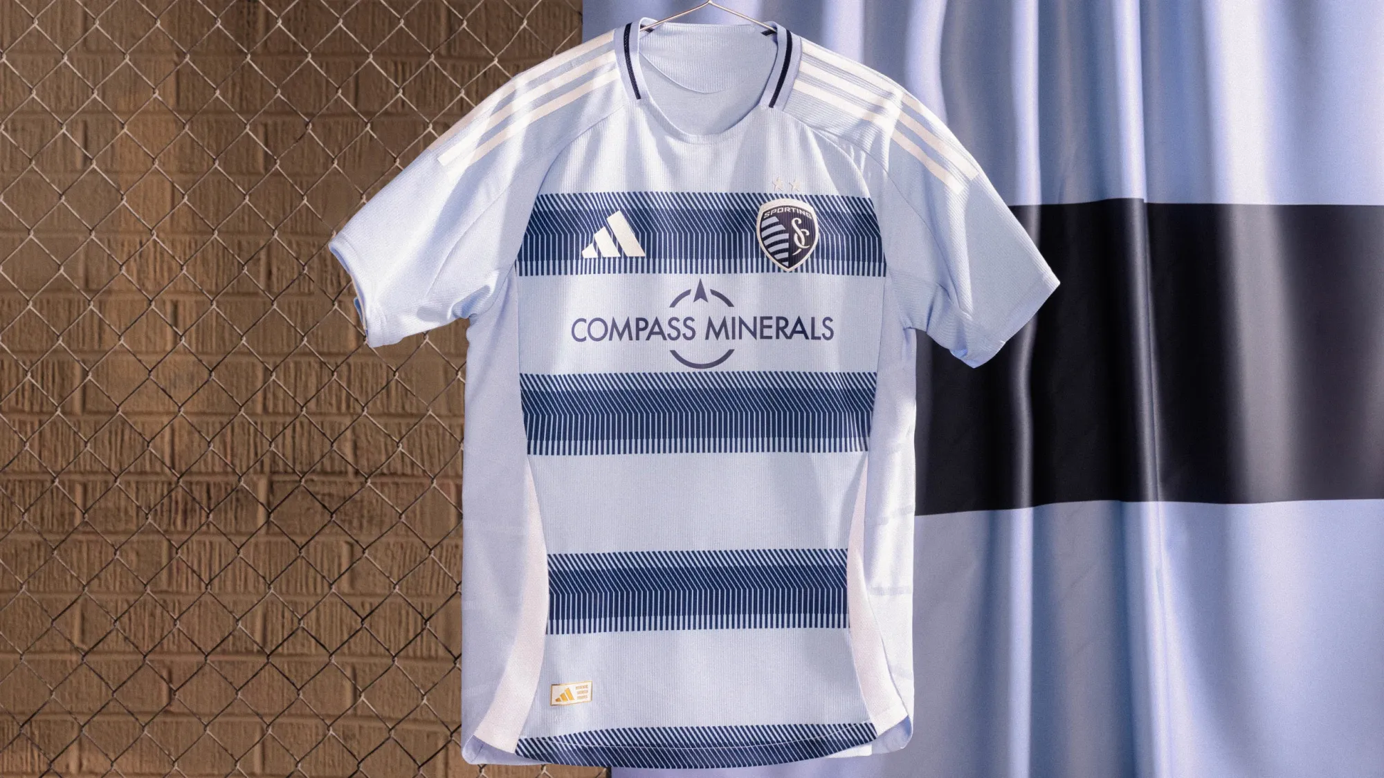
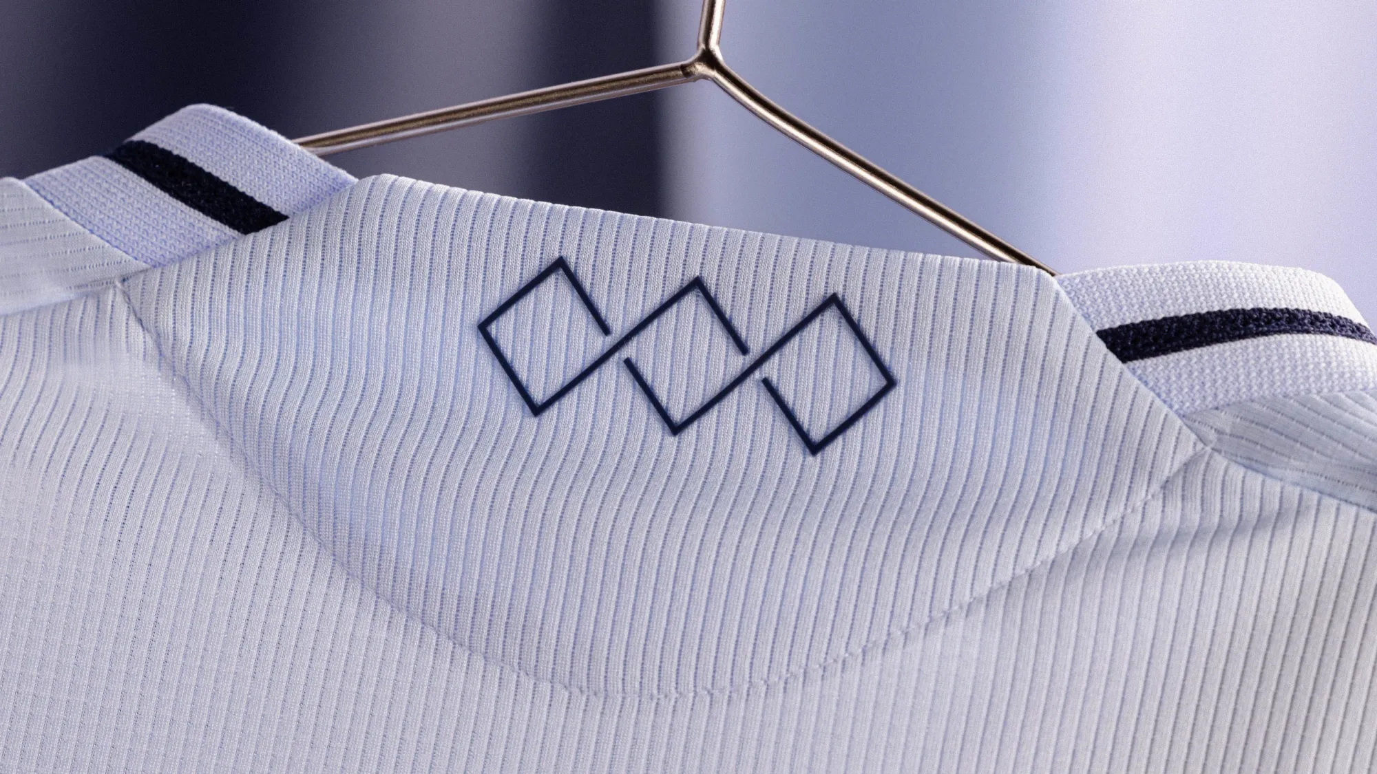
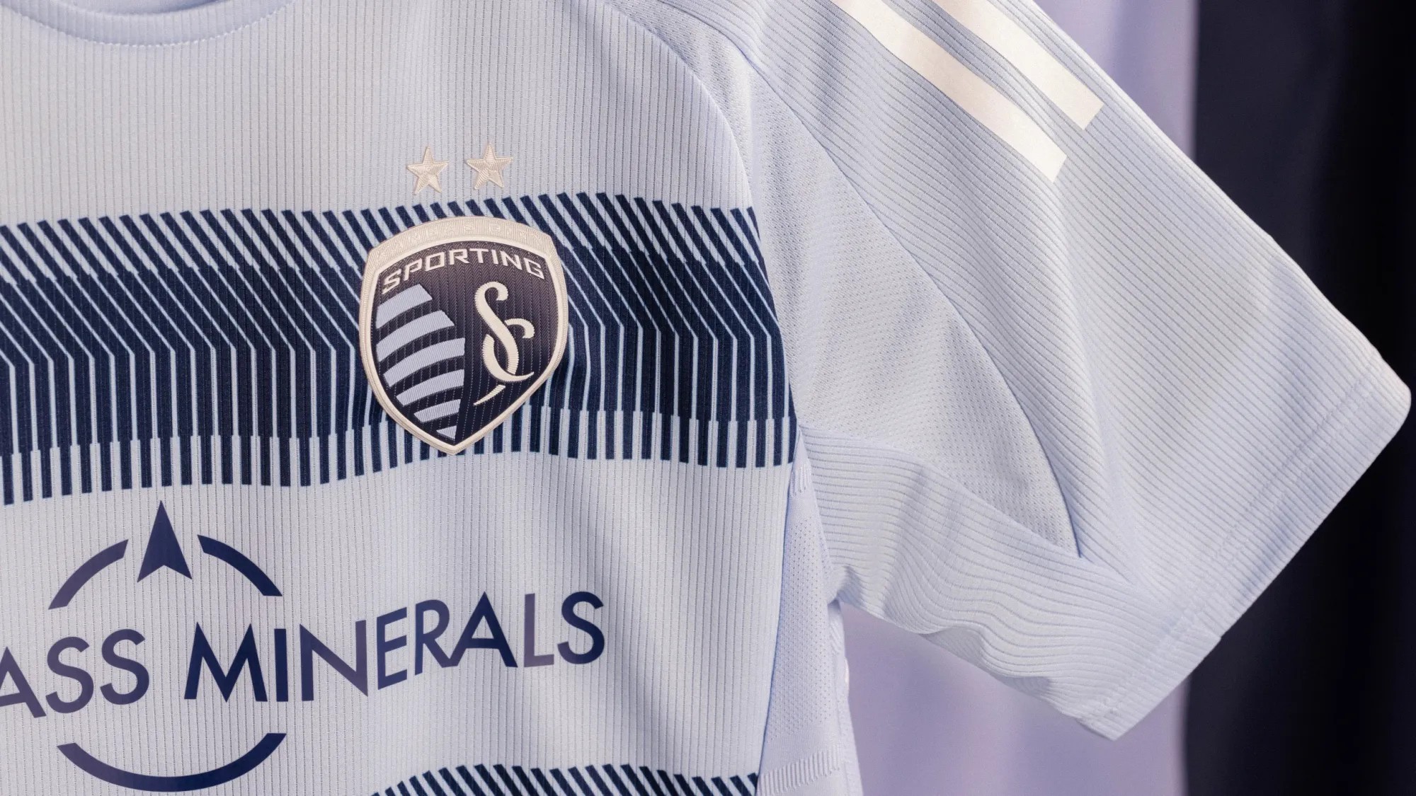
I'm a big fan of Sporting KC using hoop stripes as their primary look; their 2014-15 shirt was one of the first MLS kits I bought and one of my all-time favorites. This edition just looks... incomplete. Using white as the accents means a lot of the detail gets lost, and to me it doesn't hold up to past efforts.
29 – Philadelphia Union "Voltage Kit"
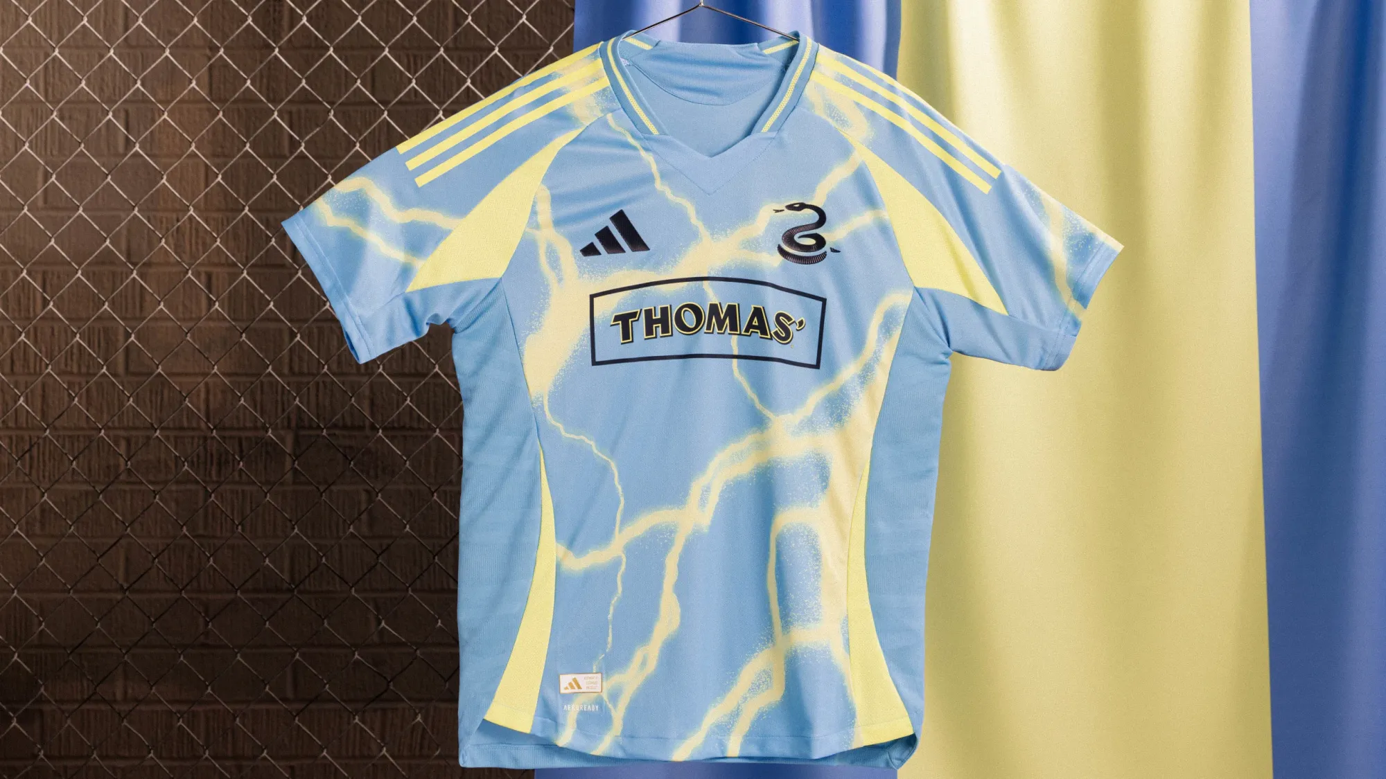
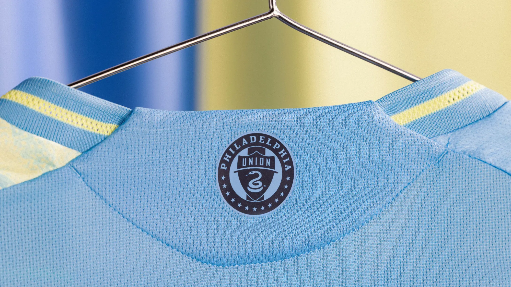
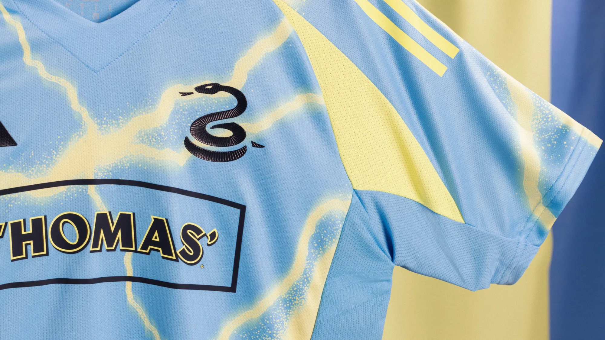
"You miss 100% of the shots you don't take."
And sometimes you miss shots you do take. Like this. The Union tried something cool here, but I don't think they pulled it off.
To their credit, it should look better once you zoom out.
This one is my seven-year-old's favorite.
28 – LA Galaxy "RIZON Jersey"
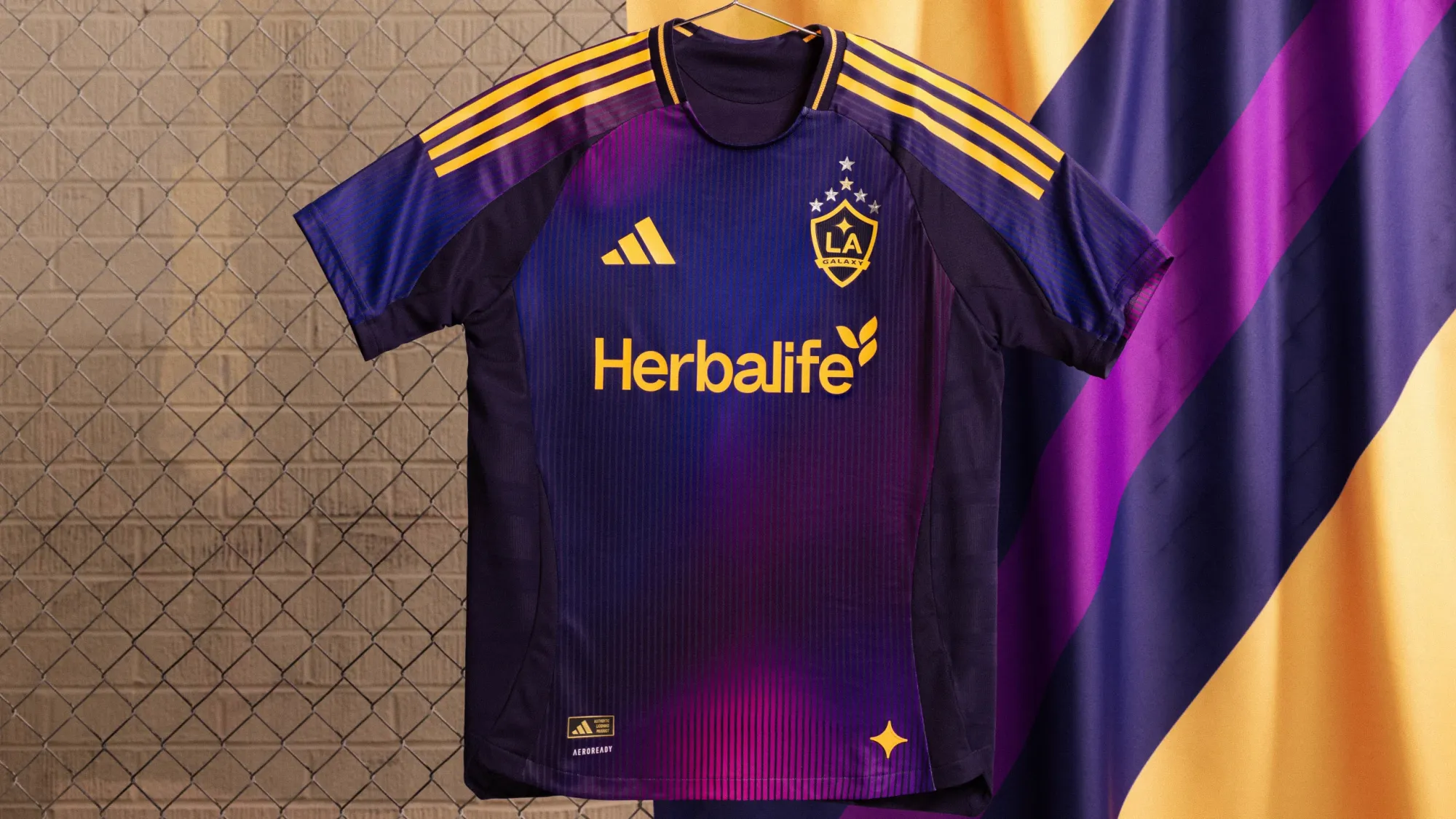
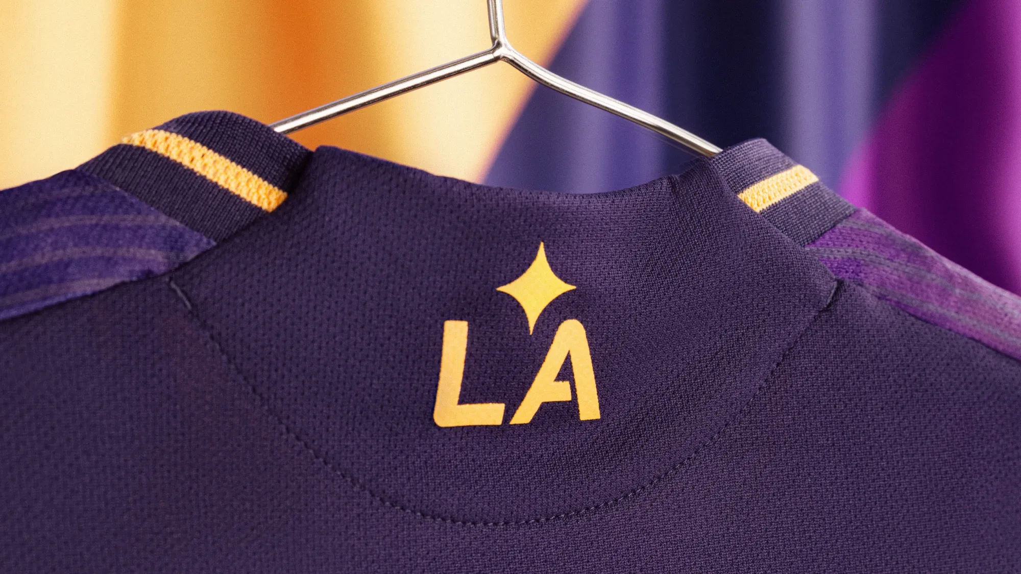
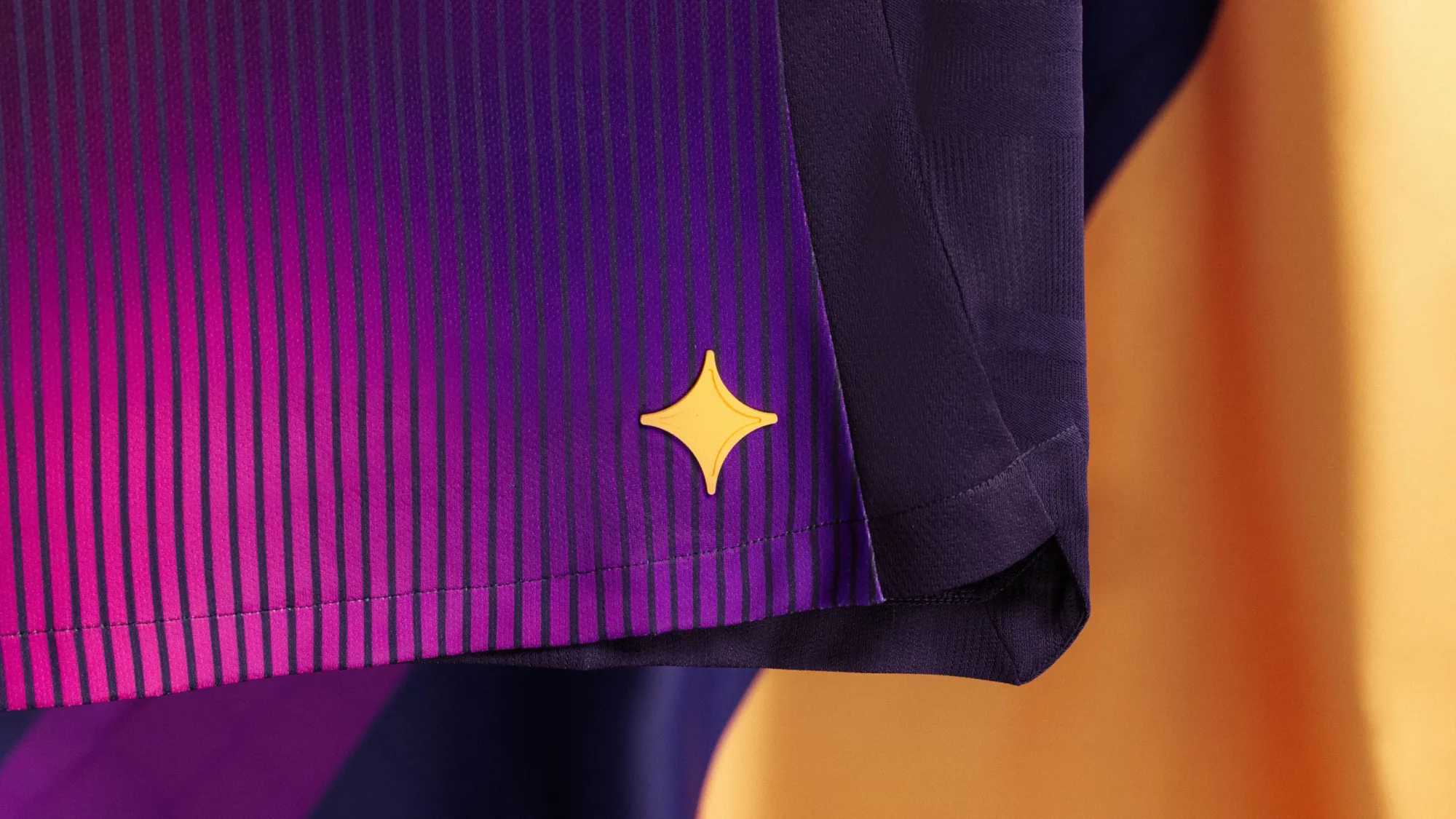
The Galaxy took a big swing with this one, and while I don't think it quite paid off, it's nice to see teams try something new and not play it safe. And hey, fans will happily buy it just for the additional star above the crest. So it all works out.
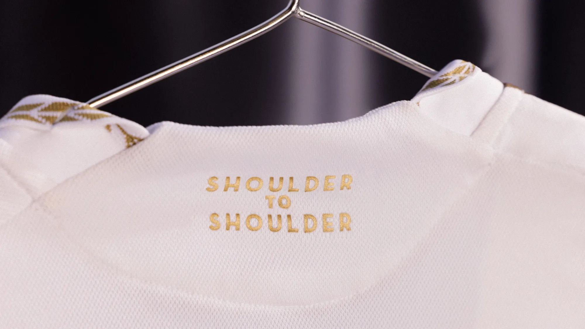
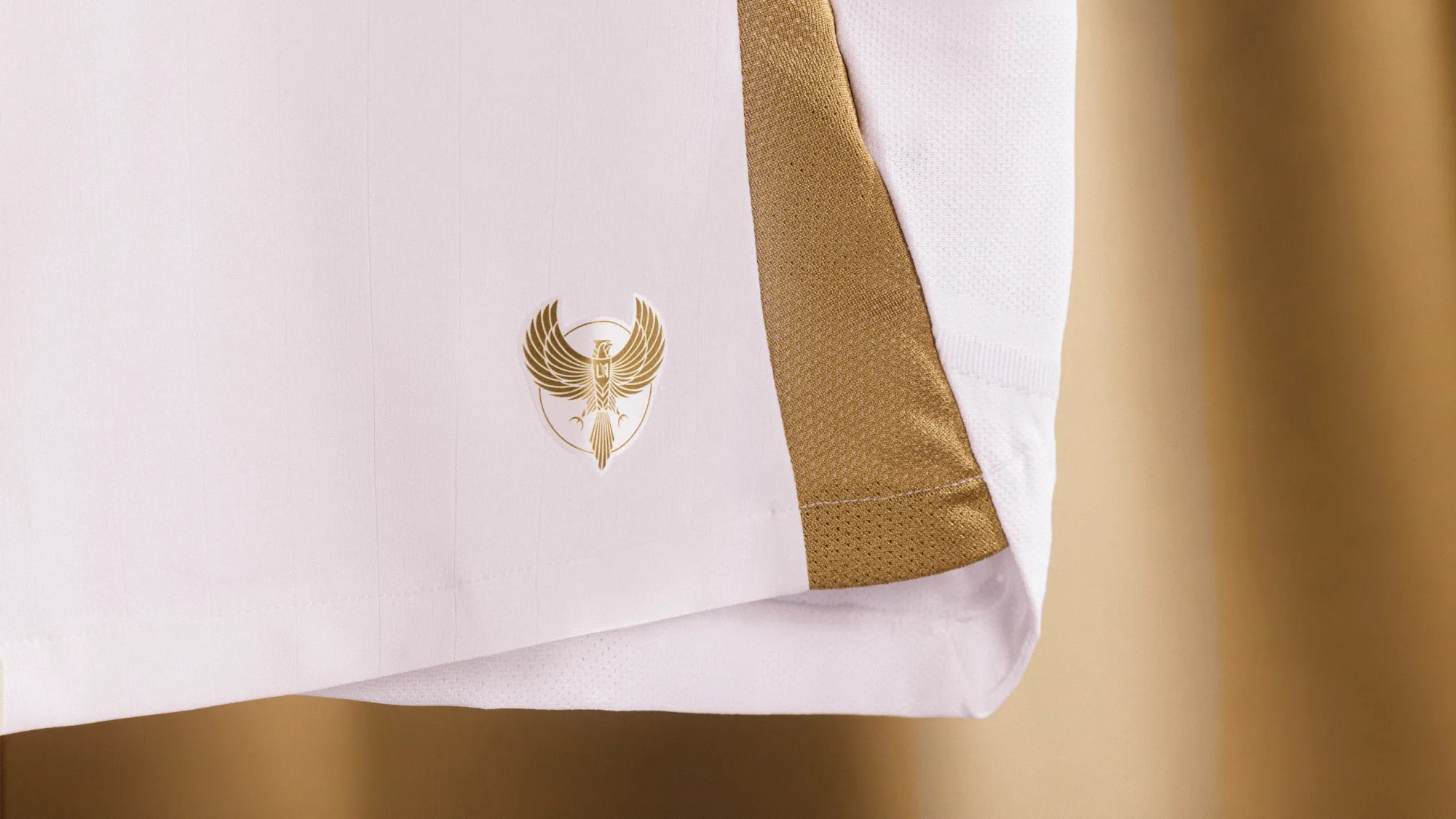
27 – D.C. United "The Soul Kit"
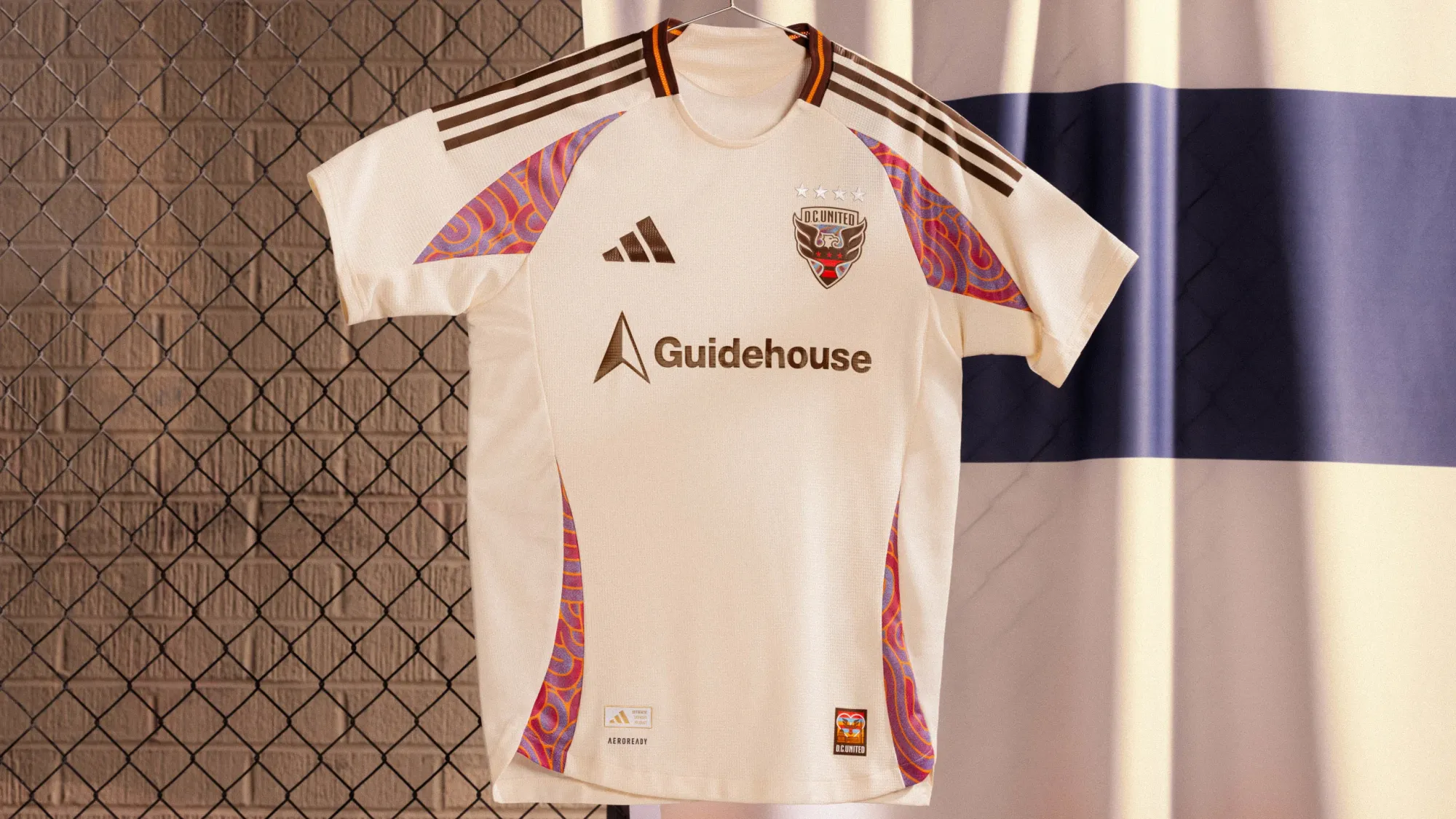
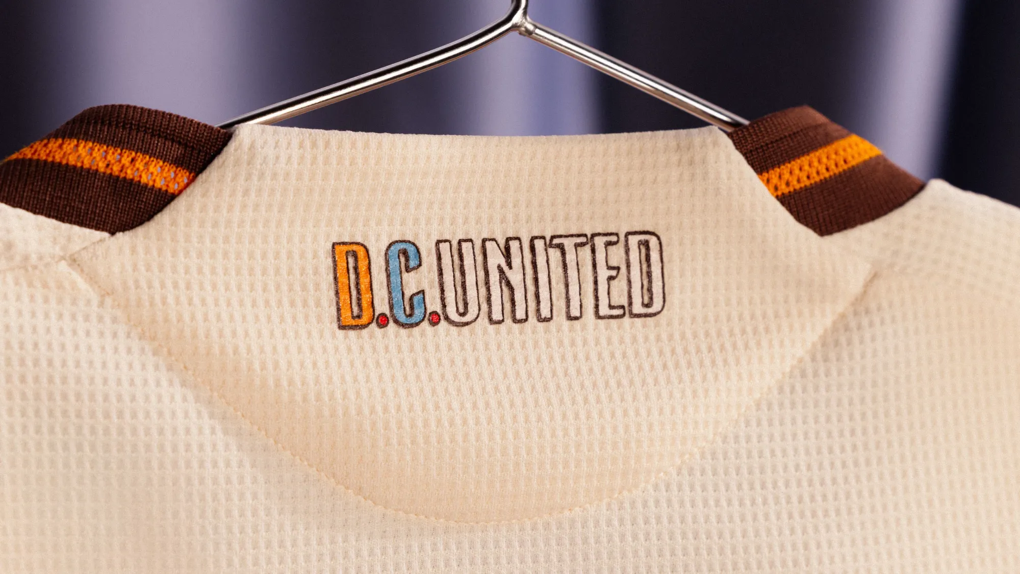
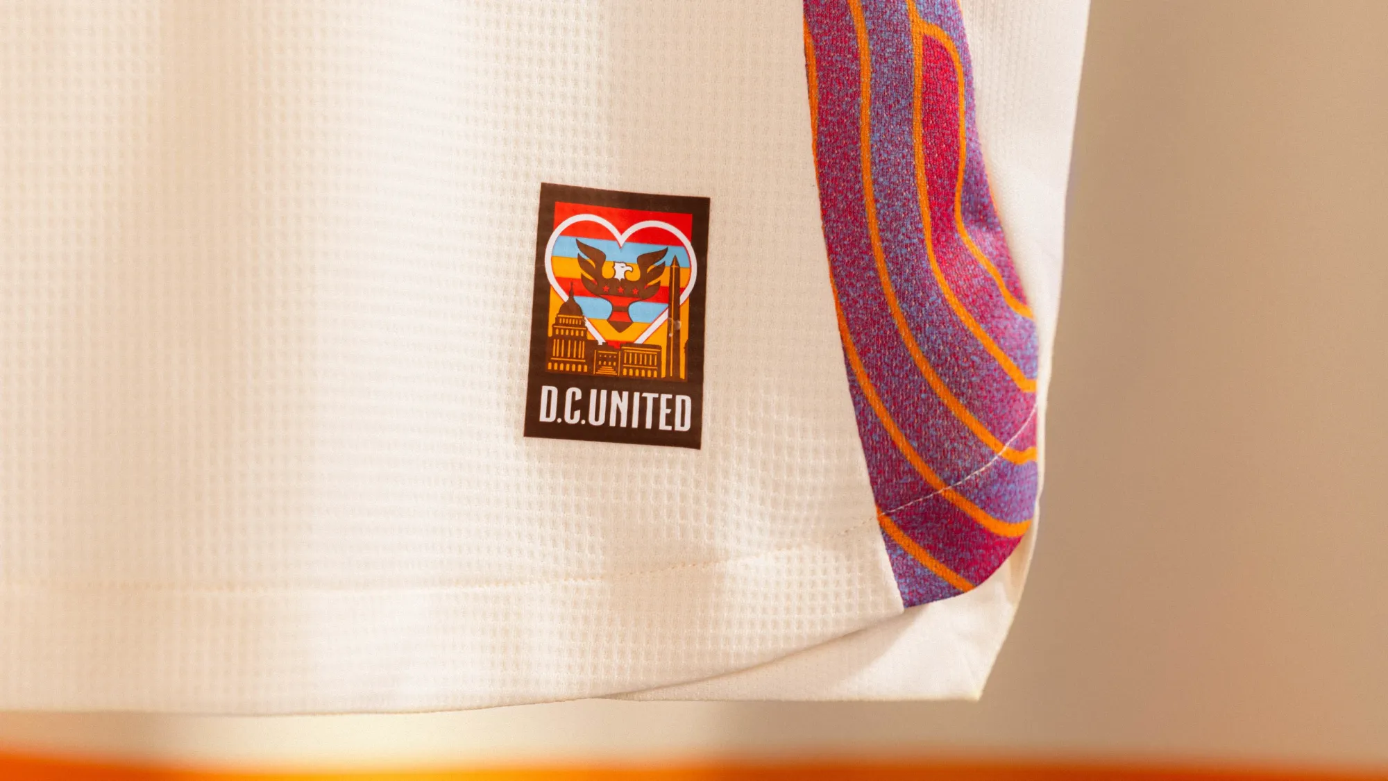
This kit is billed as an homage to D.C.'s Funk, Soul and Go-Go heritage. It's a cool concept, and I really do like the design on the side and sleeve panels. It's featured so minimally, though. Instead of building the whole plane out of the theme, they just used it for a tiny part of the wing. It's not bad, but it's a major downgrade from the cherry blossom kit it's replacing.
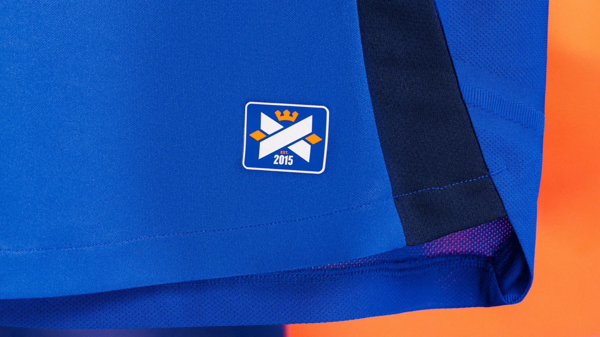
26 – San Diego FC "State Of Flow Kit"
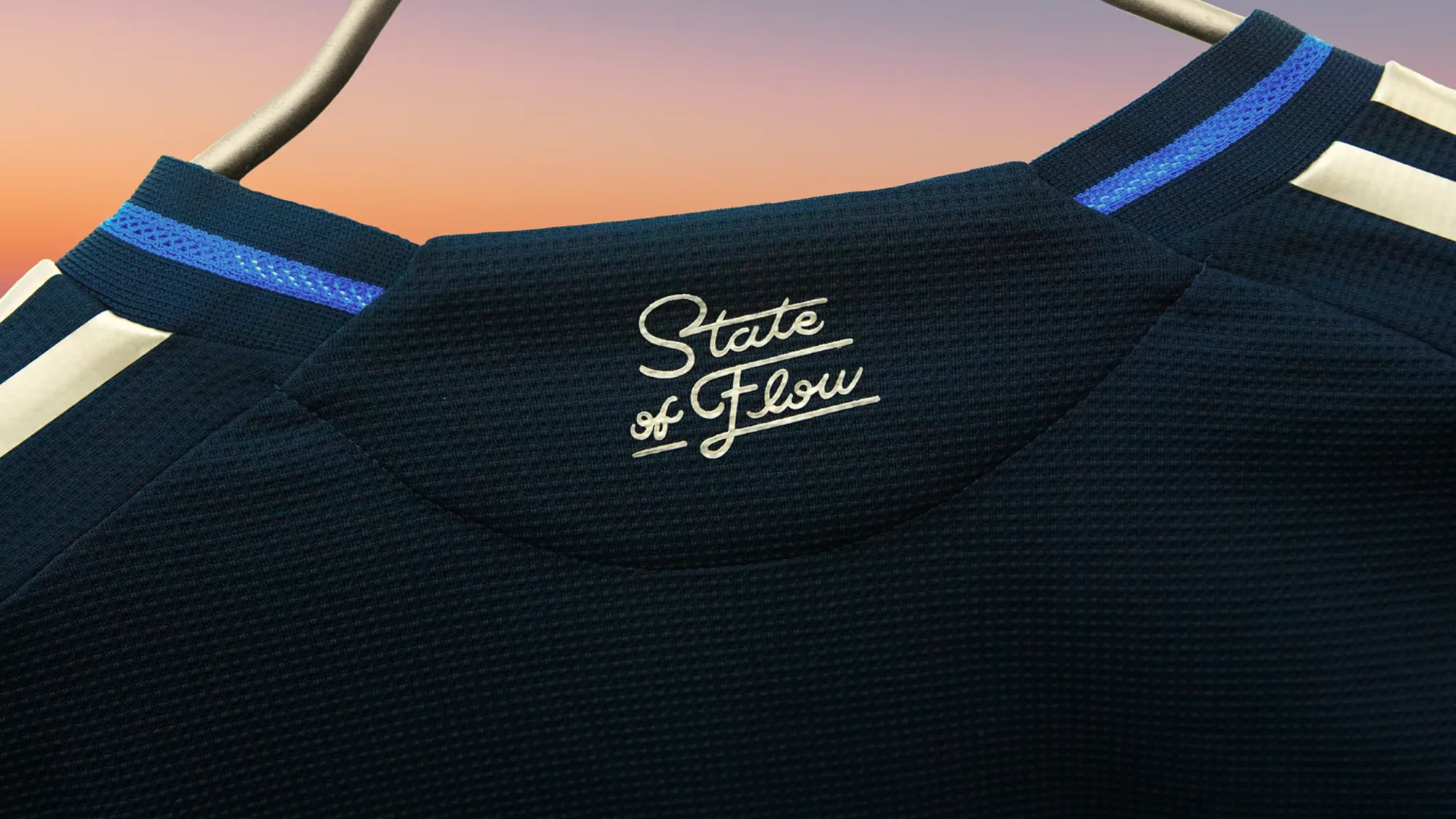
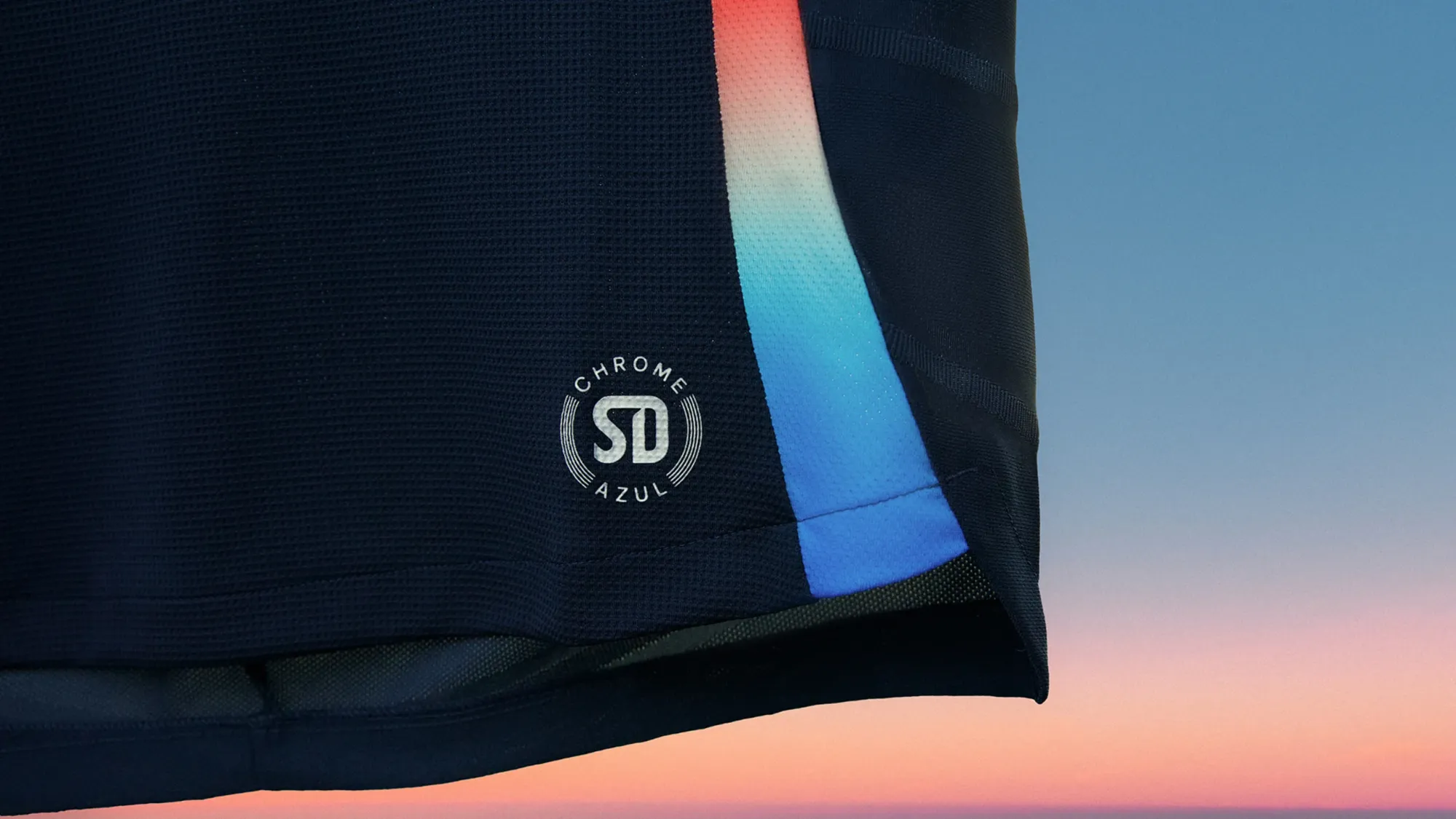
Like I said earlier, expansion teams rarely have great initial kits. This one is resppectable, though. It's simple and safe, and I really like their entire color scheme, especially the gradient element. It won't wow anyone, but it's one that fans can wear for the next decade.
25 – Chicago Fire "Municipal Device Kit"
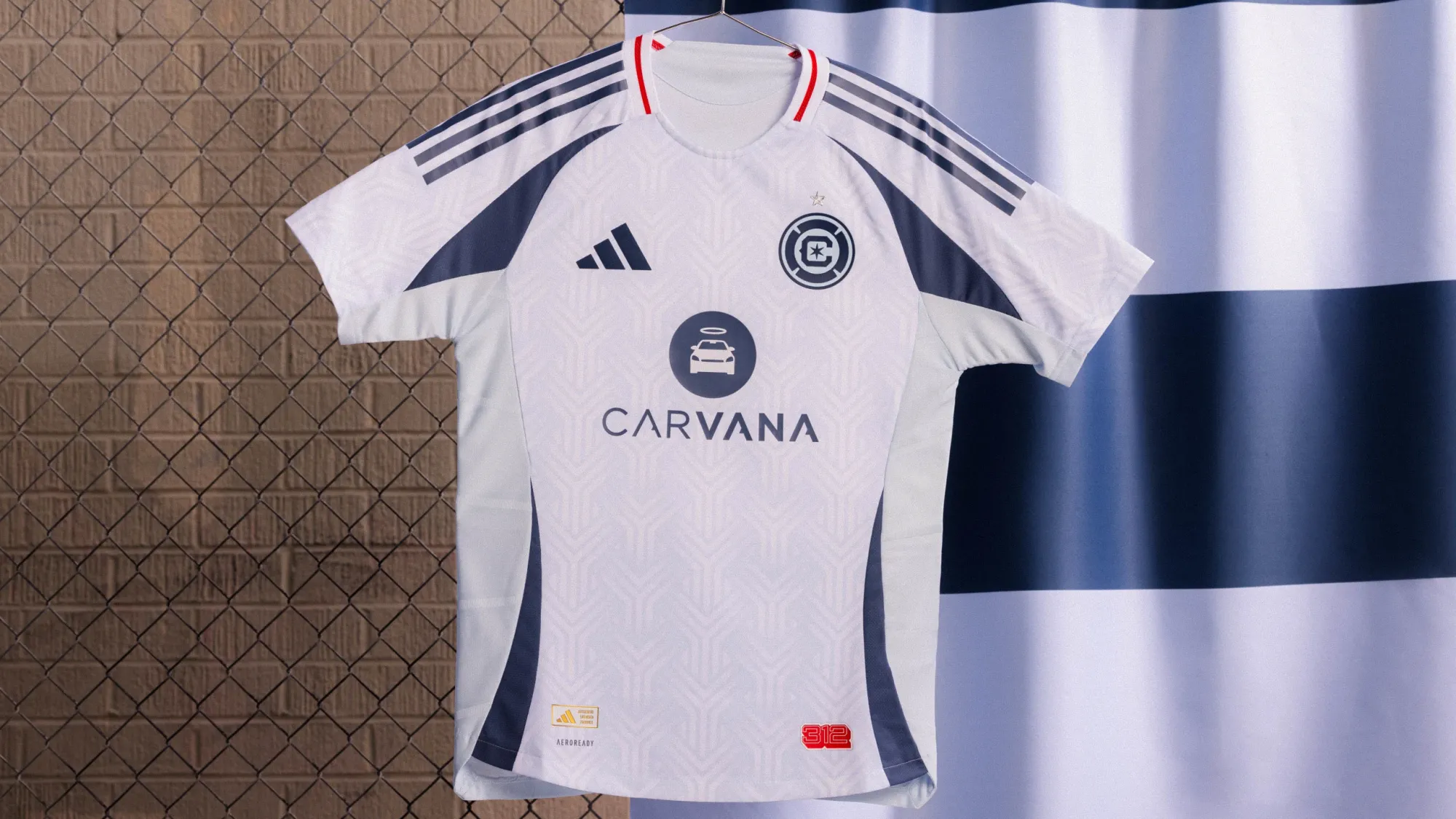
I've been fairly harsh towards some of the other monochromatic kits released this year, but something about the way the crest looks on this really sticks out to me. The red on the collar and jock tag is a nice touch, too. I probably shouldn't like this one as much as I do.
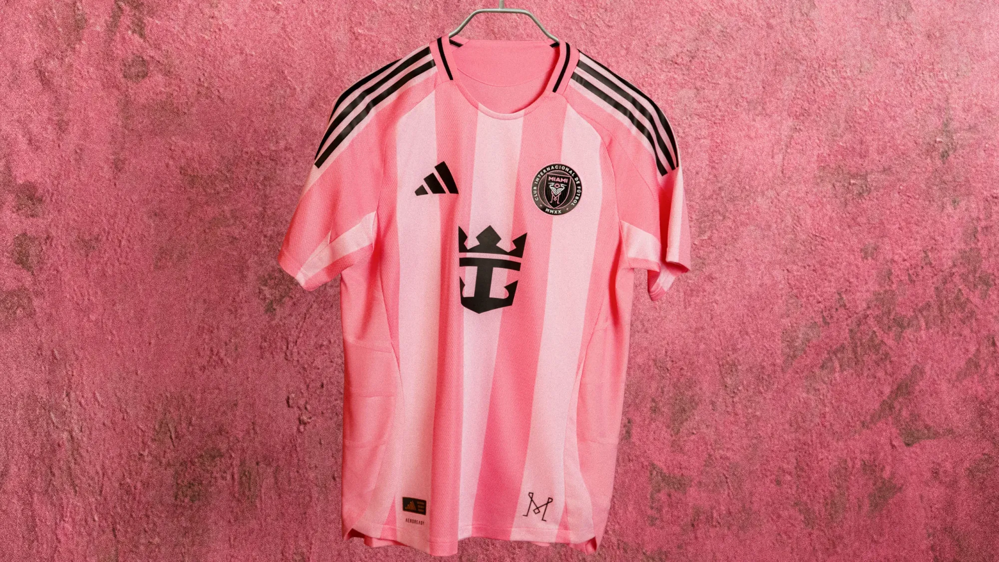
24 – Inter Miami CF "The Fortitude Kit"
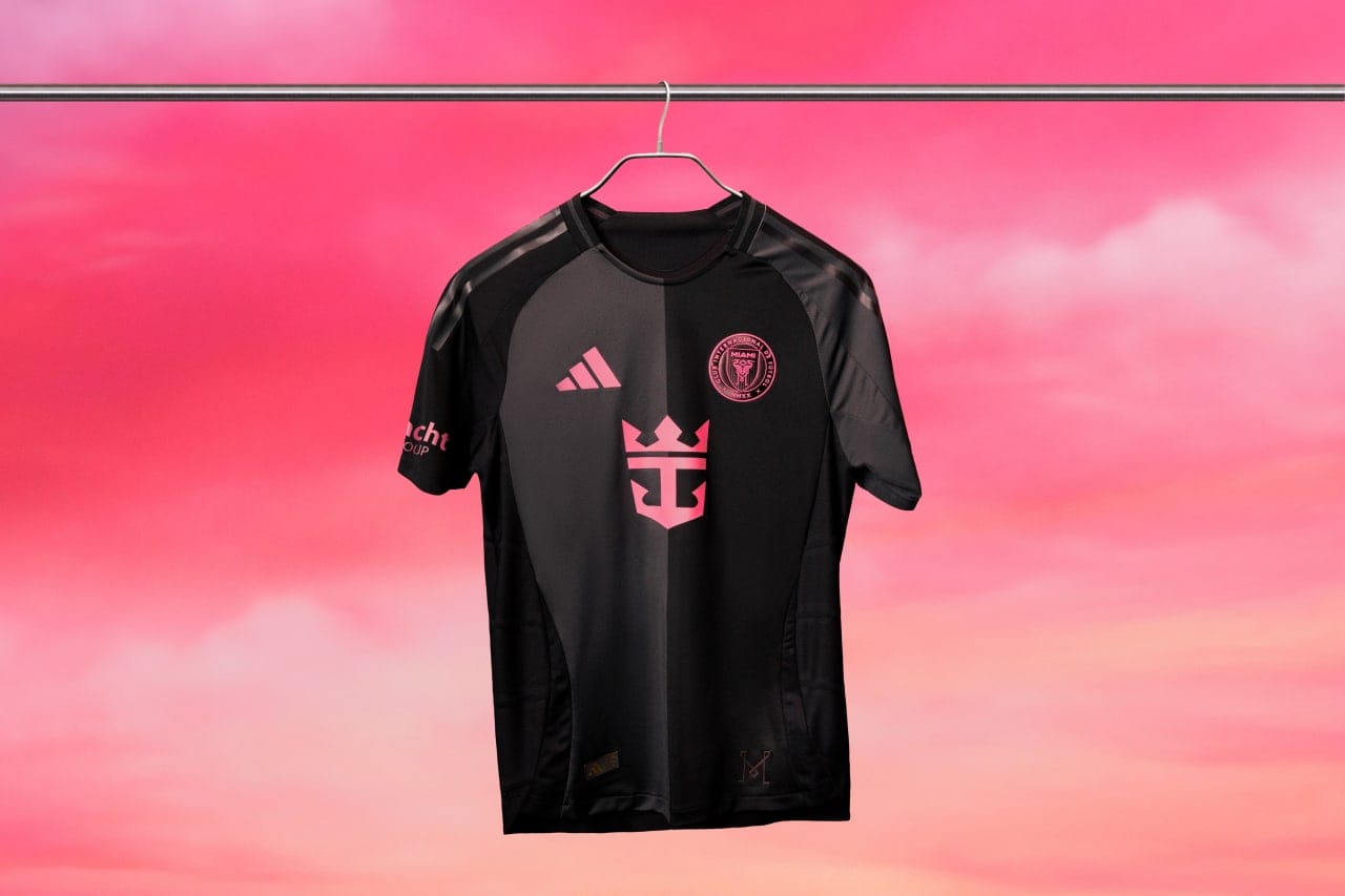
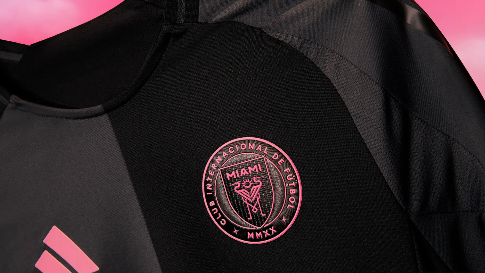
It's simple, but the half-and-half design on the front of this shirt is cool without trying too hard. The black-and-pink color scheme looks great on the pitch, and it's a major improvement over last year's away kit.
23 – Vancouver Whitecaps "The Peak Kit"
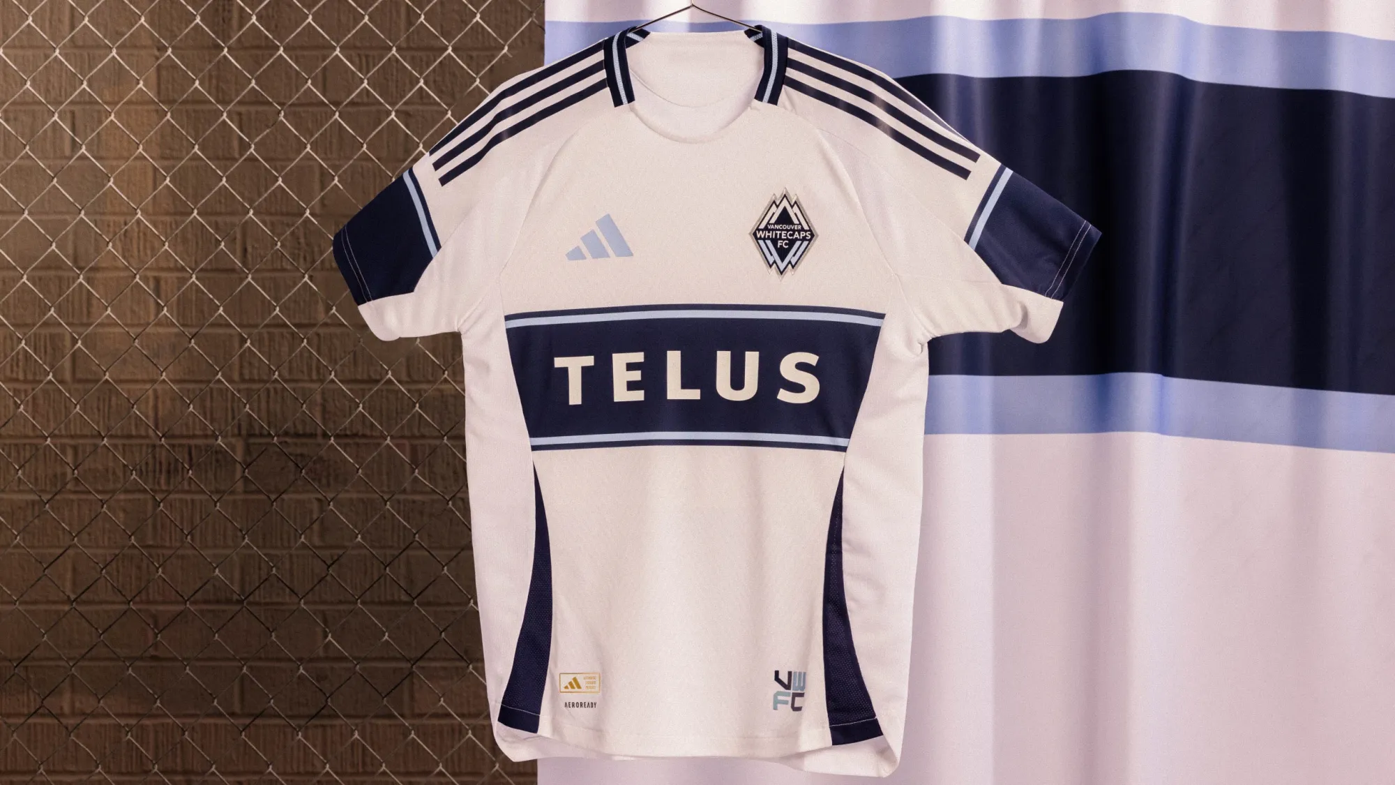
Vancouver normally nail their kit releases. They... didn't with this one. The body is fine - unspectacular, but fine. The sleeves completely ruin this for me. Not only do they look strange without wrapping around the full arm, but they don't completely line up with the chest stripe.
It's certainly grown on me since I started putting together these rankings, but it doesn't live up to the 'Caps' recent releases.
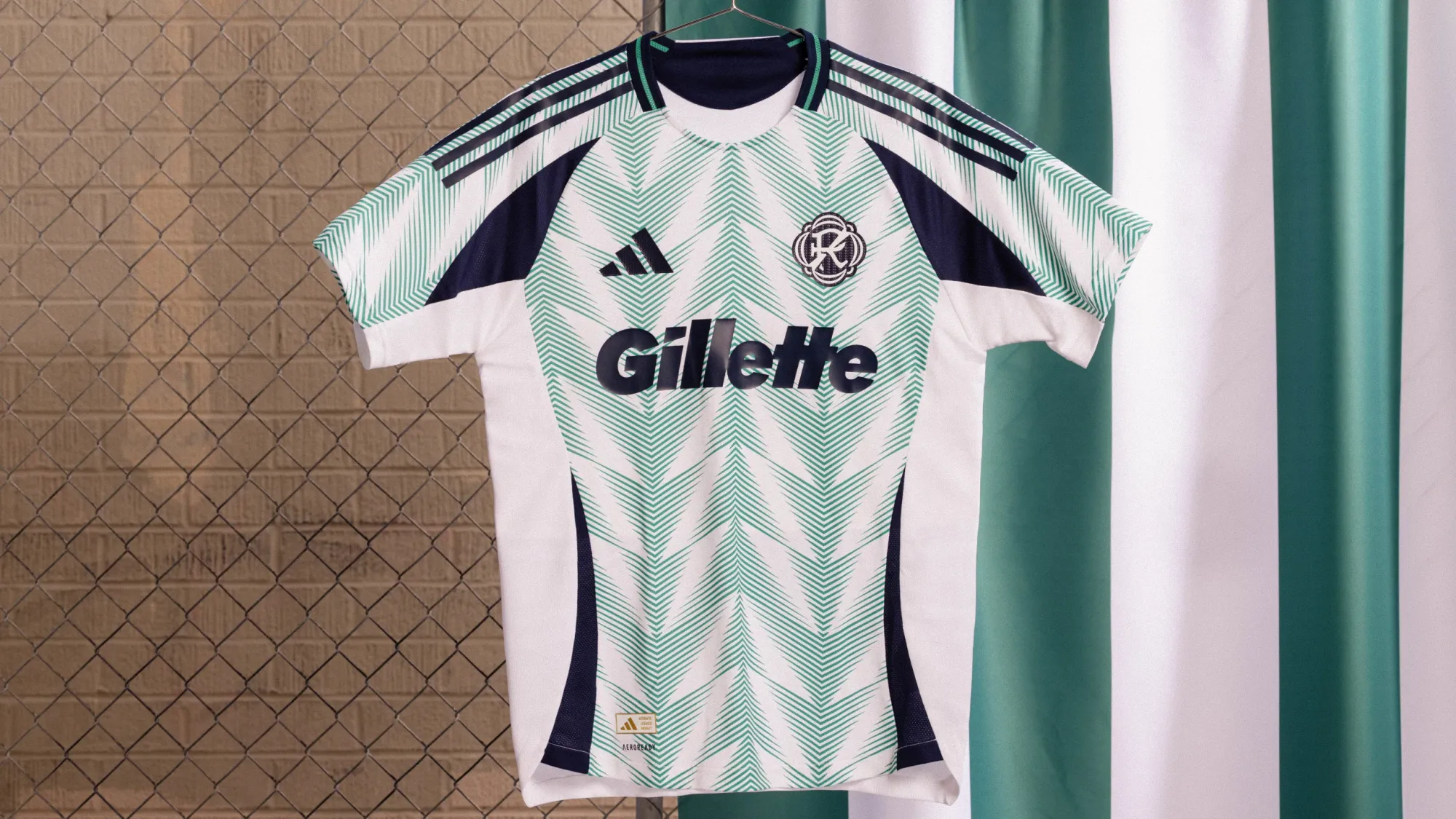
22 – Nashville SC "The Heart of Nashville Kit"
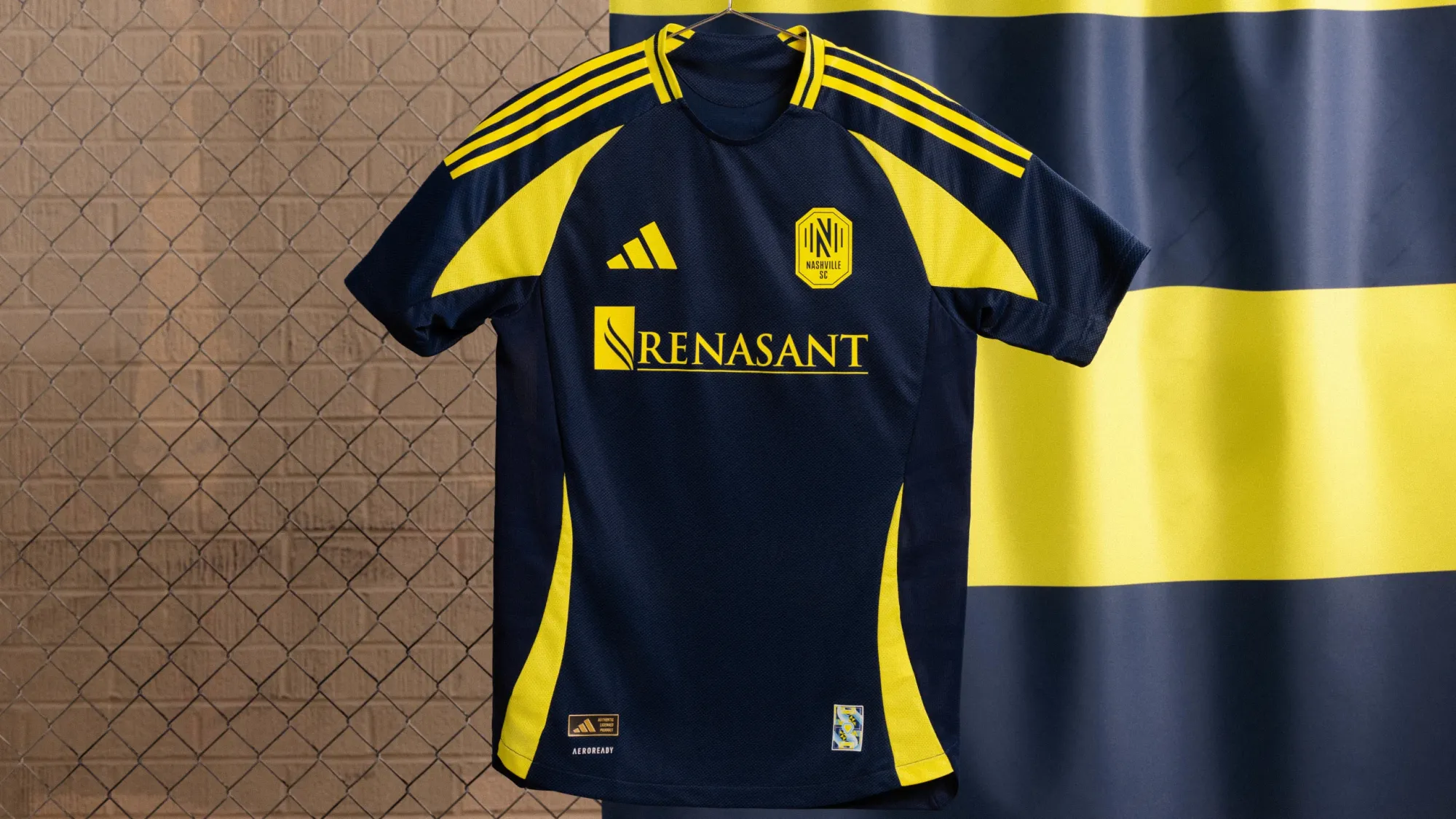
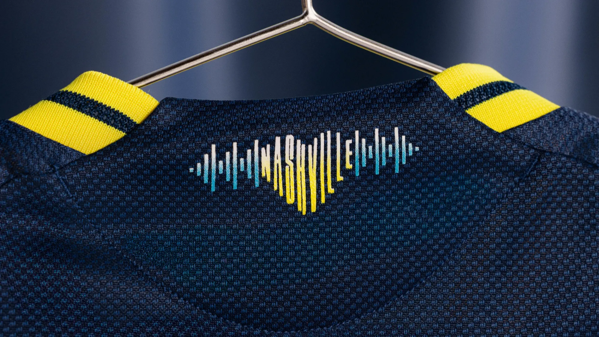
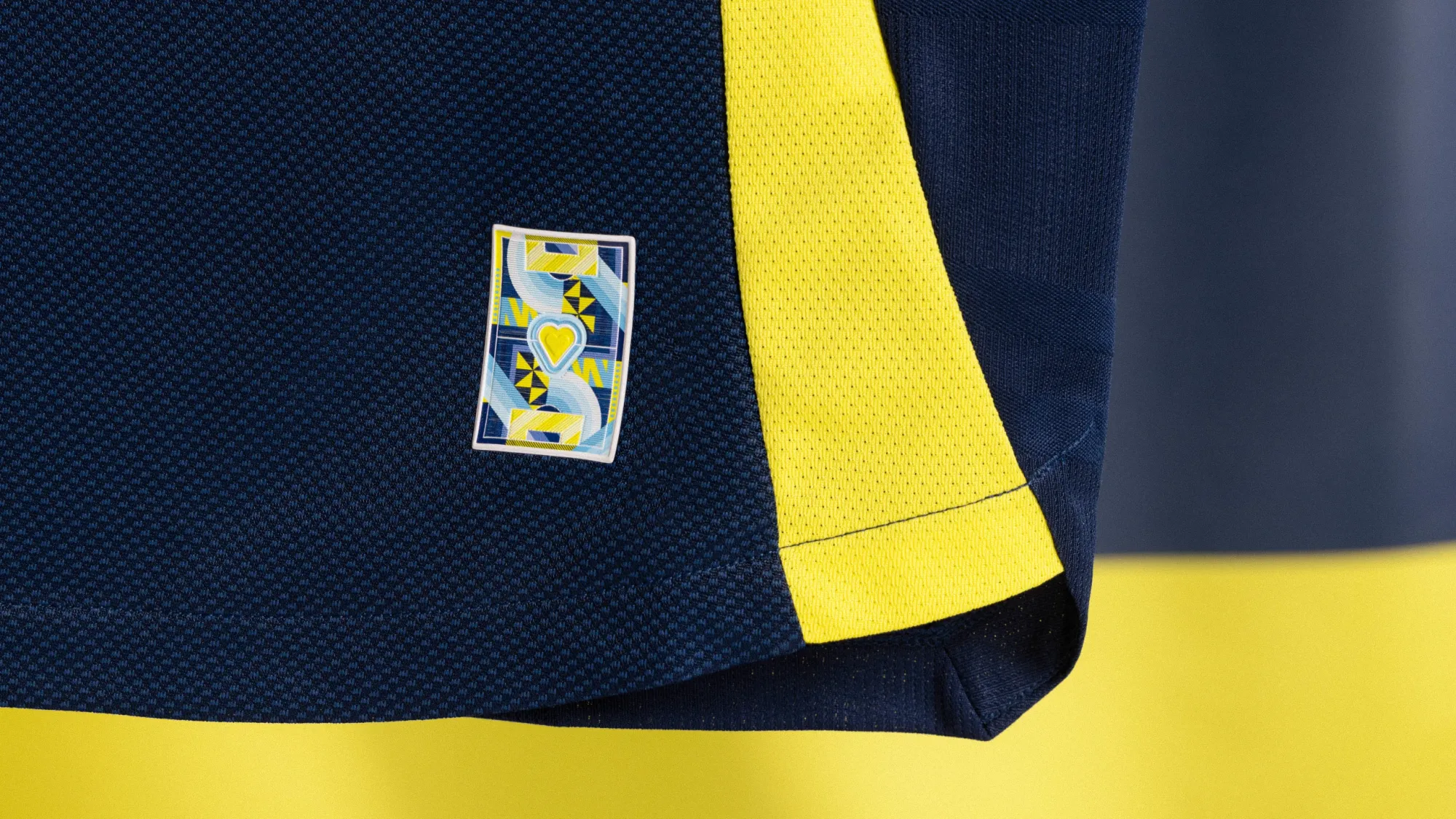
This is one that I think will look pretty good on the field, but up close it's one of the more template-y shirts released this week. Nashville used the jock tag elements as their main teaser, and it would have been great to see them implement them more in the actual shirt and go for something truly memorable.
— Nashville SC (@NashvilleSC) February 10, 2025
21 – Colorado Rapids "Headwaters Jersey"
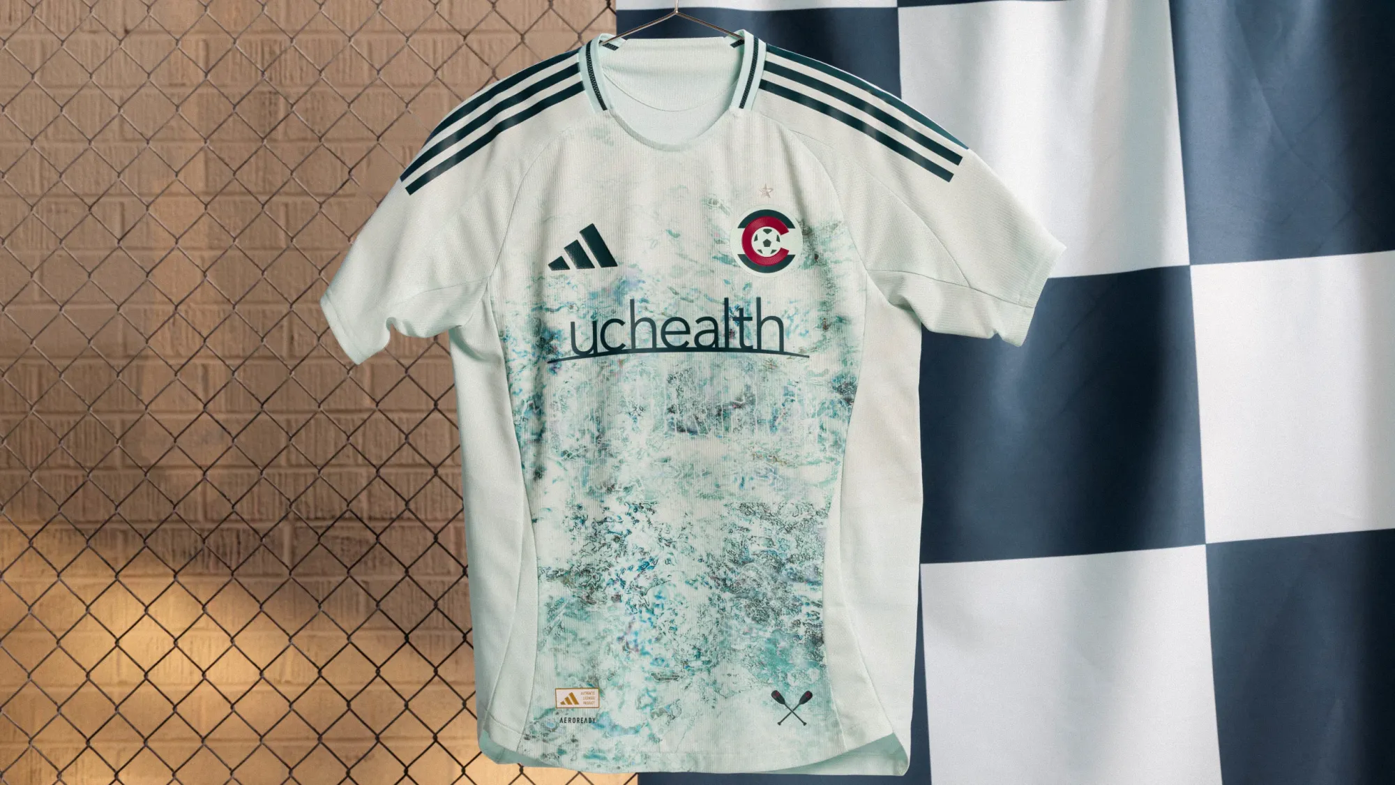
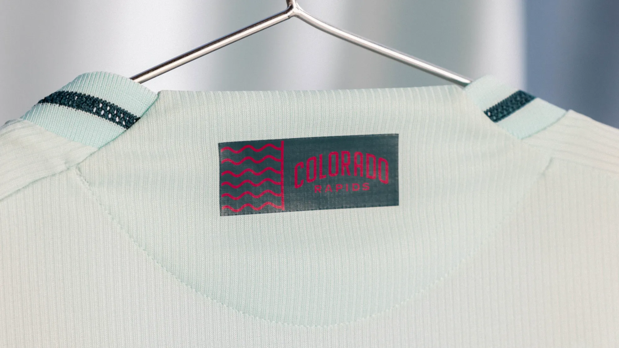
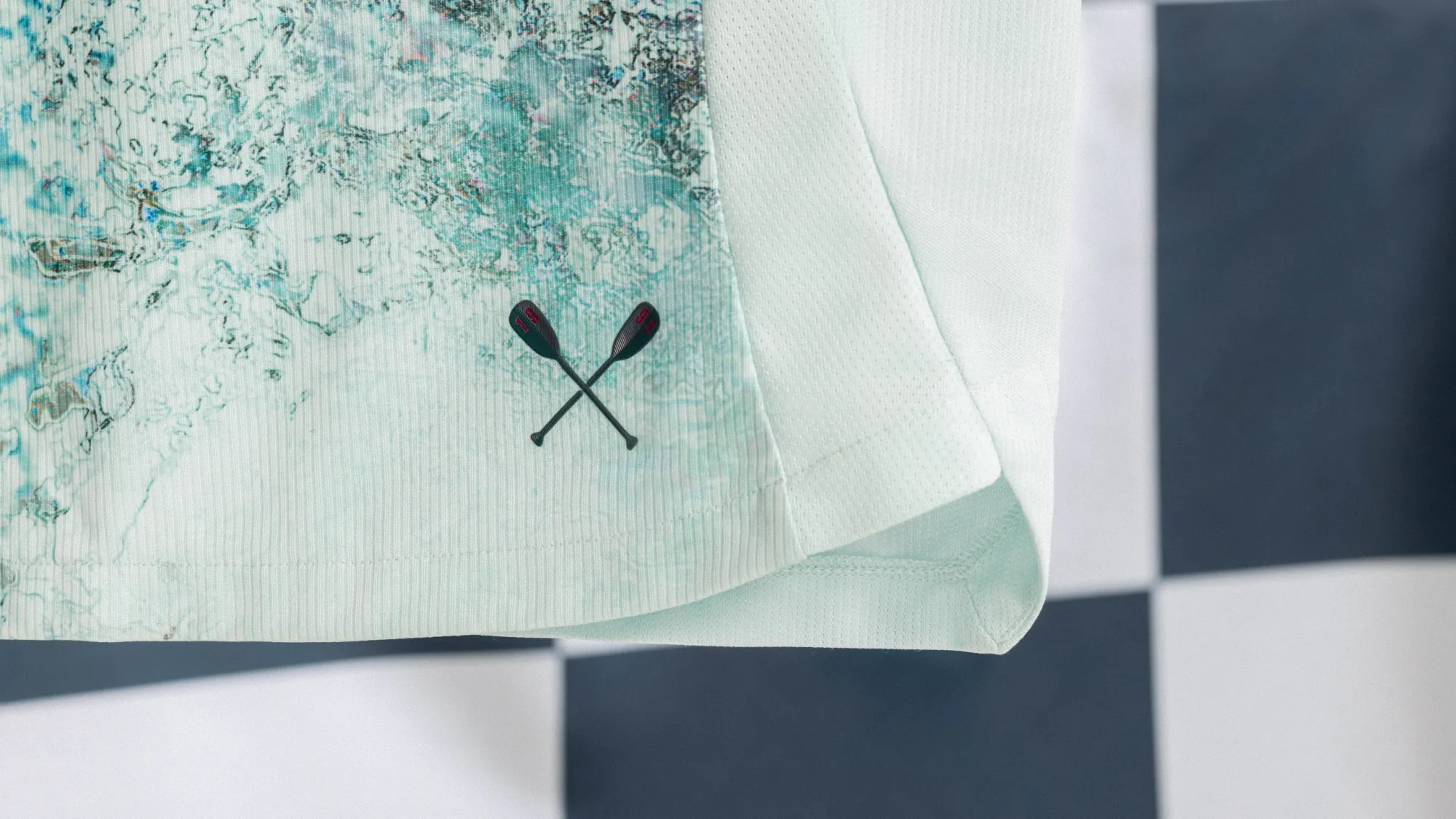
I had this one in dead last after the initial leaks, but seeing the full version certainly changed my opinion. I'm not sure it will look like anything special on the pitch, but the details on the front of the shirt are really nice.
20 – New York City FC "Excelsior Kit"
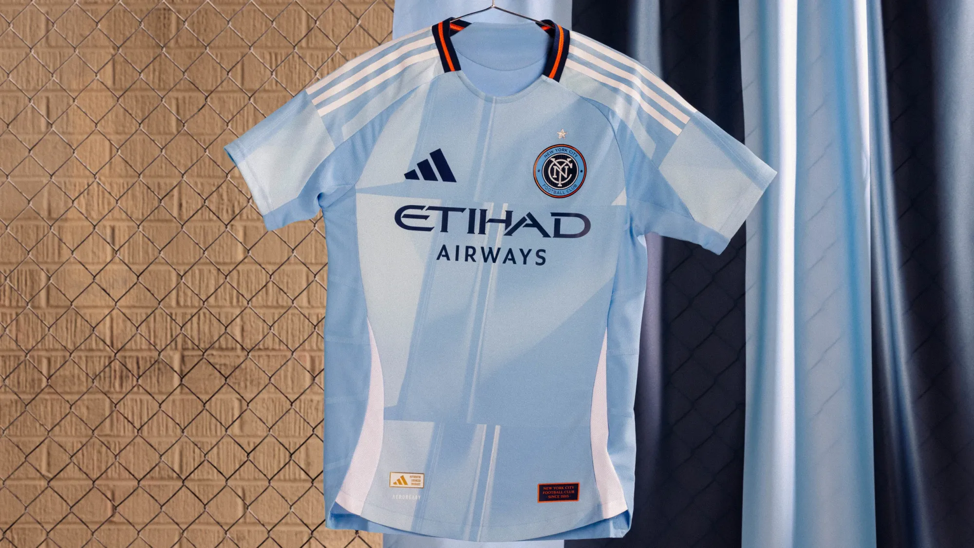
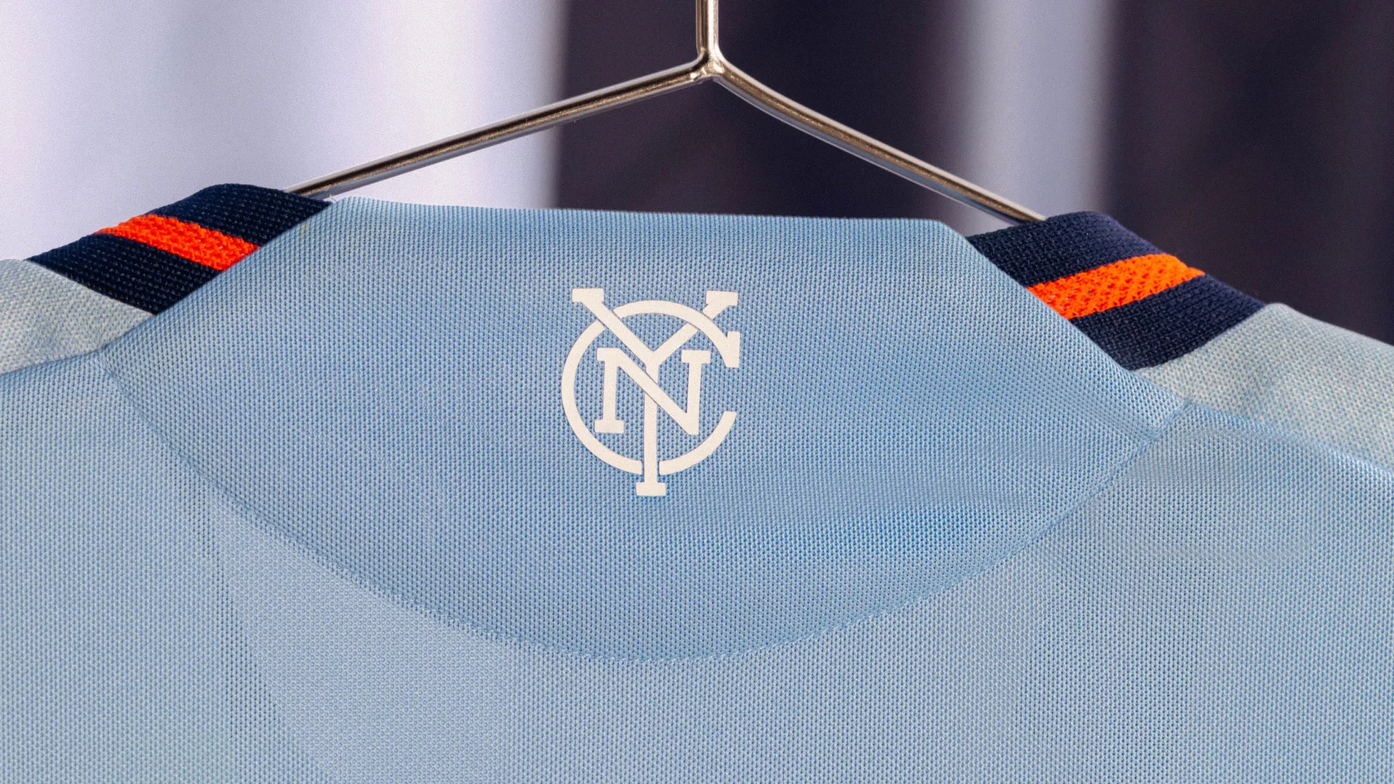
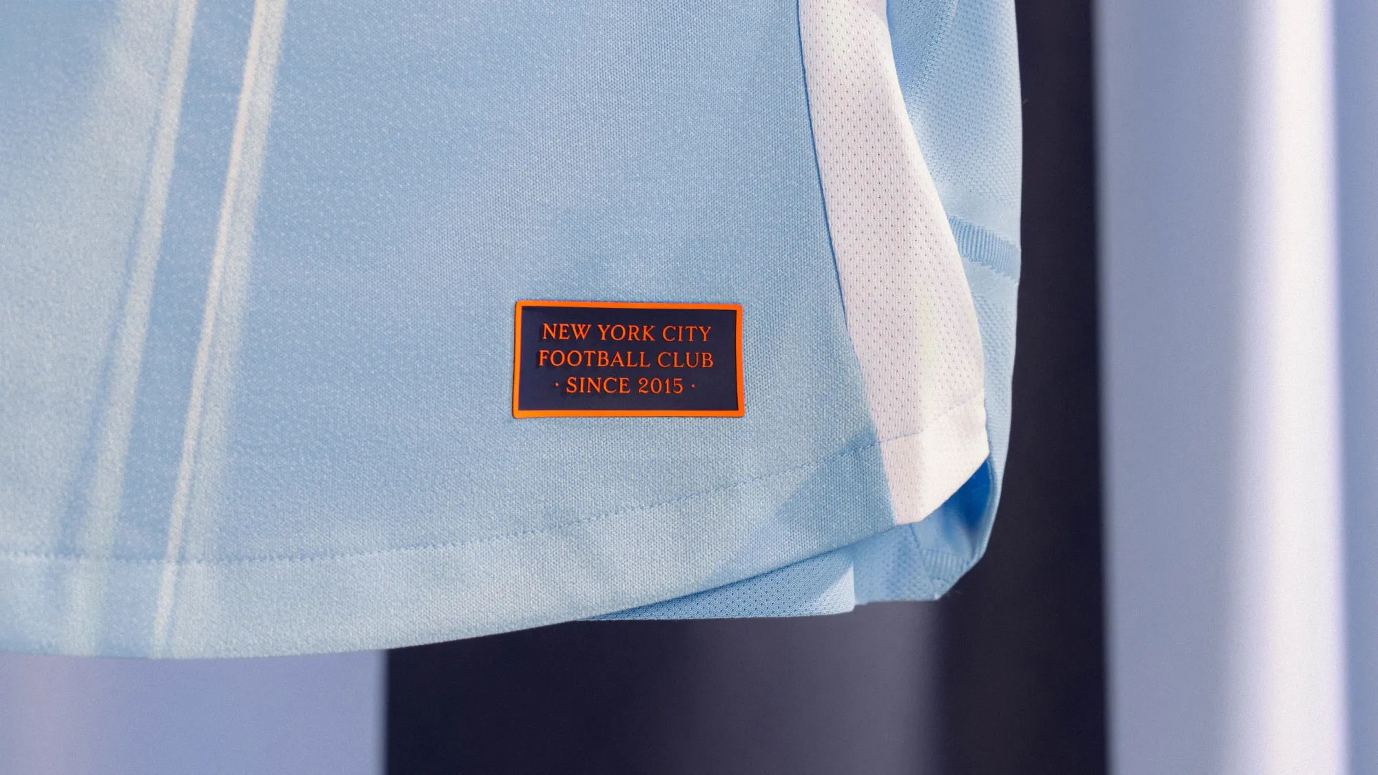
This isn't a bad kit, and NYCFC's color scheme always looks great on the pitch. It at least tried to put a different twist on it with skyscraper-themed graphic on the front, and while it's nice enough, it's not one of the more memorable offerings this season.
They did land a solid shot on their New York rivals with this, though:
The only New York team with a star above its crest ⭐️ https://t.co/8bCqBHv4Jl
— New York City FC (@newyorkcityfc) February 12, 2025
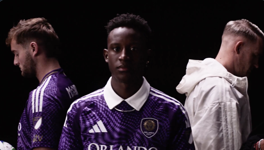
19 – Orlando City "Perfect Storm Kit"
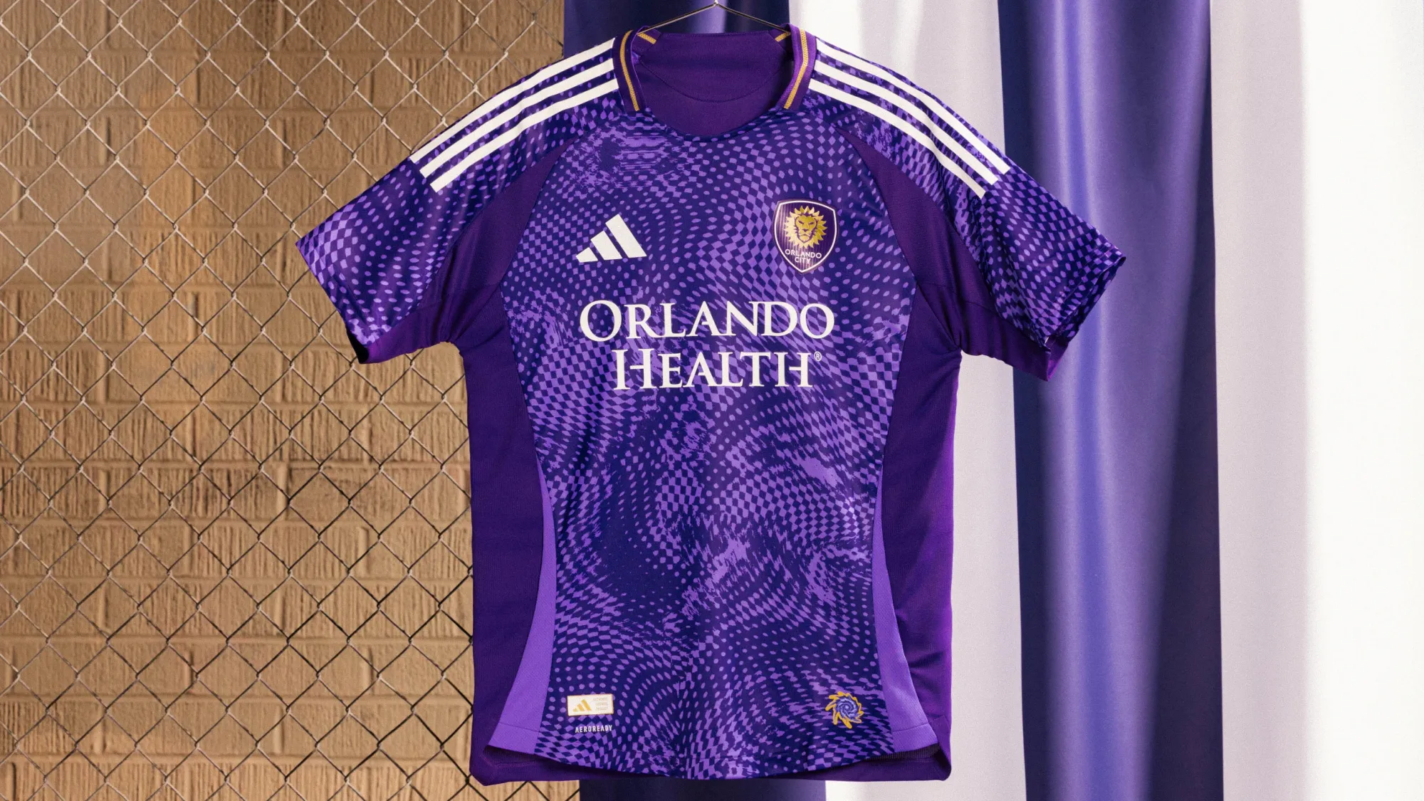
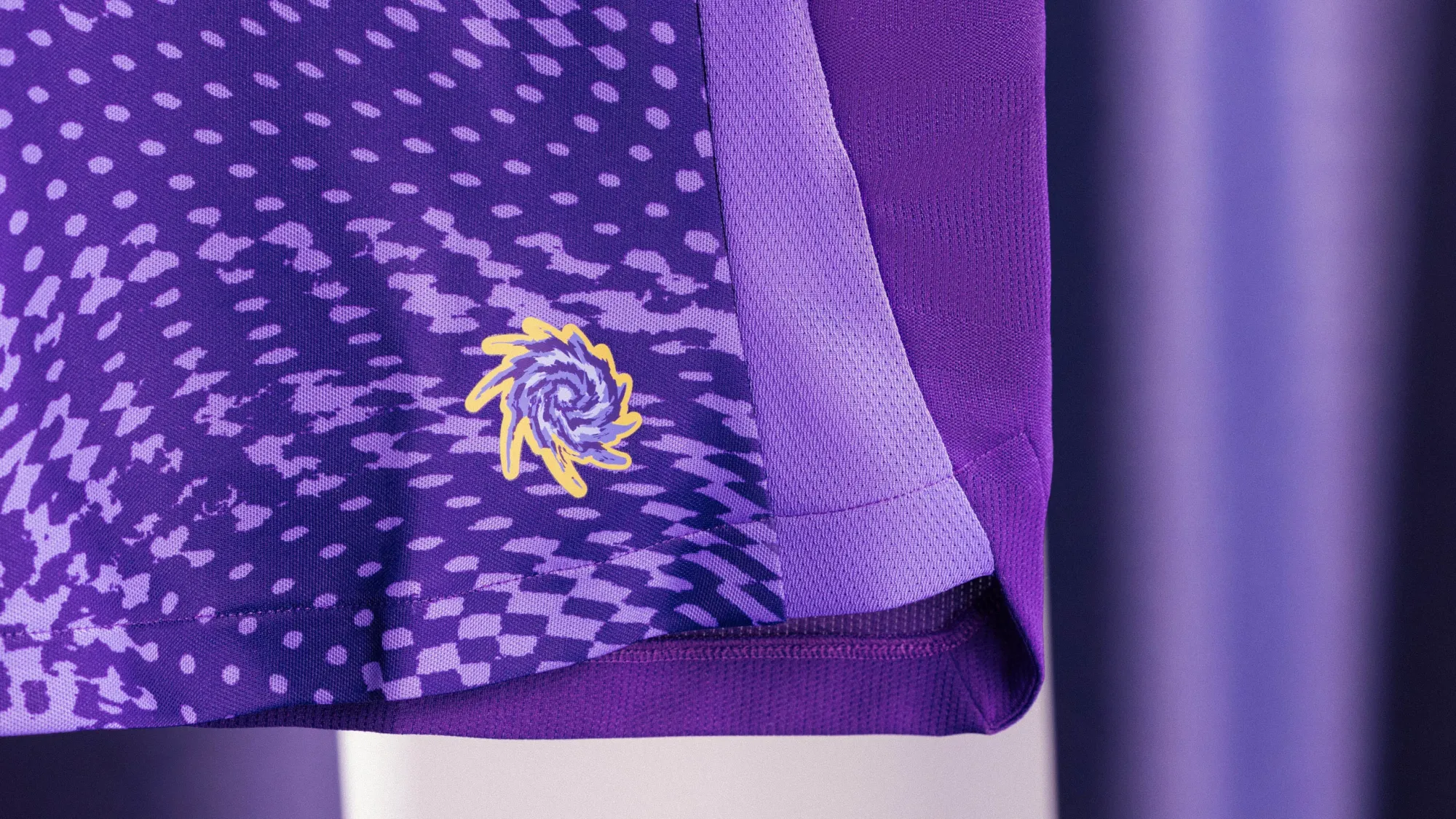
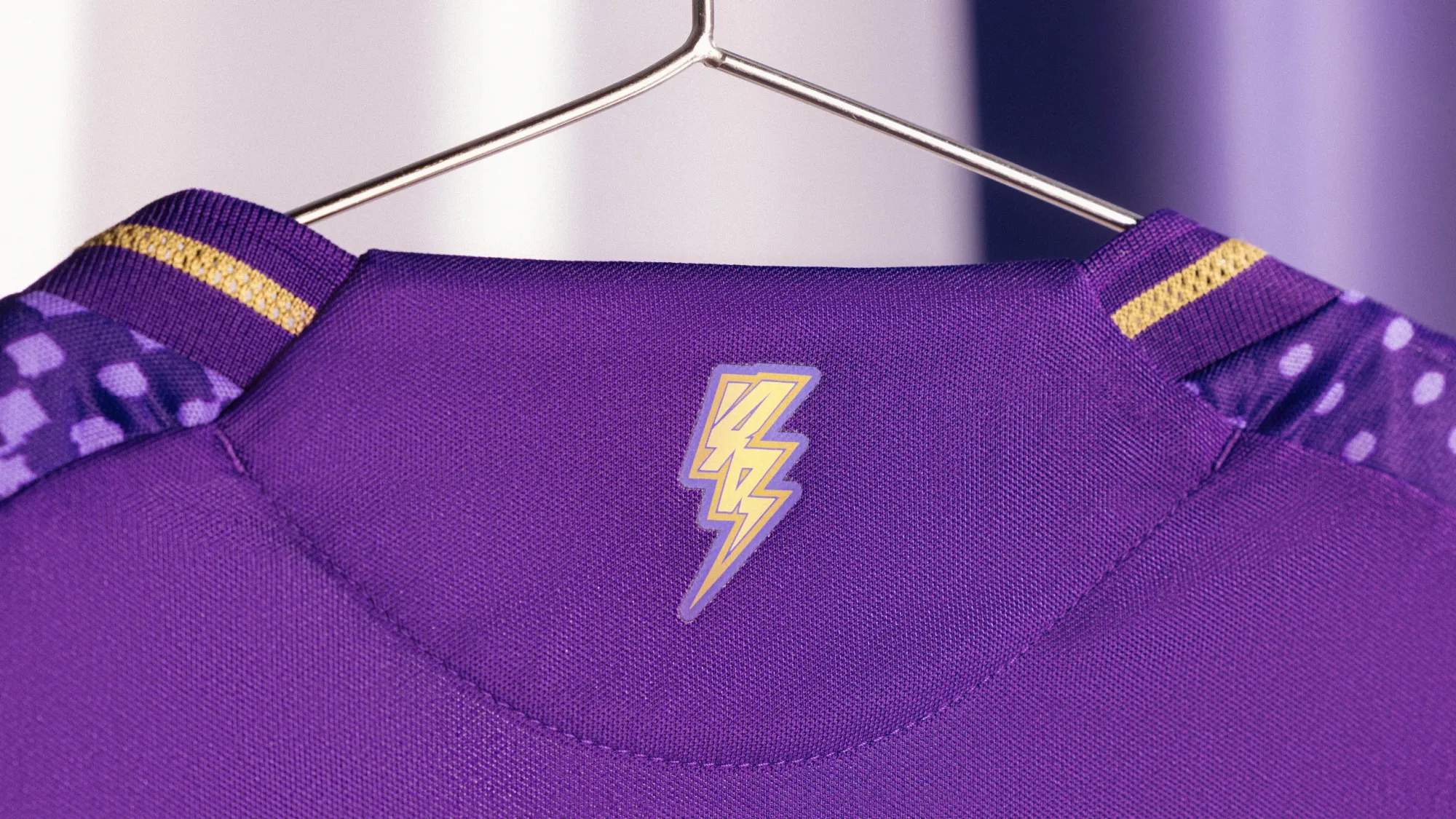
Orlando's color scheme makes their shirts really hard to mess up, and I think this is a pretty solid attempt. The pattern on the front isn't my absolute favorite, but it should look fine on the pitch.
But man, after seeing Ivan Angulo rock a white collar underneath the shirt in the promo video makes this feel like a major missed opportunity. Throw a white collar on this shirt and in instantly jumps towards the top of the list.
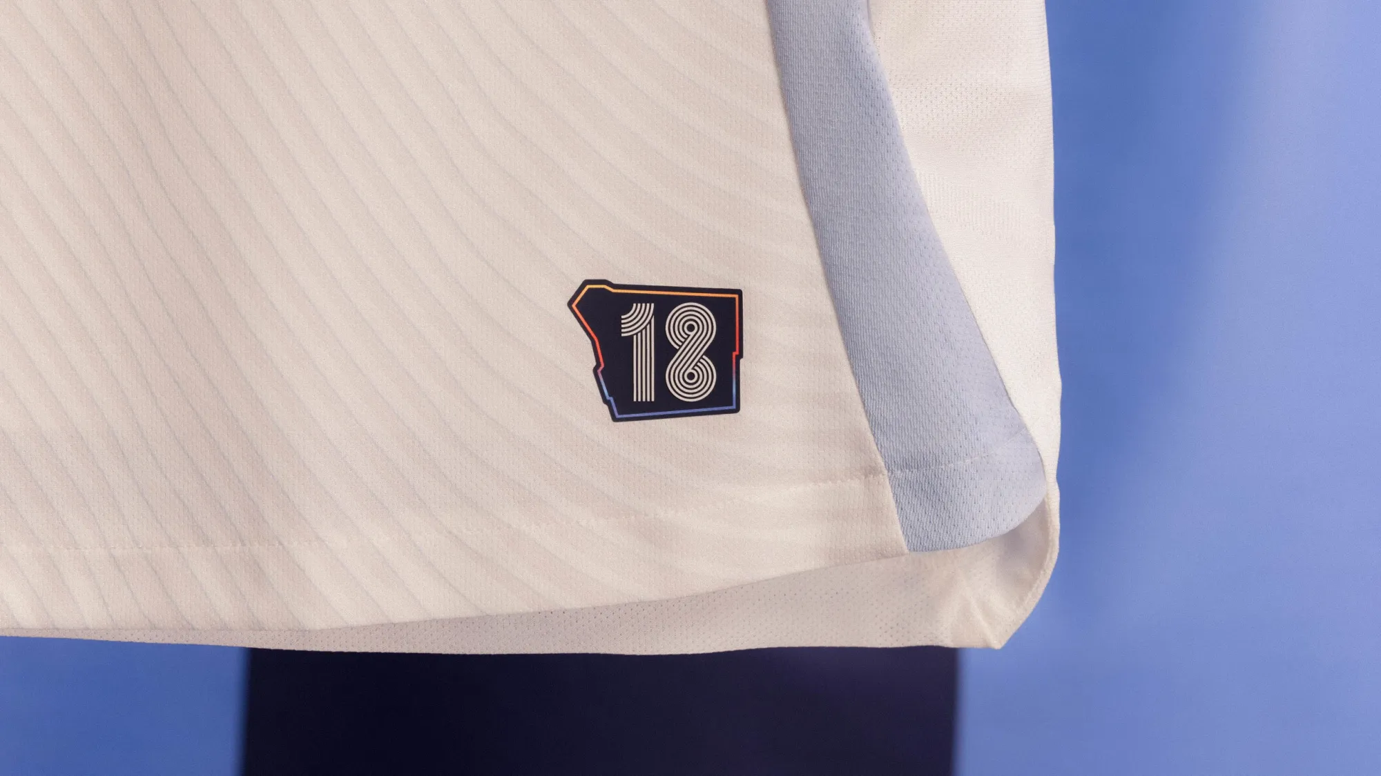
18 – Minnesota United "The CONVERGENCE Jersey"
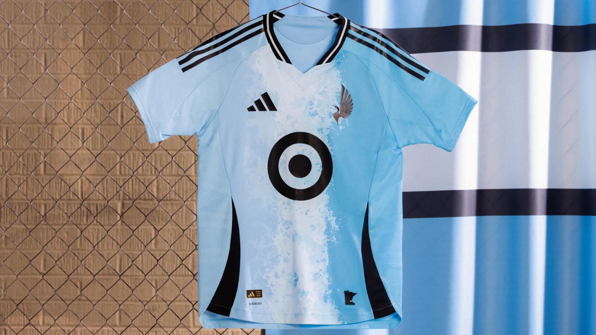
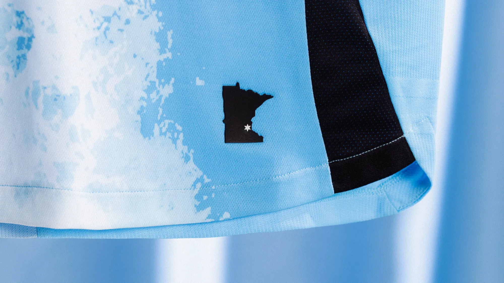
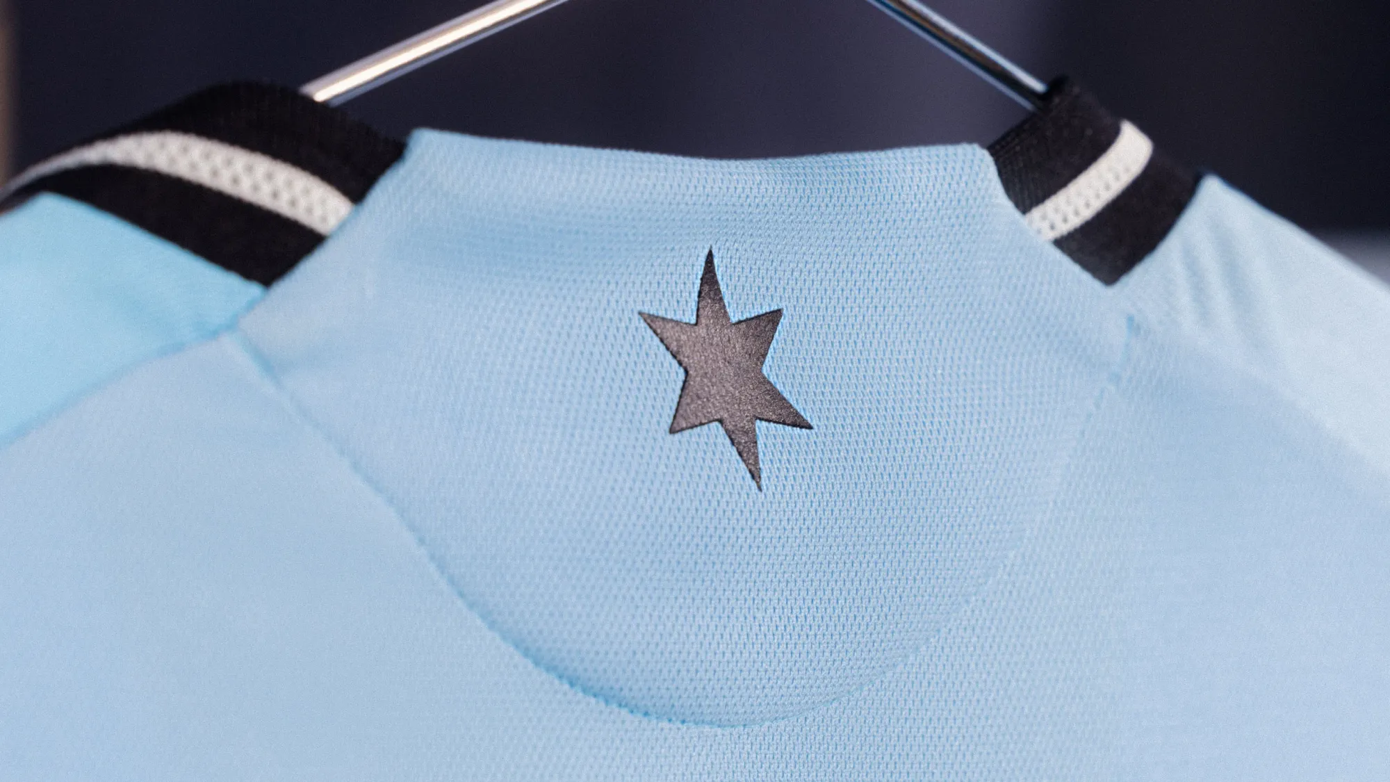
This isn't my favorite Minnesota United kit from recent years, but their color scheme is fantastic and they always try something out of the box. Points for not sticking with something generic.
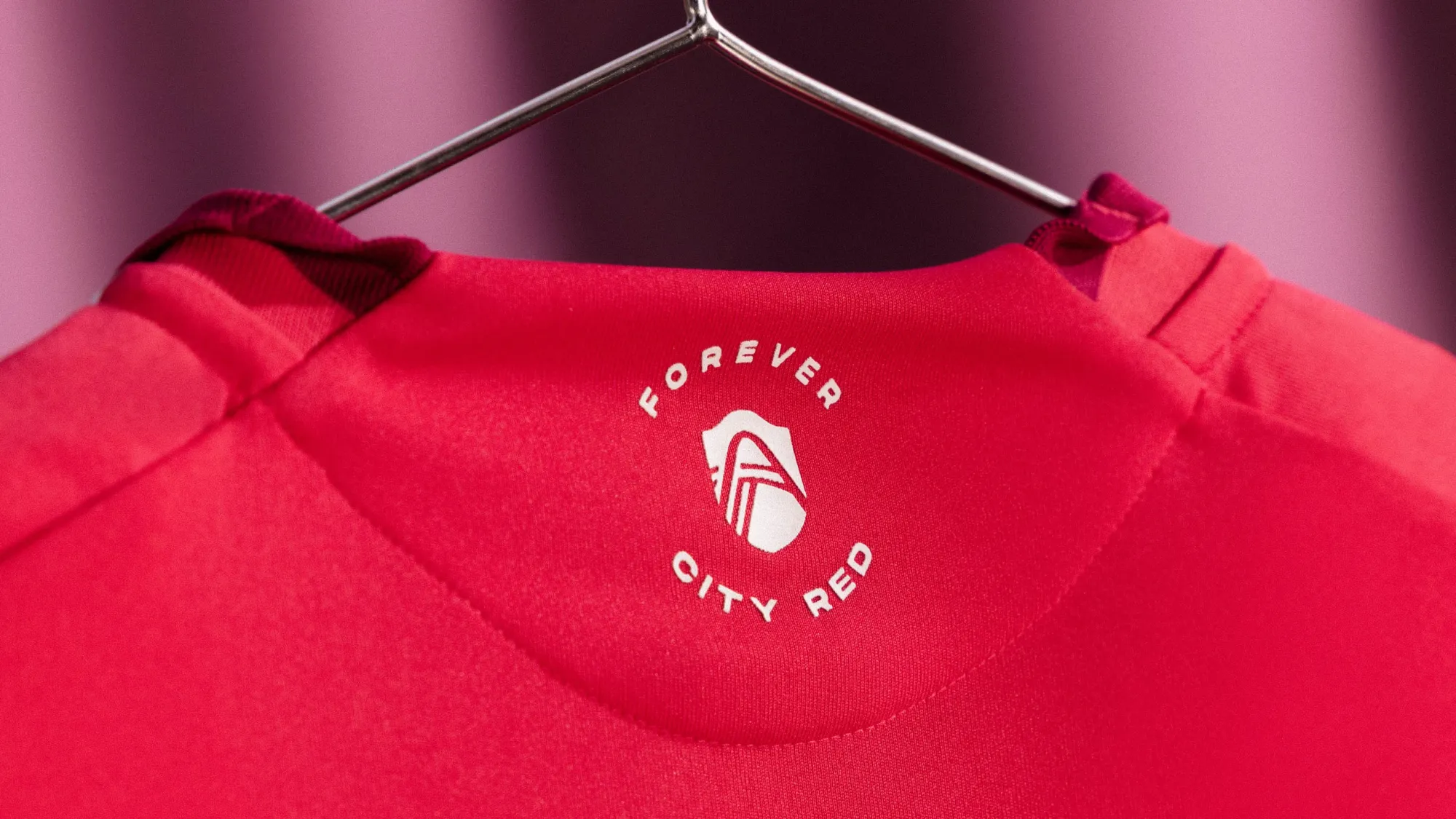
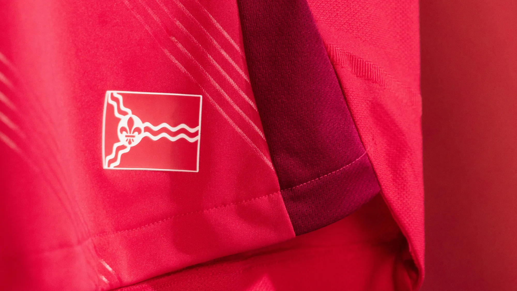
17 – St Louis City "Forever CITY Red Jersey"
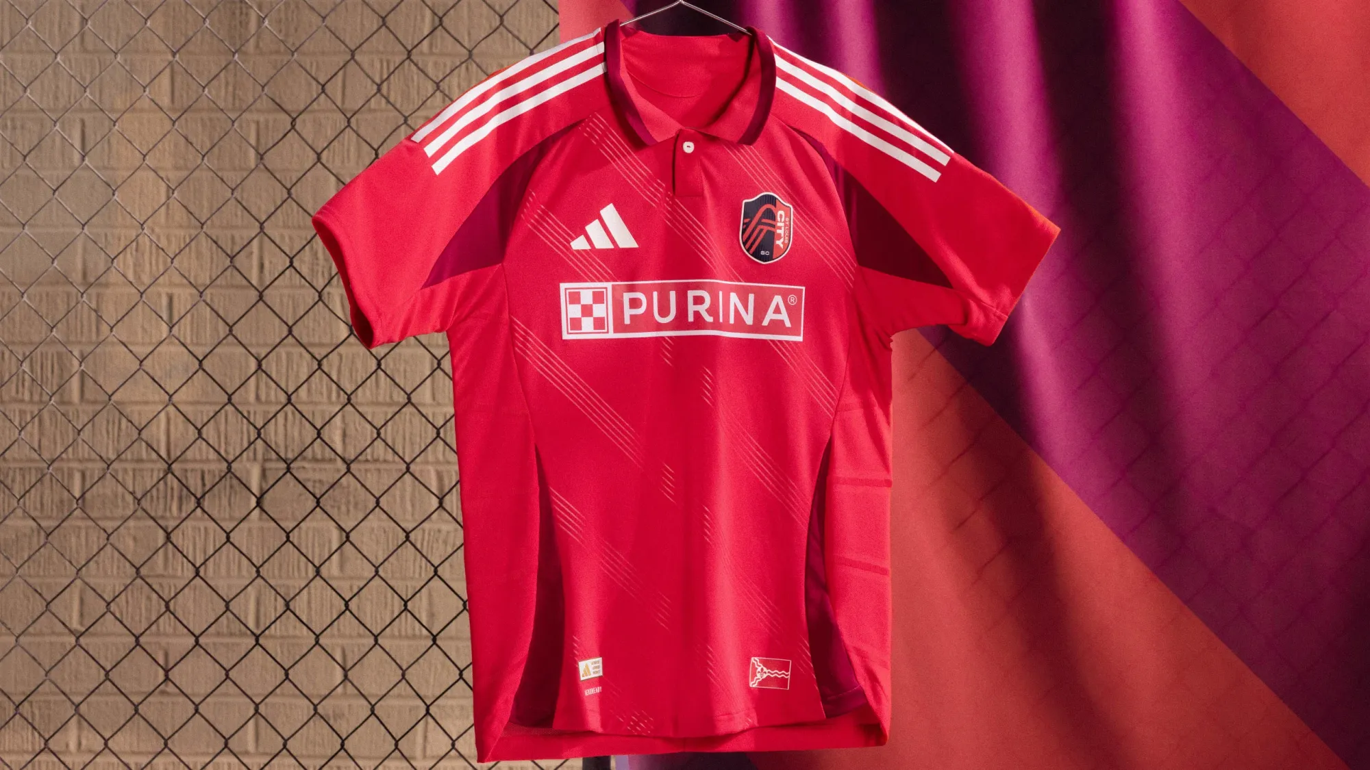
Toronto get's the prize for the best all-red jersey this season, but I do like the collar and the subtle diagonal stripe here. Going all red/pink with this covers up a lot of the downsides to this template, too.
16 – Houston Dynamo "Season 20 Kit"
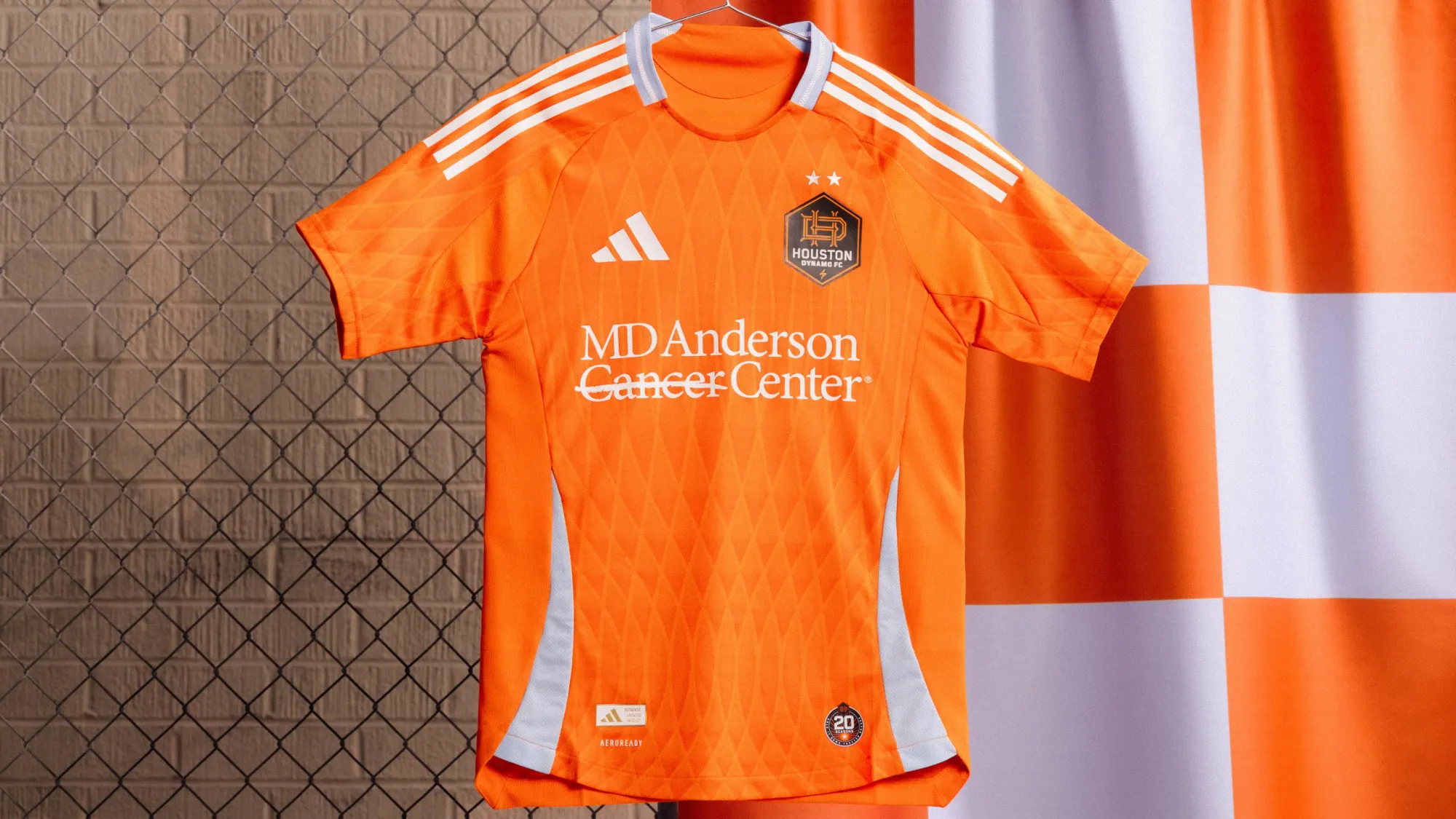
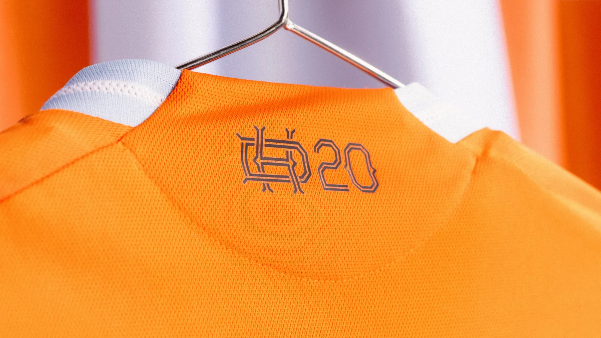
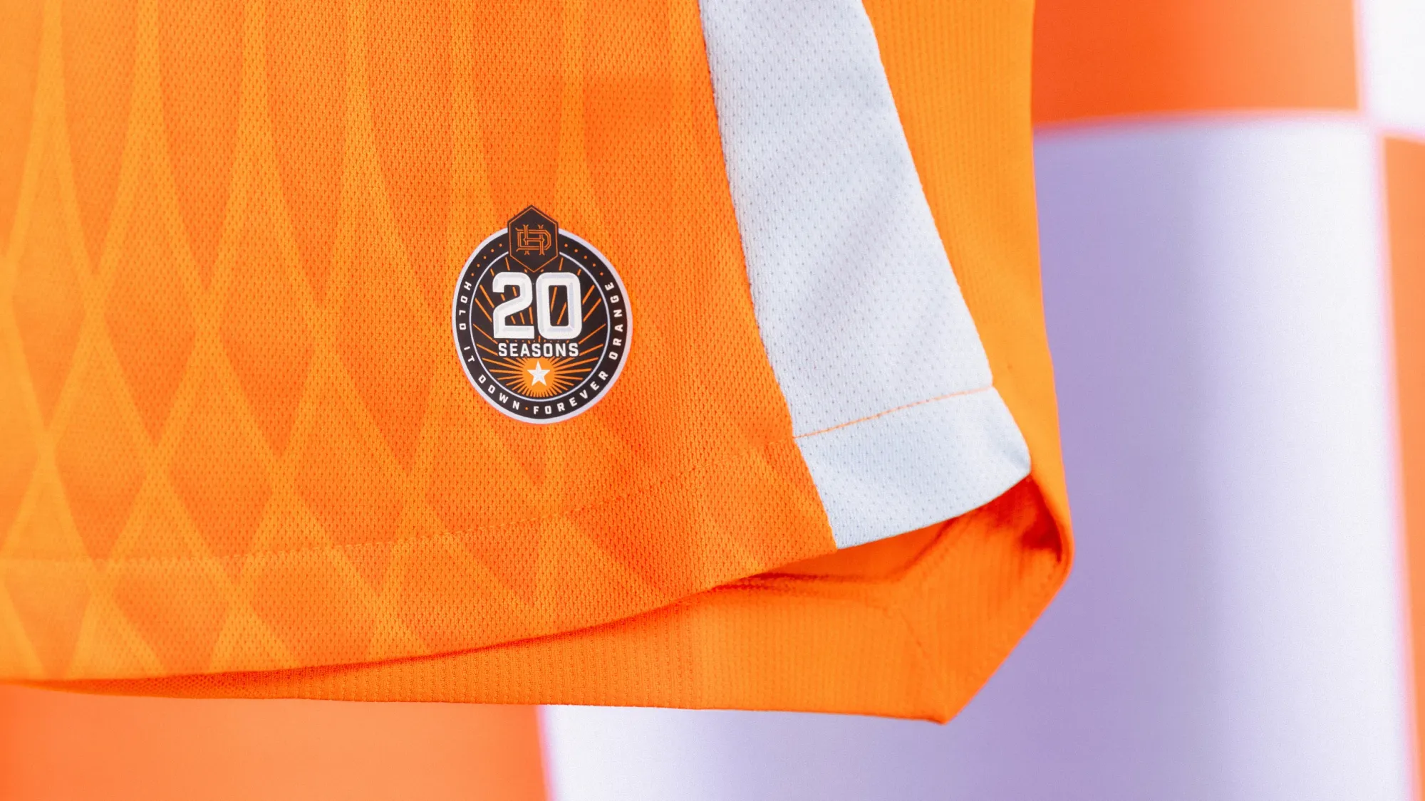
This shirt is fairly understated, but I love the callback to their early looks with the return of the light blue accents. I wish it continued from the collar onto the sleeves, but this is a really solid effort, and one that should look good in retrospect, too.
15 – Toronto FC "Club Kit"
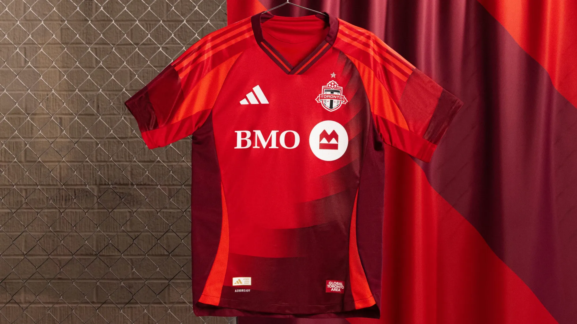
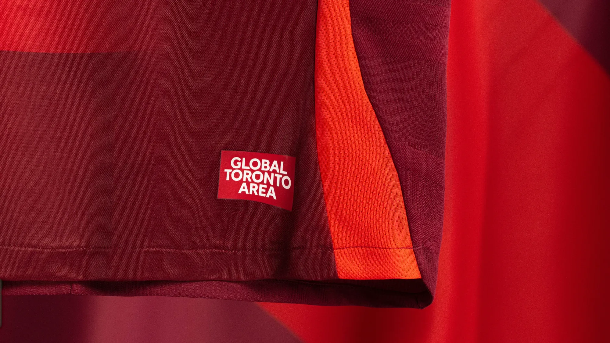
Toronto went back to basics for their new home kit. They ditched that travesty of a grey-and-red hoop stripe and return to their roots with this classic red shirt. There's so much red. There's nothing but red. And I love it.
2.14.25 ♥️ pic.twitter.com/cuVS3yvawR
— Toronto FC (@TorontoFC) February 12, 2025
14 – Red Bull New York "Stone Kit"
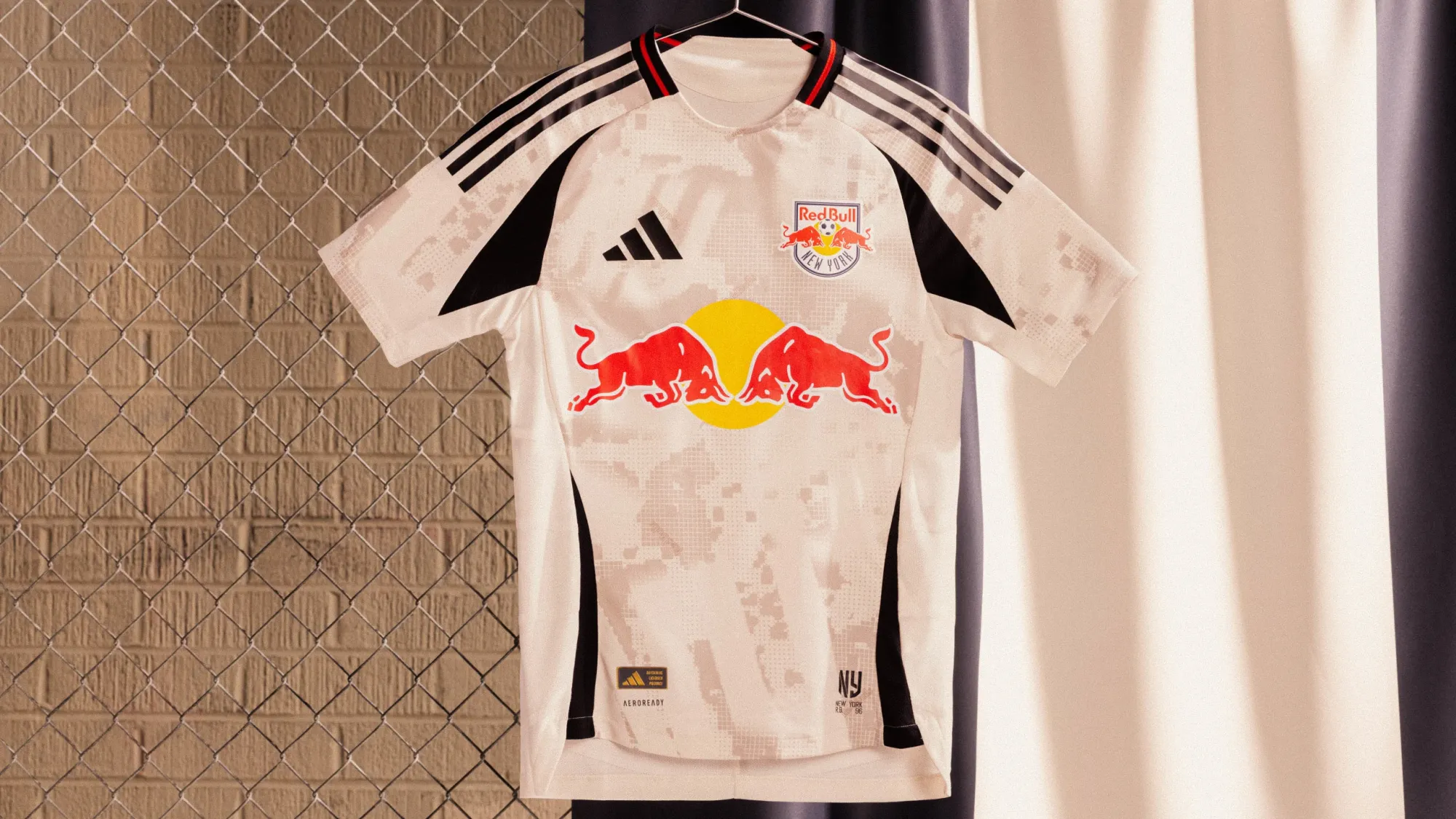
I keep going back and forth on this one. I'm still not totally sure what I think of it. It's definitely different, and I really like the color scheme, it just doesn't feel very "Red Bulls".
The kit is way, way better than whatever this explainer is, though.
The birthplace of the Metro, where asphalt dreams took flight, and one road ignited a revolution.
— New York Red Bulls (@NewYorkRedBulls) February 12, 2025
Stone by stone, block by block, a legacy was born. Connecting generations and neighborhoods, from the 718 to the 973.
Introducing the Stone Kit. Styled by Alpha Tauri. pic.twitter.com/PFpmEmS7lp
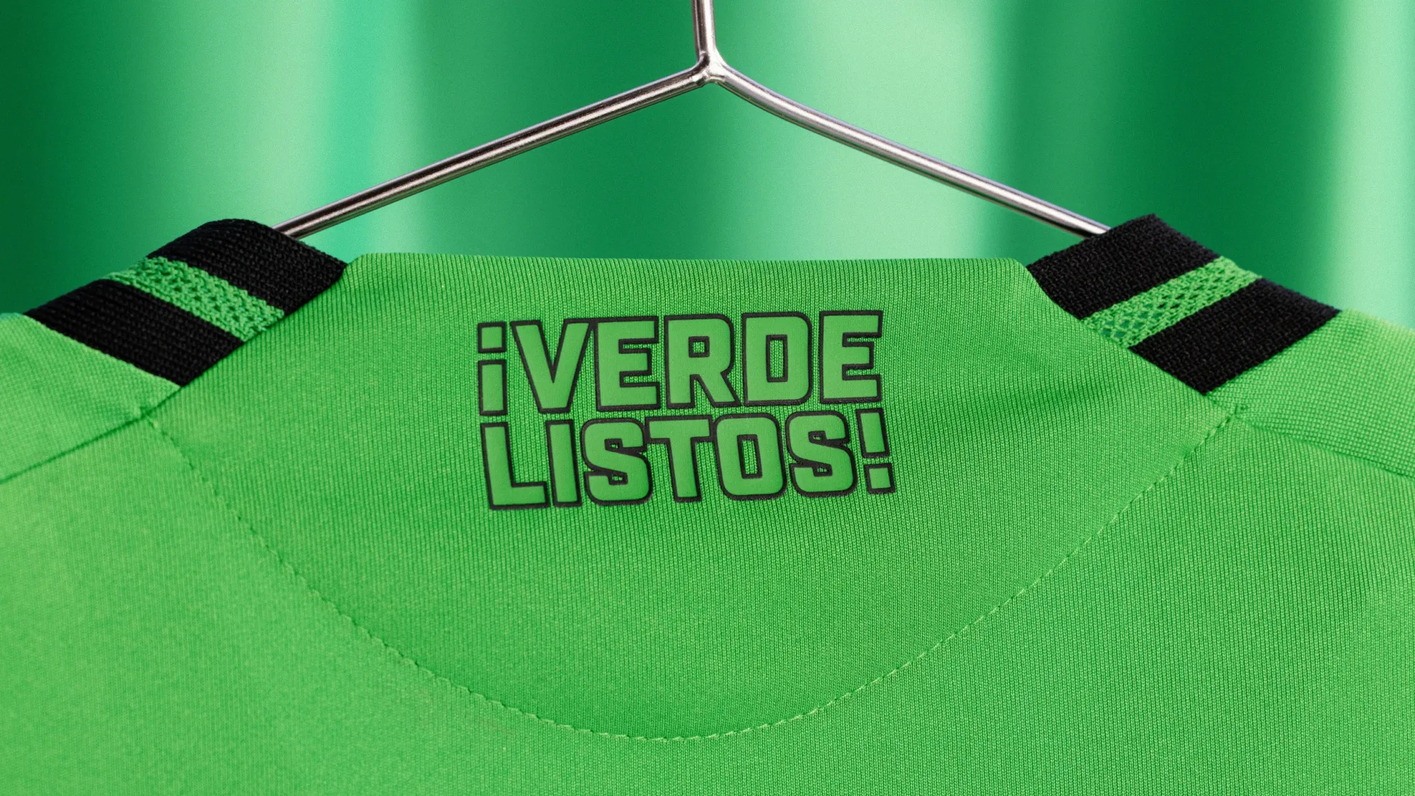
13 – Austin FC "The Heartbeat Kit"
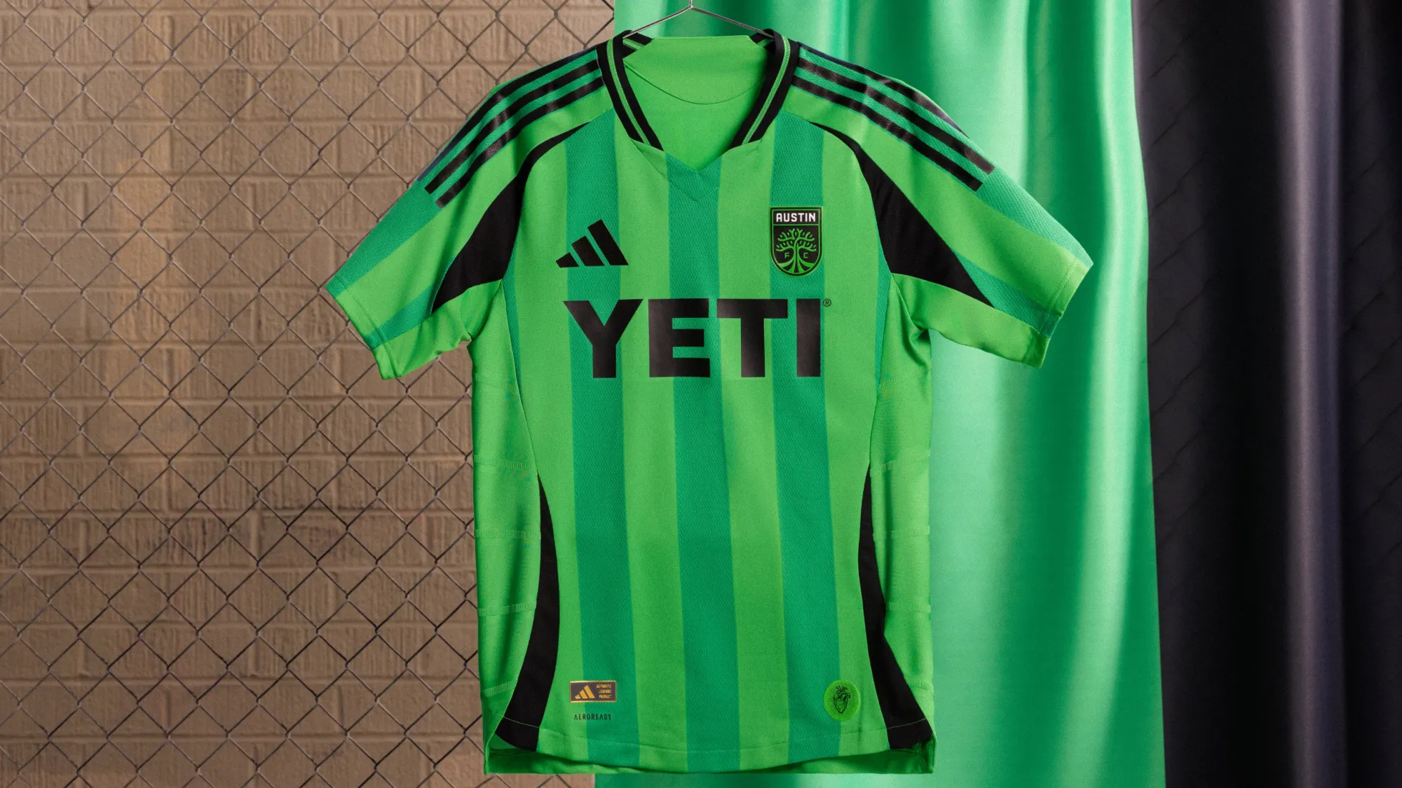
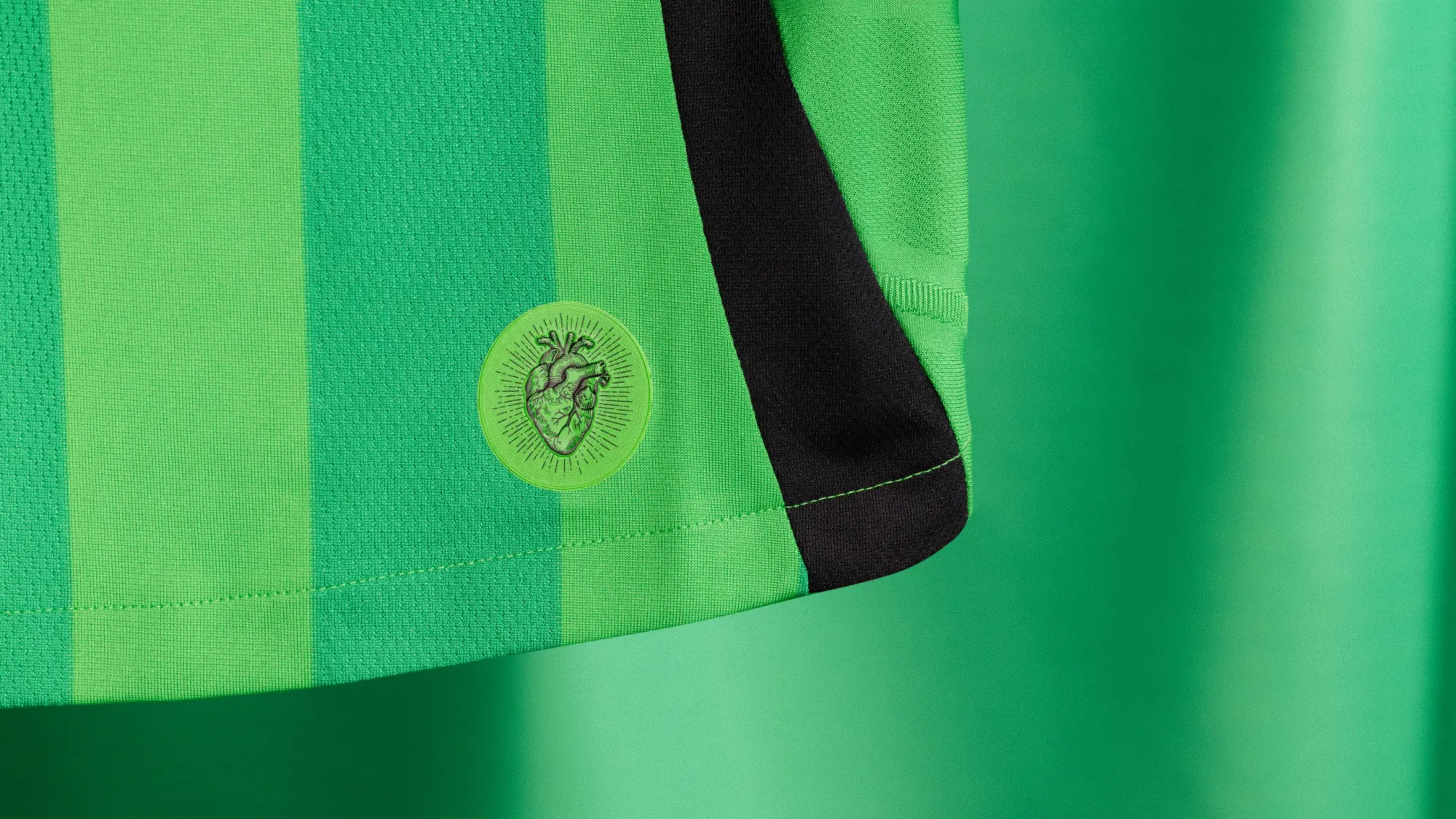
Austin tend to have really solid kits, and this one is no exception. I wish they had stuck with the black stripes, which is one of the more instantly recognizable looks around the MLS landscape, but this is still a great shirt.
Even better? Their announcement video. You can almost taste the vibes.
¡VERDE! ¡LISTOS!
— Austin FC (@AustinFC) February 12, 2025
Introducing The Heartbeat Kit. 💚🖤 pic.twitter.com/qajEw0itfY
12 – Atlanta United "The Connector Kit"
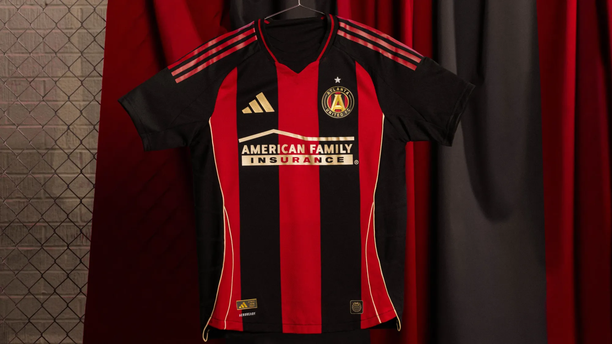
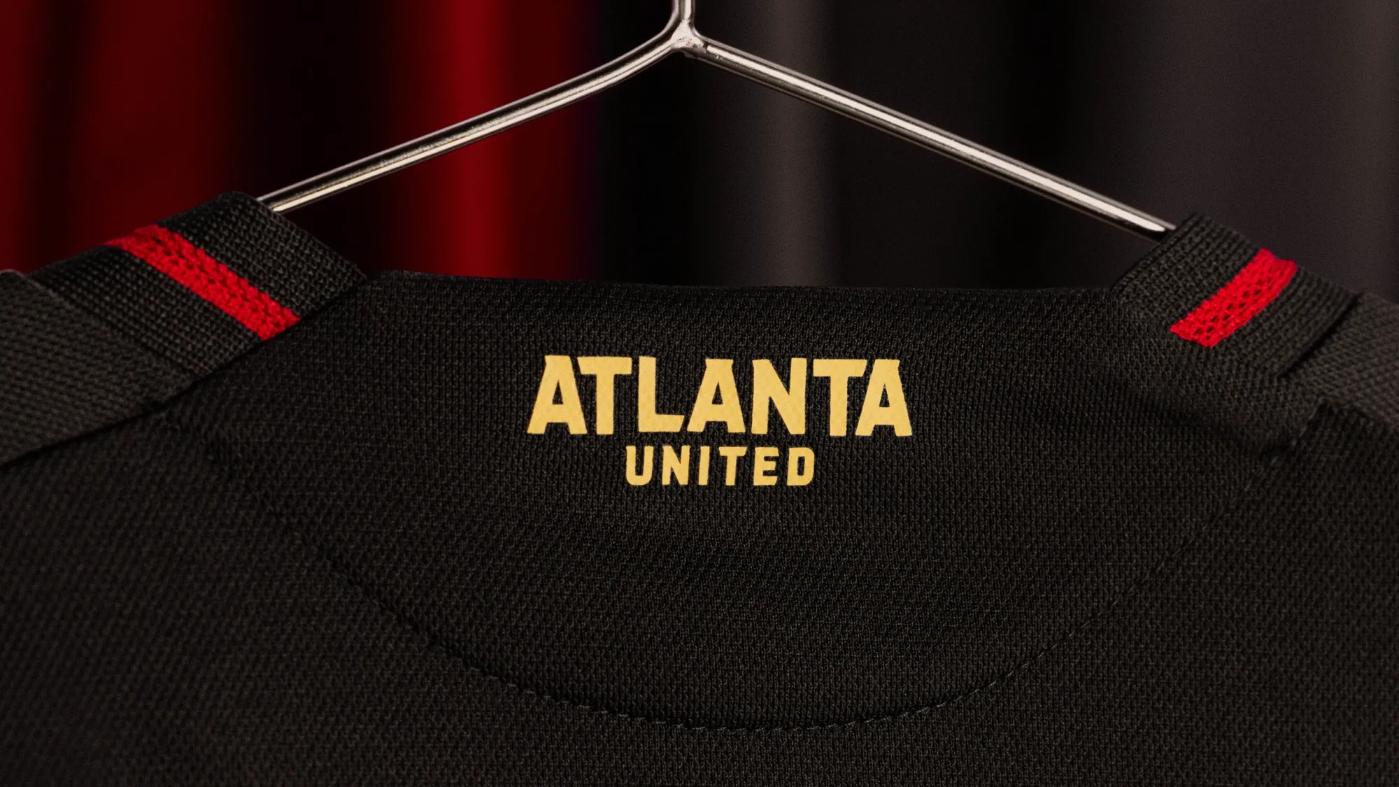
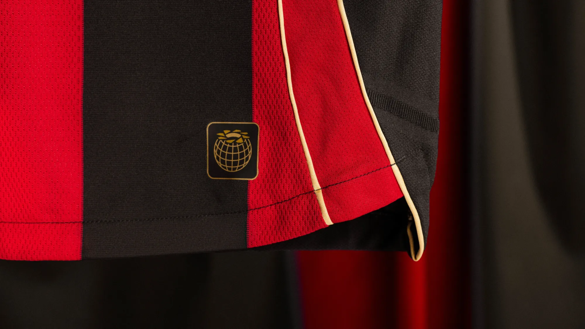
Atlanta United have such a clear identity that it's almost impossible to mess up (looking at you, 2021-22). If we're gonna nitpick, I wish the trim around the collar and the three stripes on the sleeves were gold, not red. It's not their best ever, but it's good.
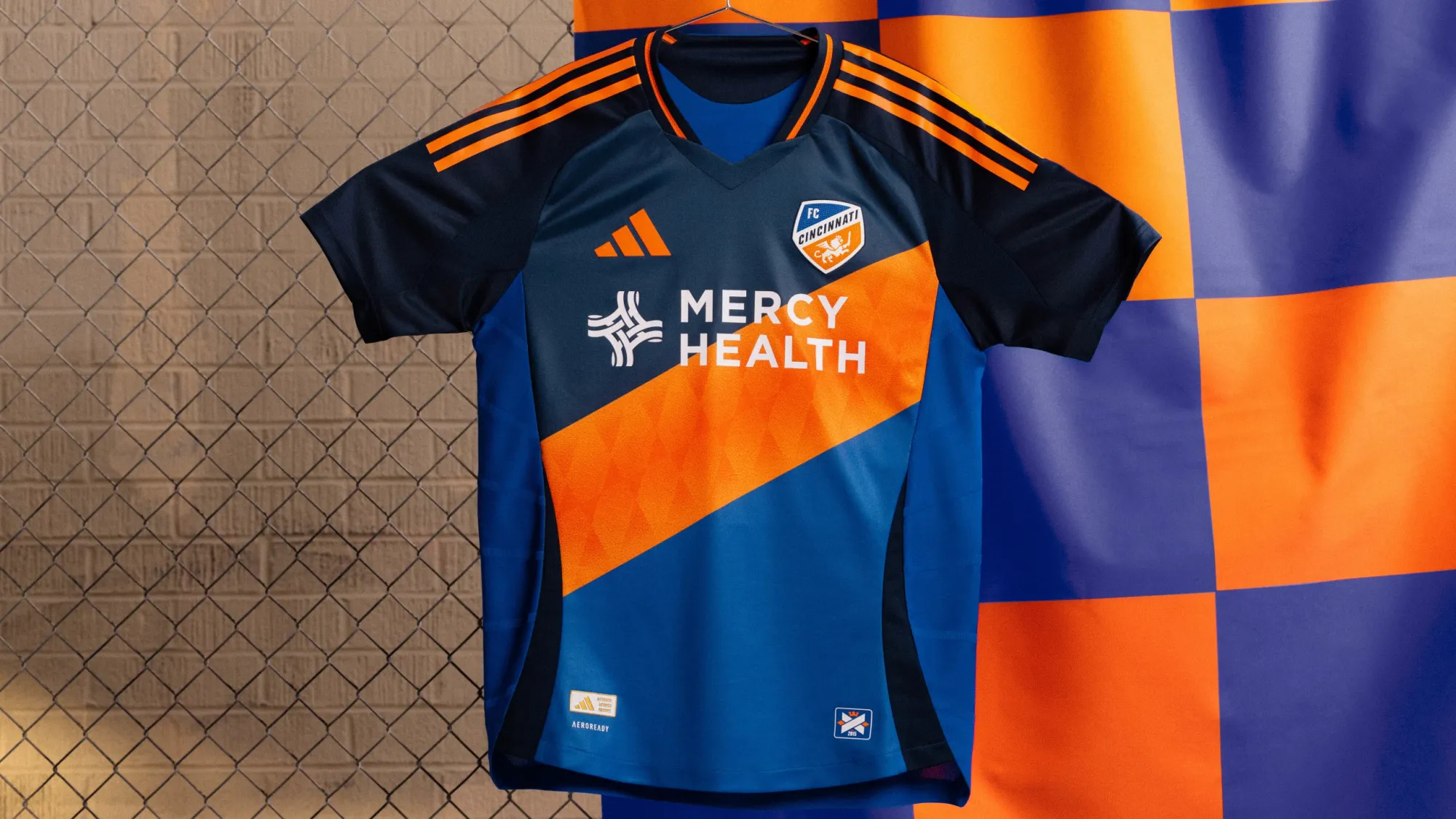
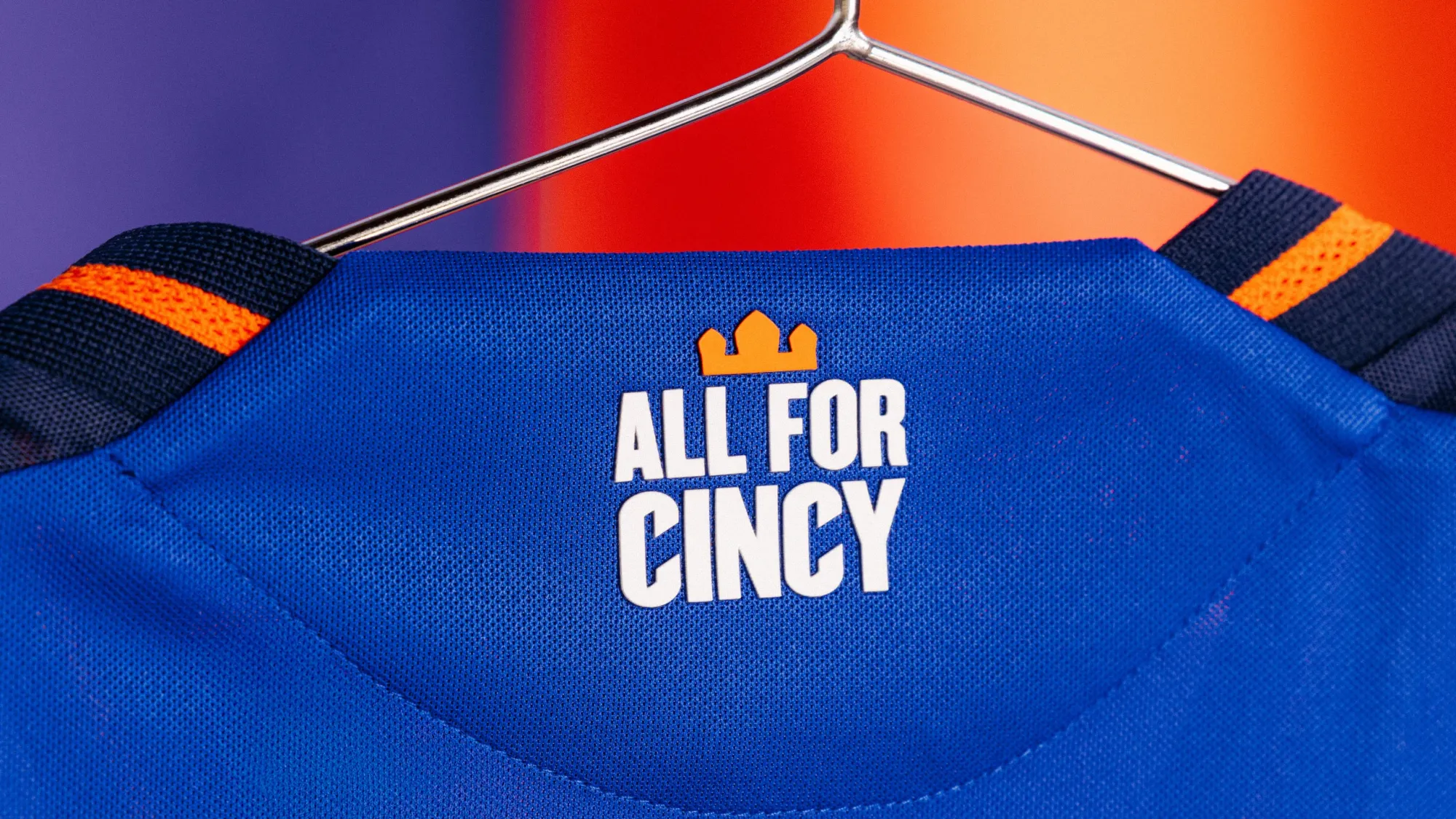
11 – FC Cincinnati "Orange & Blue Legacy Kit"
Cincinnati made up for their plain white kit last year. Remember, the one where they tried to convince fans that they should paint their own design on a $200 shirt as a way to spin the plain white kit as a creative design choice? I still can't believe that was a real marketing pitch.
Anyway, 2025's new home shirt is much, much better. Maybe some people won't be a huge fan of the giant sash on the front, but to me it's big, brash and instantly identifiable. I love that they're leaning into the orange part of their color scheme, something their most recent home kit failed to do. And the decision to feature both shades of blue prominently here makes this one really nice.
Oh, yeah, and the release video was awesome.
🔸🔹 The Orange and Blue Legacy Kit. 🔸🔹 pic.twitter.com/vb2Oxjuqfx
— FC Cincinnati (@fccincinnati) February 12, 2025
10 – Inter Miami CF "Euforia Kit"
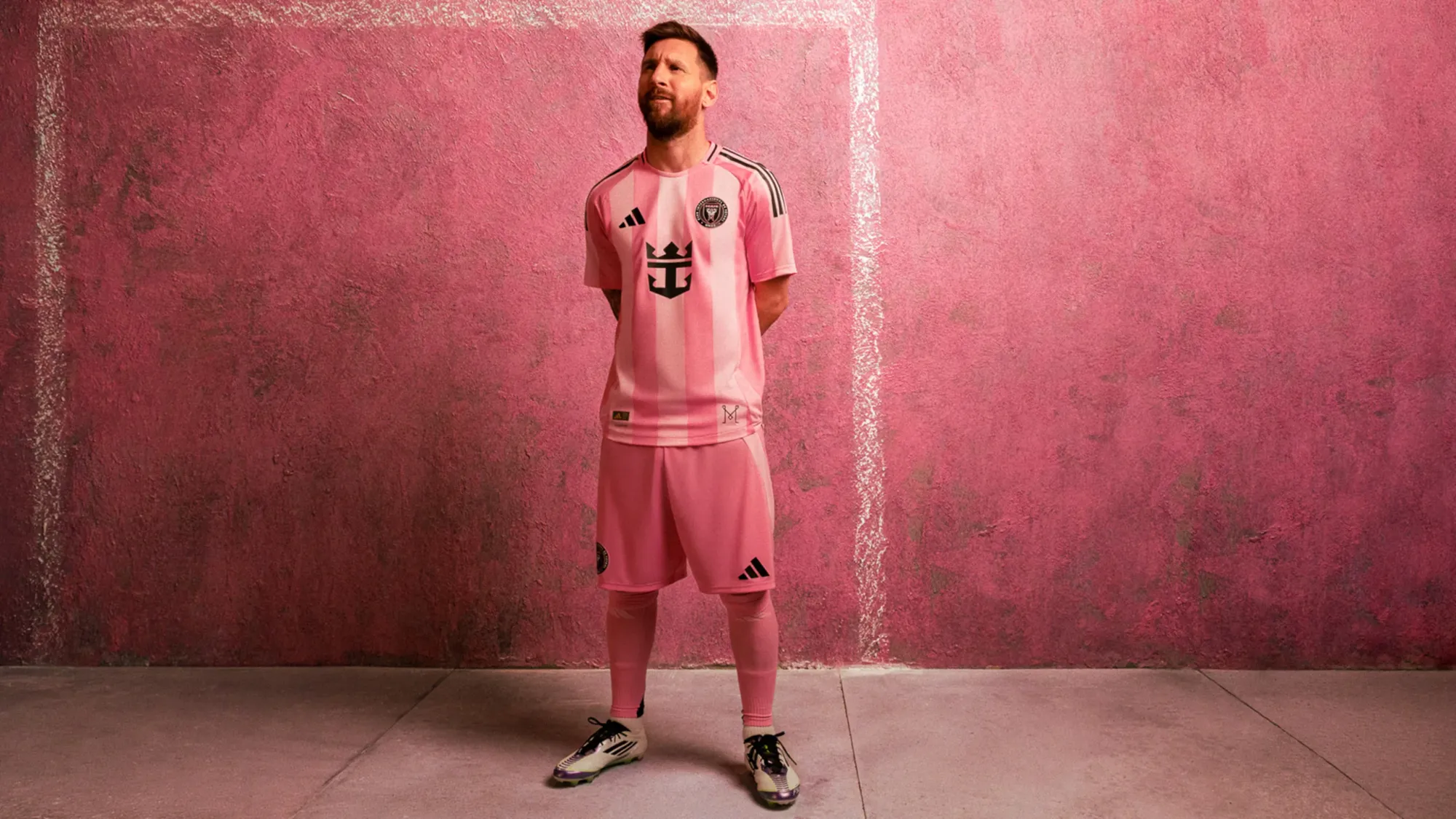
"Wait, didn't Miami already have a new kit on this list," one of the more observant readers might inquire. And they would be right. For some reason, Miami get not one, but two, completely new kits this year (and could potentially get another third kit this summer).
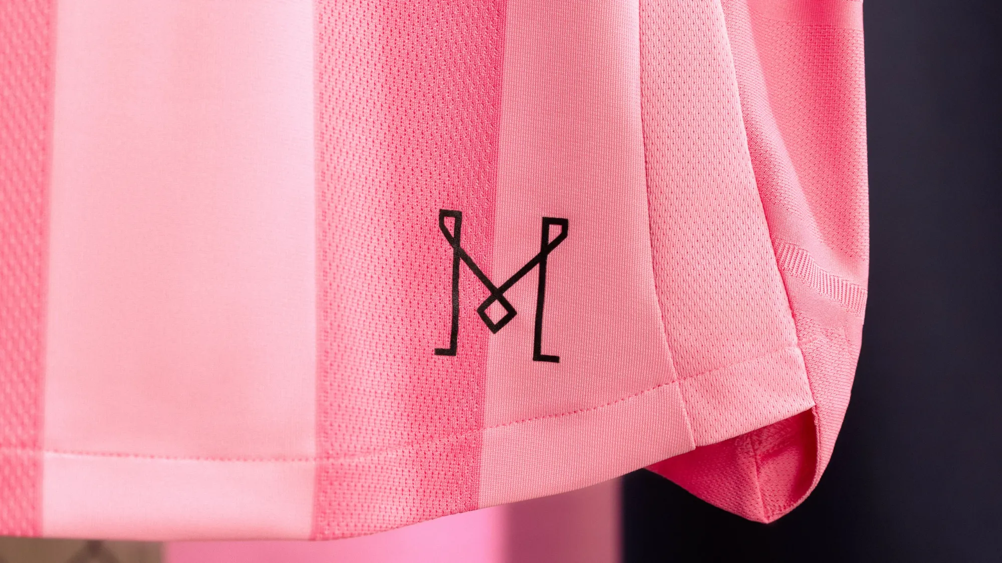
But this is a great kit. I've always been a fan of vertical stripes, and I love to see Miami fully leaning into the pink. And let's be honest, anything that moves away from last year's kit with those awful center-stacked logos is a huge win.
This one is my four-year-old's favorite.
9 – CF Montréal "Montréal Original Jersey"
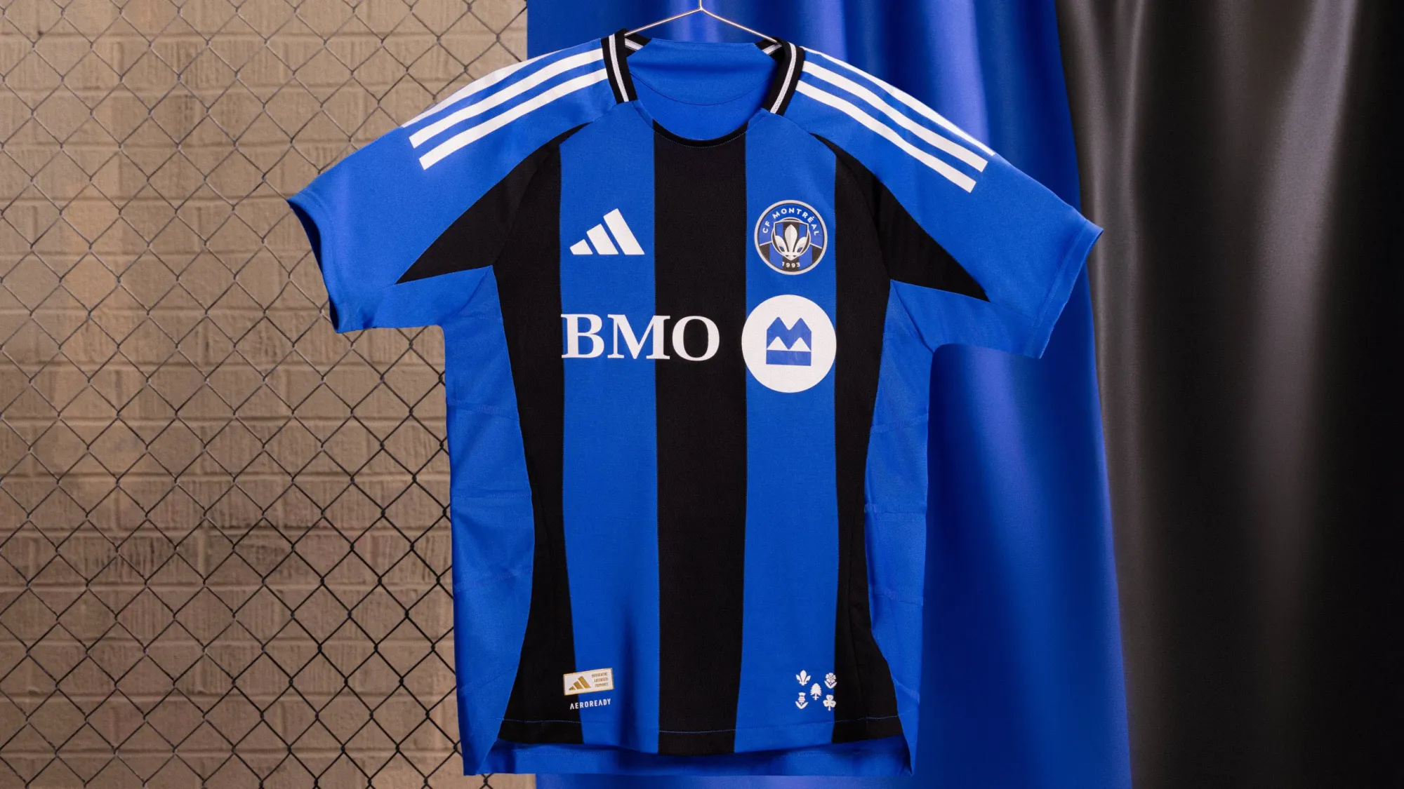
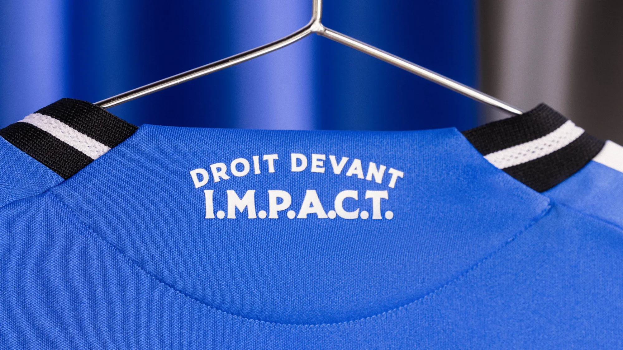
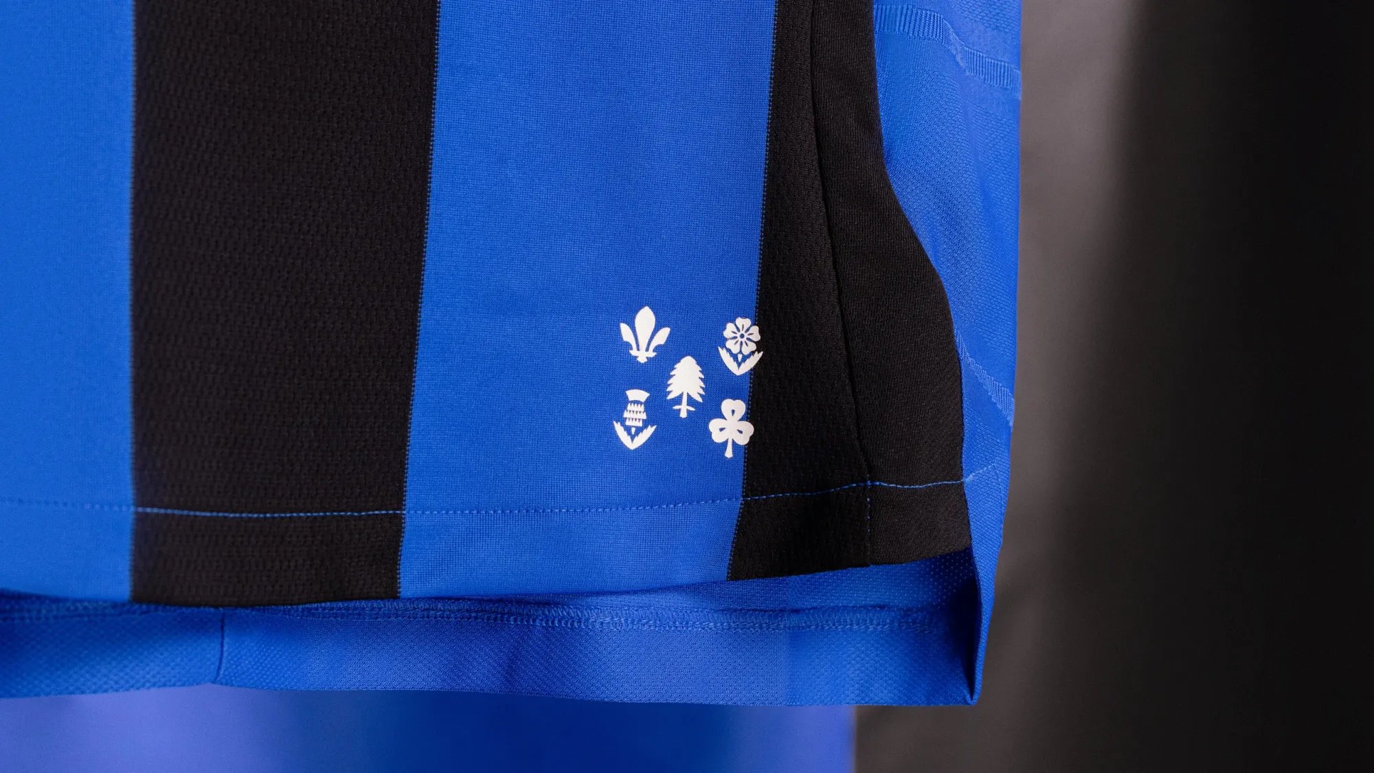
This is a classic Montréal shirt. Back to the blue and black stripes (maybe some bias here as they're my two favorite colors), and the shirt looks even better off the hanger.
Montréal Original 🔵⚫️
— CF Montréal (@cfmontreal) February 13, 2025
️#CFMTL @BMOfr pic.twitter.com/sfBmIU1fw8
This is a great kit. Instant classic.
8 – Los Angeles FC "2025 Secondary Kit"
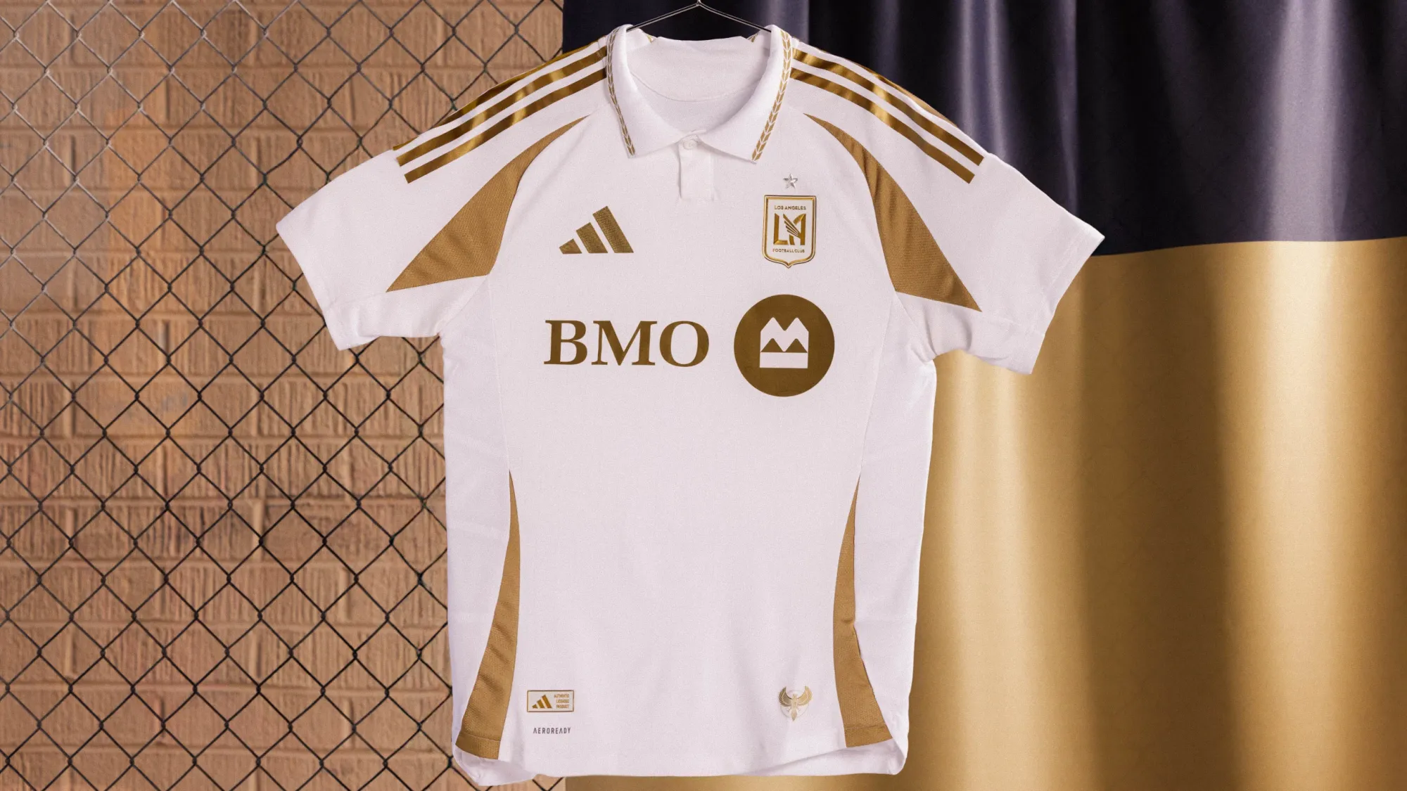
Ok, yeah, so the name isn't anything special, but the shirt itself is! Sometimes simplicity is the best policy, and the understated white and gold color scheme gives this shirt a timeless feel, especially with that fantastic collar thrown into the mix.
7 – New England Revolution "Eastern White Pine Kit"
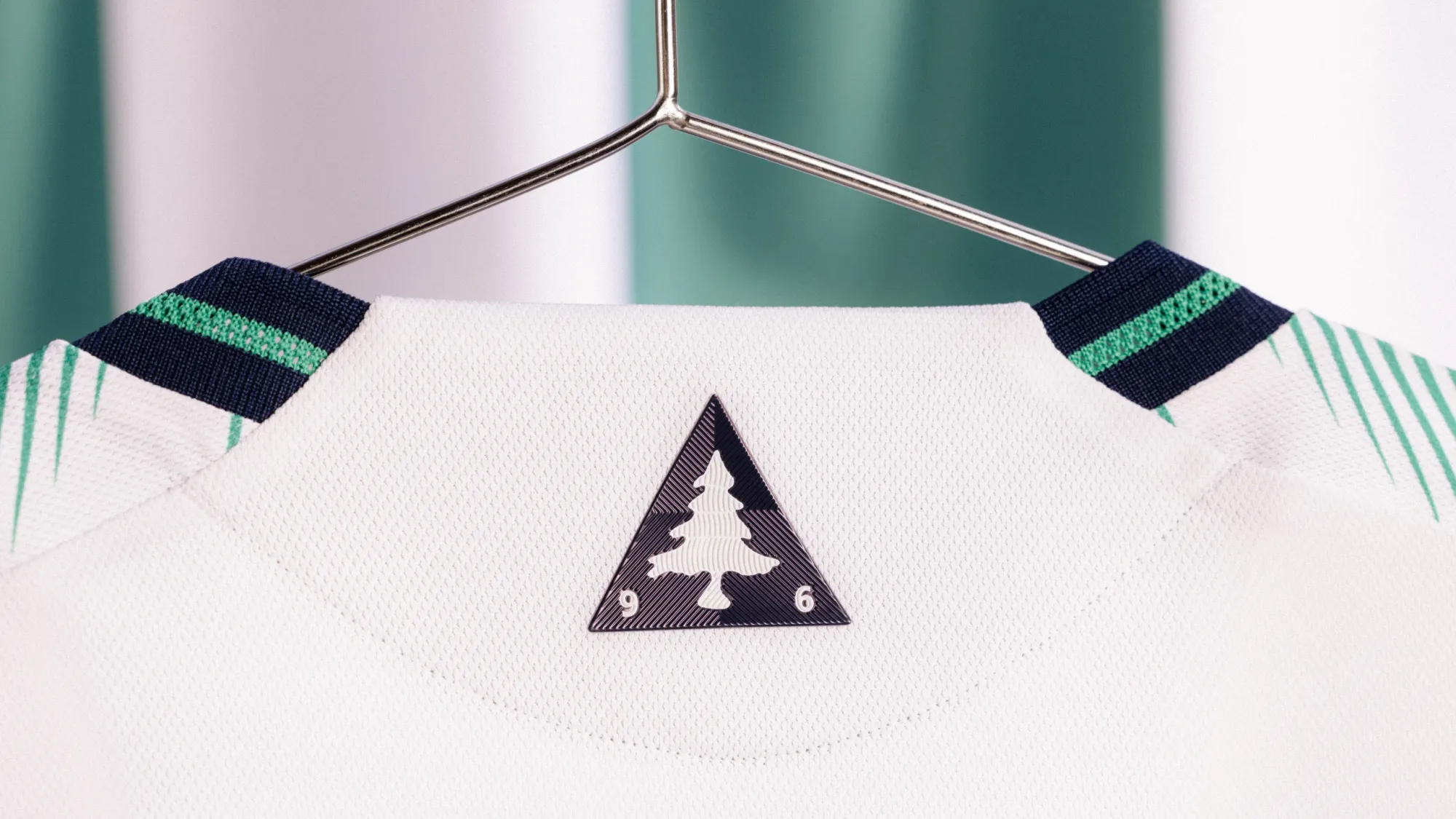
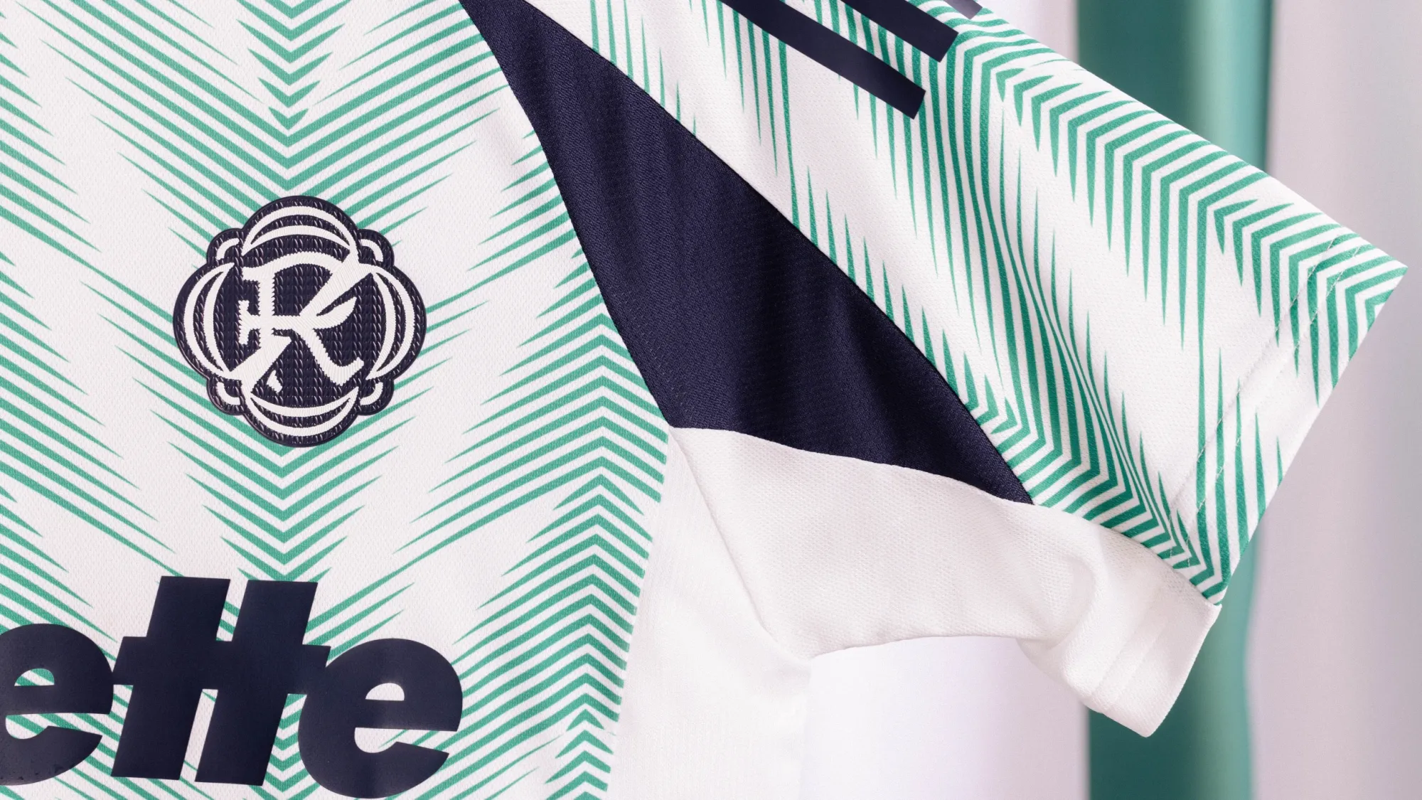
We've seen a few of these mostly white with light green kits lately from both Austin and Colorado. New England blew their attempts out of the water with one of the best looks in 2025. The pine pattern on the front is really well done, and the mint-and-navy combination works perfectly.
The main downside I have is that the generic Adidas template interrupts this and takes it down a notch, an unfortunate reality that all clubs have to deal with. Template notwithstanding, though, this is a winner.
6 – Real Salt Lake "Grid City Jersey"
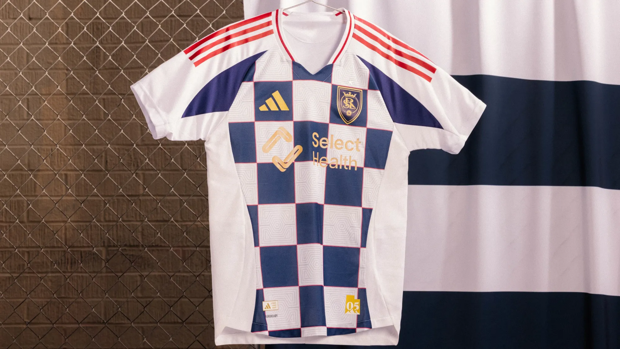
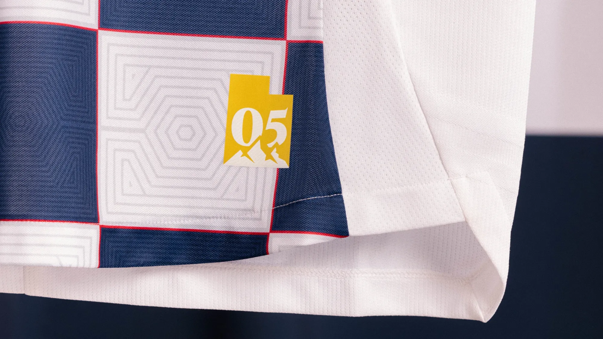
Look, some people are going to absolutely loathe this shirt. Those people also probably hated the 2016 Columbus Crew shirt, or Francis Ford Coppola's 2024 masterpiece Megalopolis. Philistines, every one of them.
I don't care what the haters say. I will not cower before the raging masses. RSL crushed it this year.
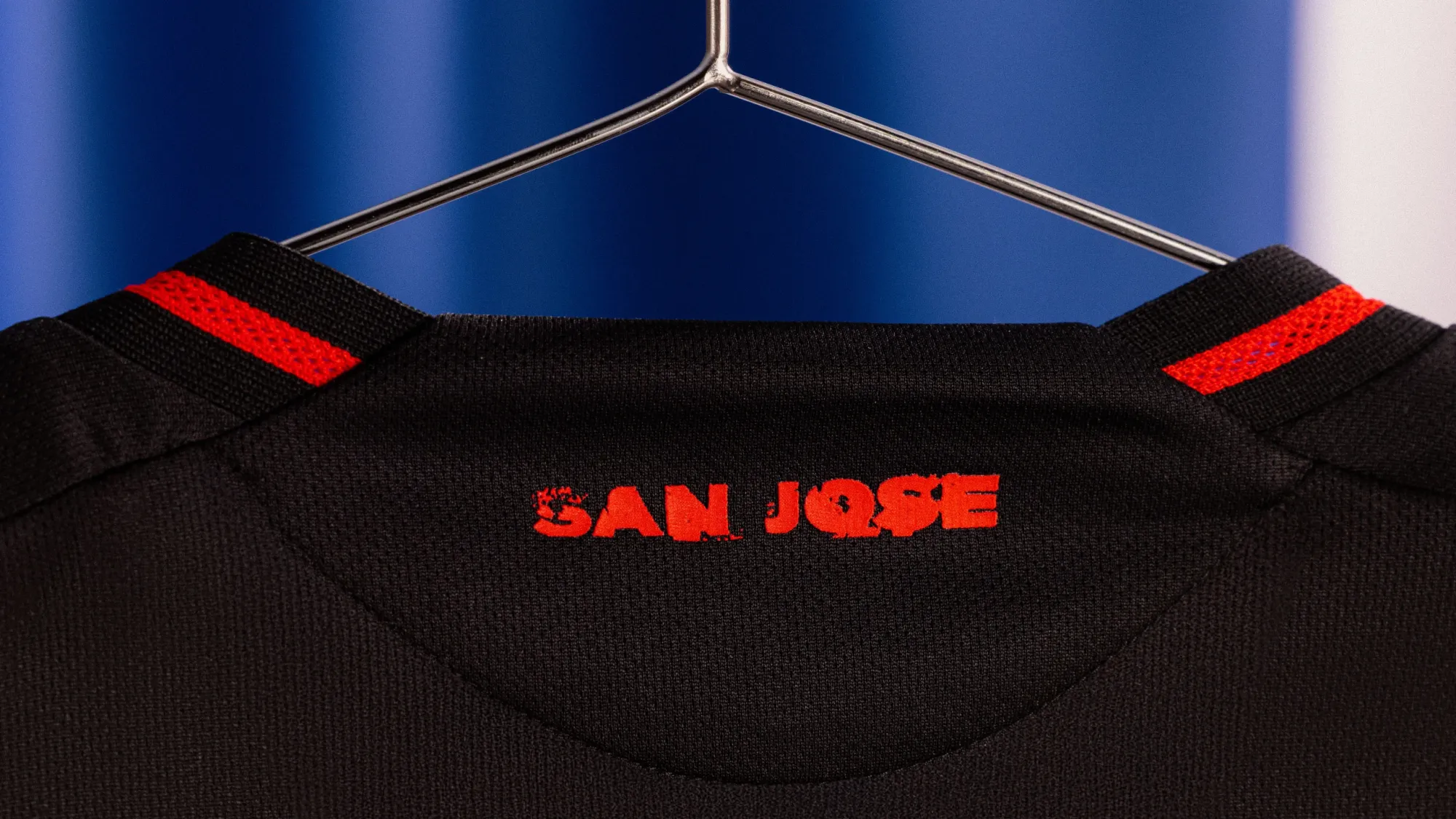
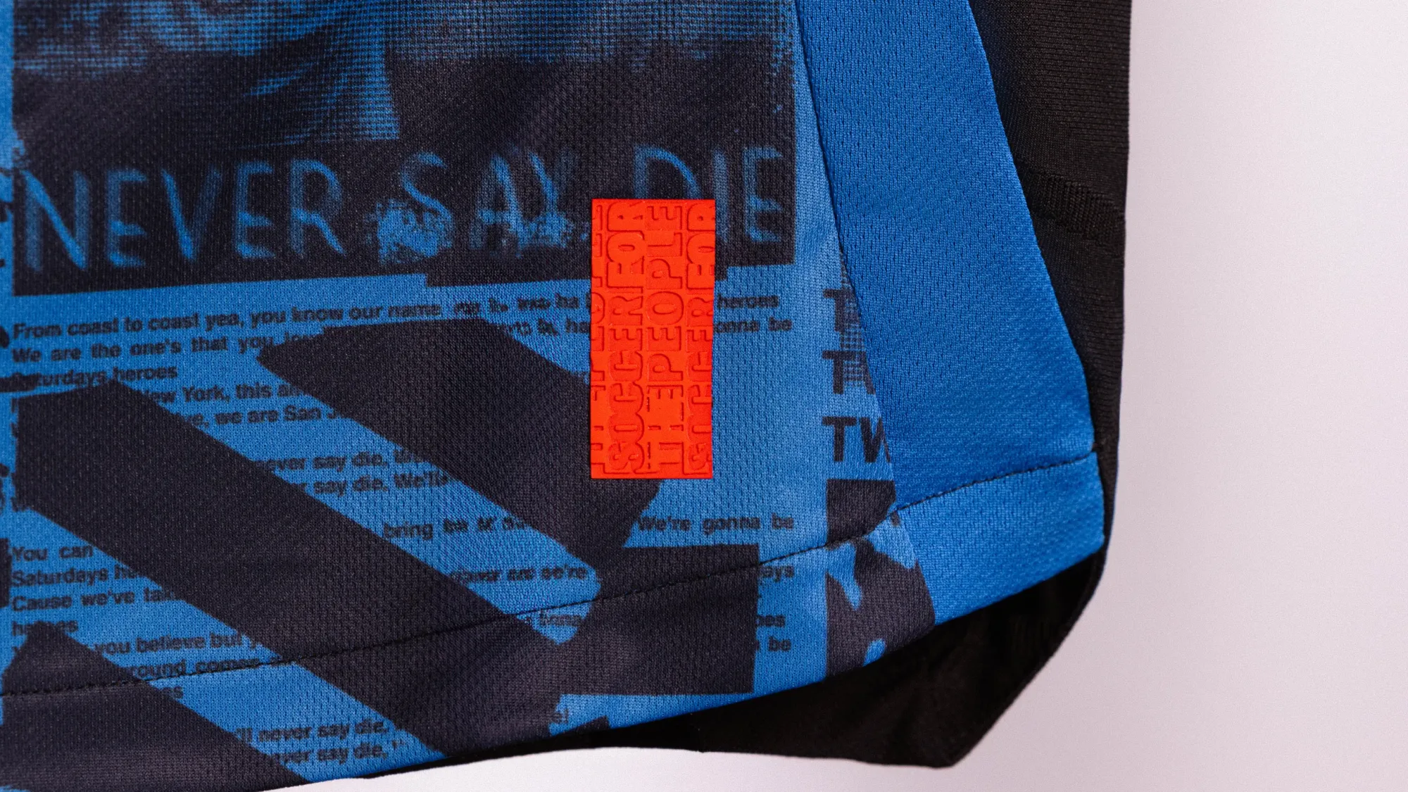
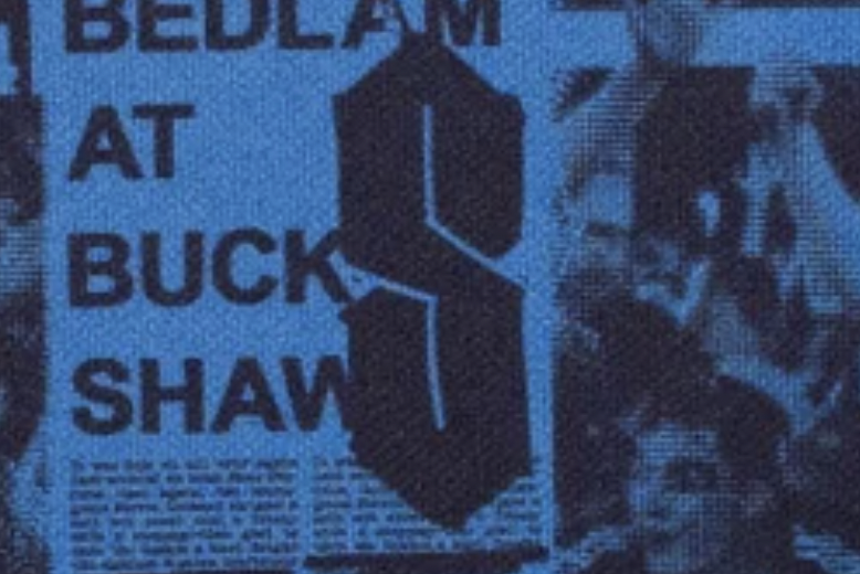
5 – San Jose Earthquakes "Headliner Kit"
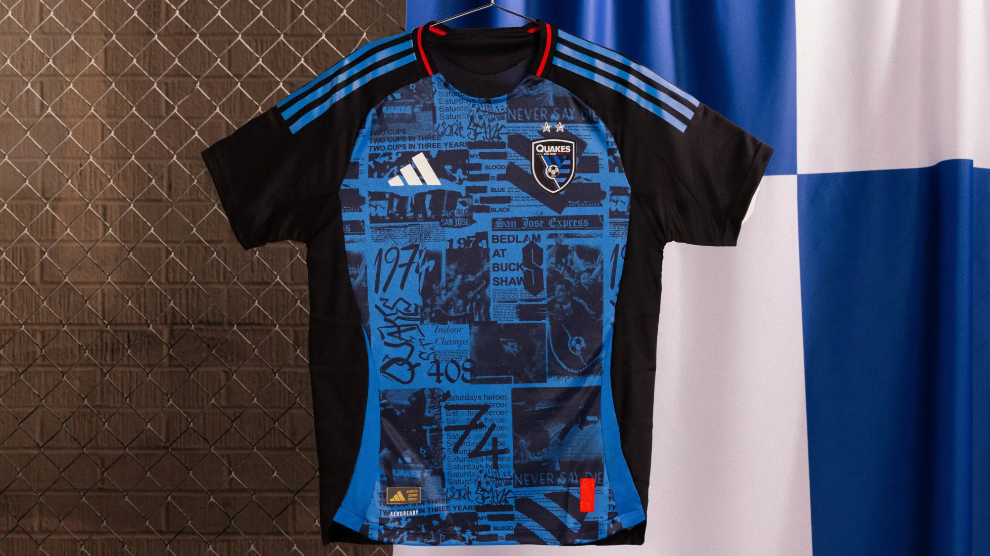
This kit absolutely rules. I love the graffiti and the old newspaper headlines on the front. Is this the first kit to feature that "Cool S" design that every kid in middle school was obsessed with?
This is such a cool concept for shirt. I'm obsessed.
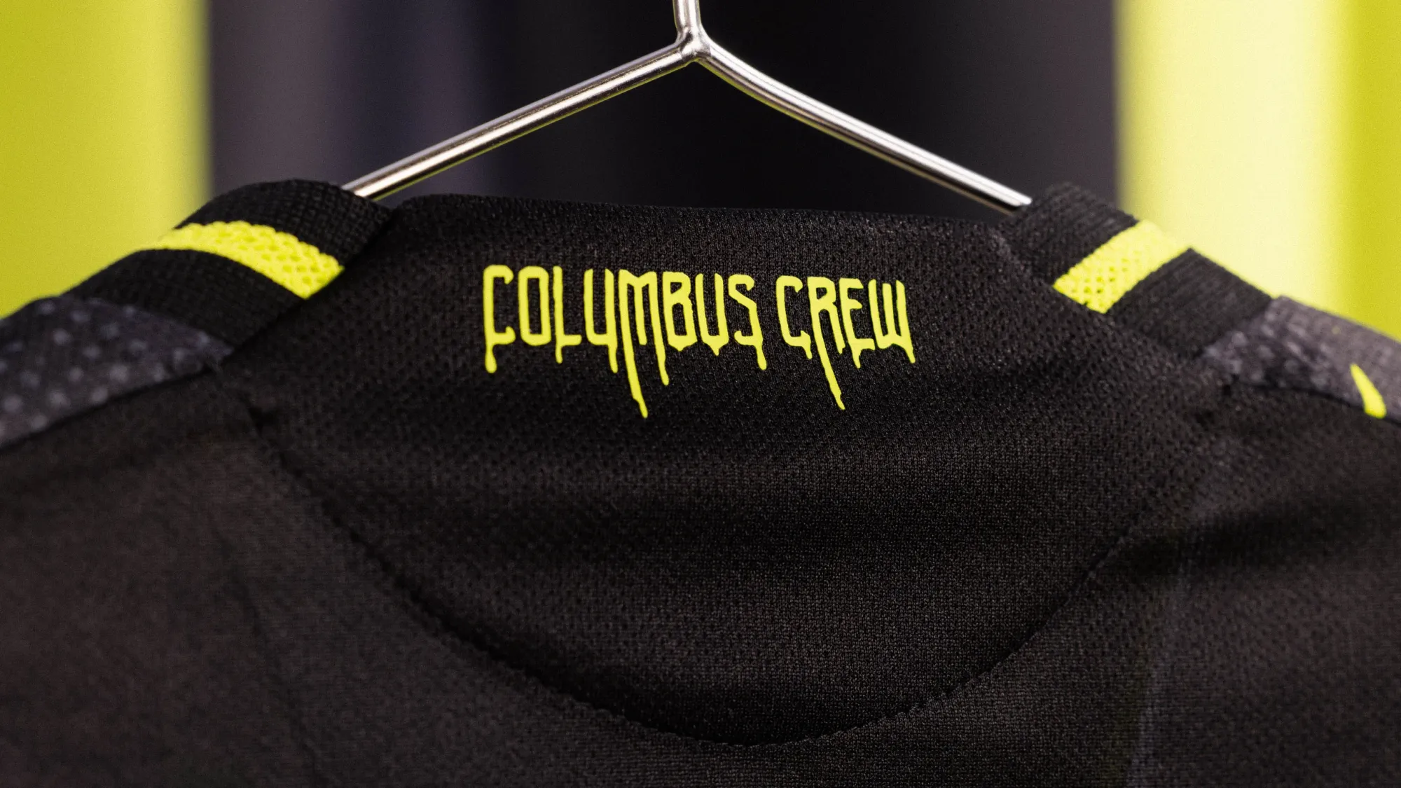
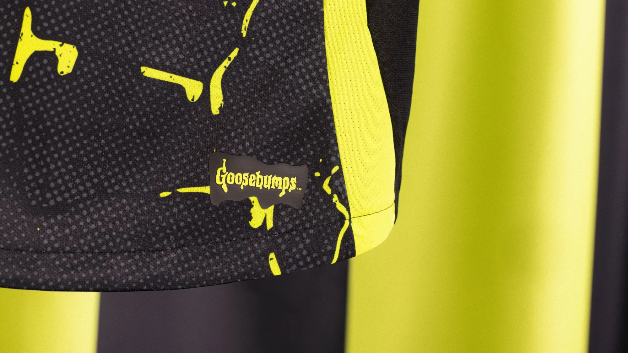
4 – Columbus Crew "The Goosebumps™ Kit"
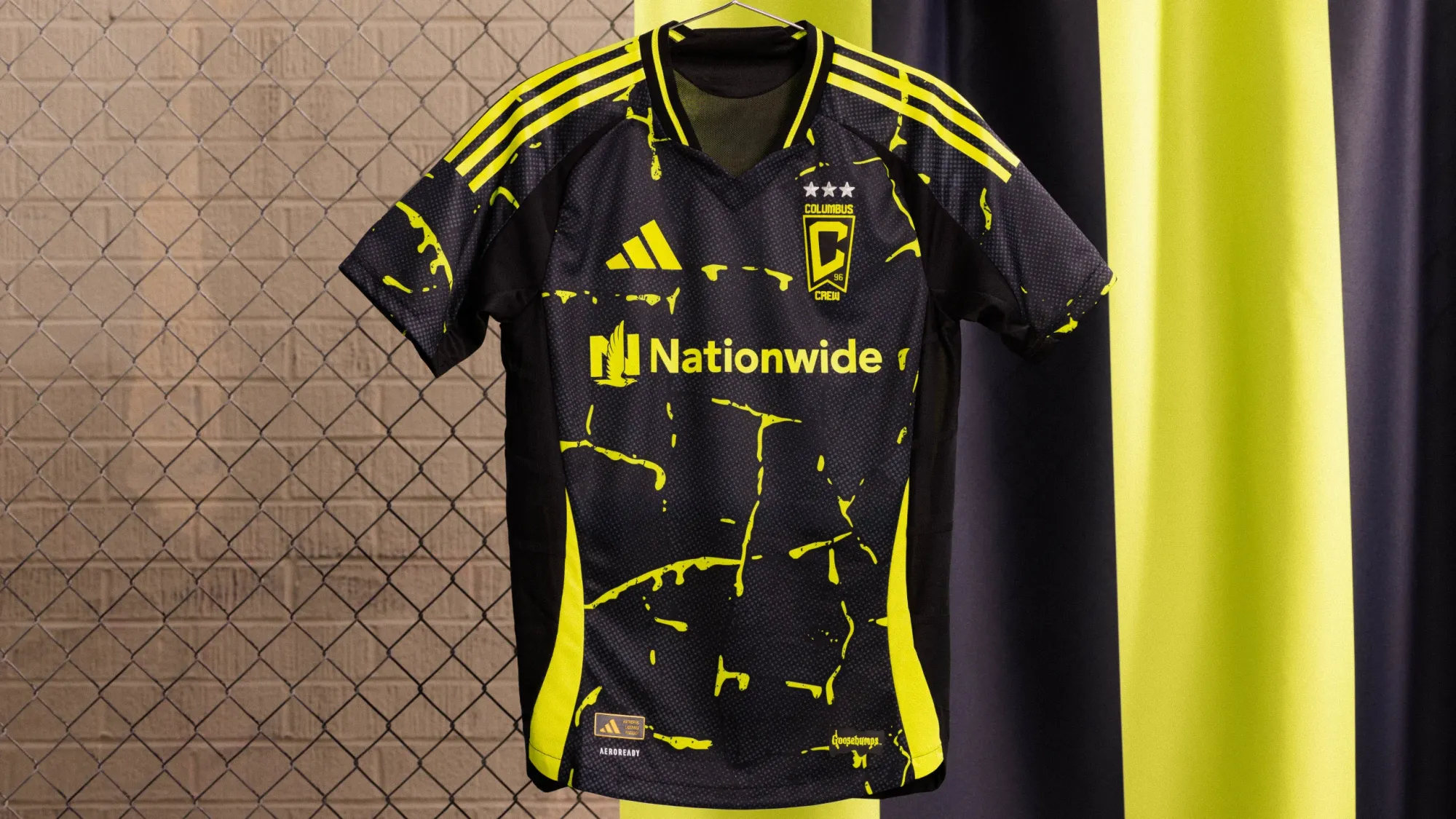
So, uh... yeah. This one's a banger.
Slime design on the front? Sick.
Paying tribute to legendary local author R.L. Stine of Goosbumps fame? Fantastic touch.
But a UV-activiated theme that makes the whole thing glow in the dark?? IN-SANITY!
It's so easy for jerseys to just be a cool color combination. This one has a clear story and a completely unique angle that also ties perfectly into the club and the community. I absolutely love it.
It's also my eight-year-old's favorite.
3 – Charlotte FC "Fortress Kit"
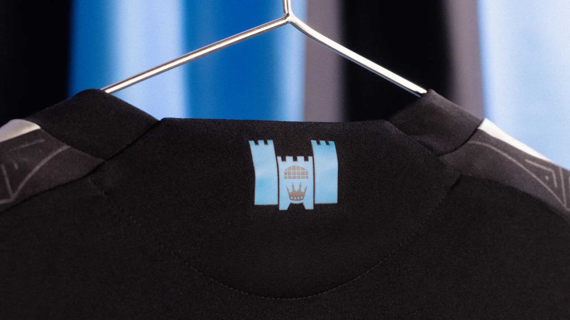
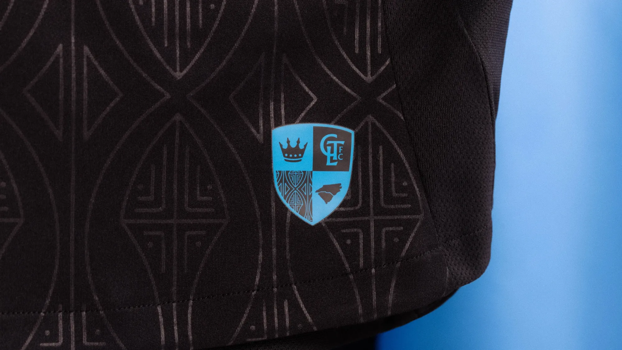
Good night, this is glorious! I'm admittedly a sucker for an all-black shirt, but the detailing here is spectacular, and the subtle touches of blue are *chef's kiss* delightful. The coat-of-arms jock tag and castle graphic on the collar further add to an incredibly solid and unique effort, and we haven't even talked about the use of the alternate crest!
This is an incredible shirt. An instant classic.
2 – Portland Timbers "Forever Green & Gold Kit"
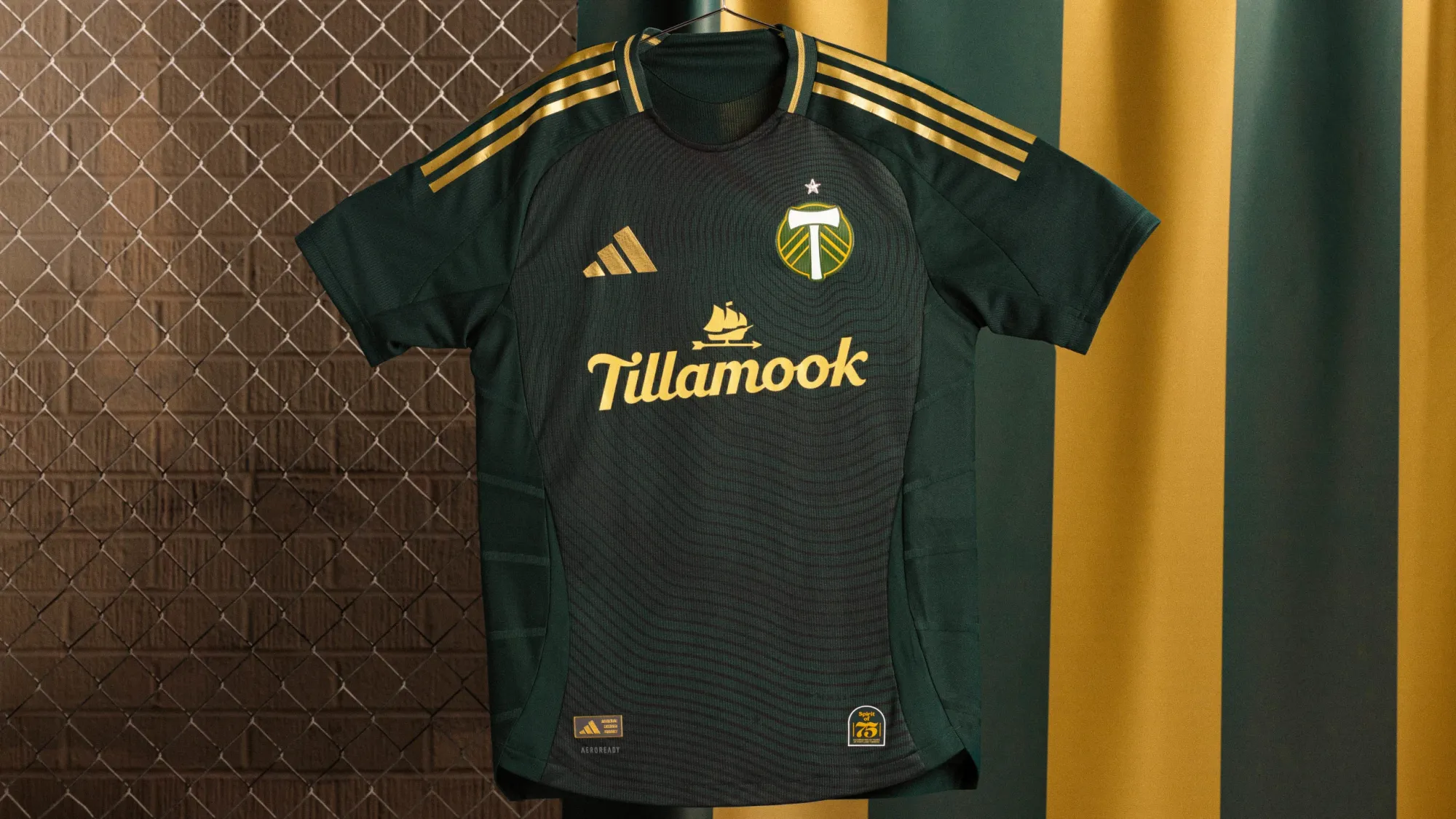
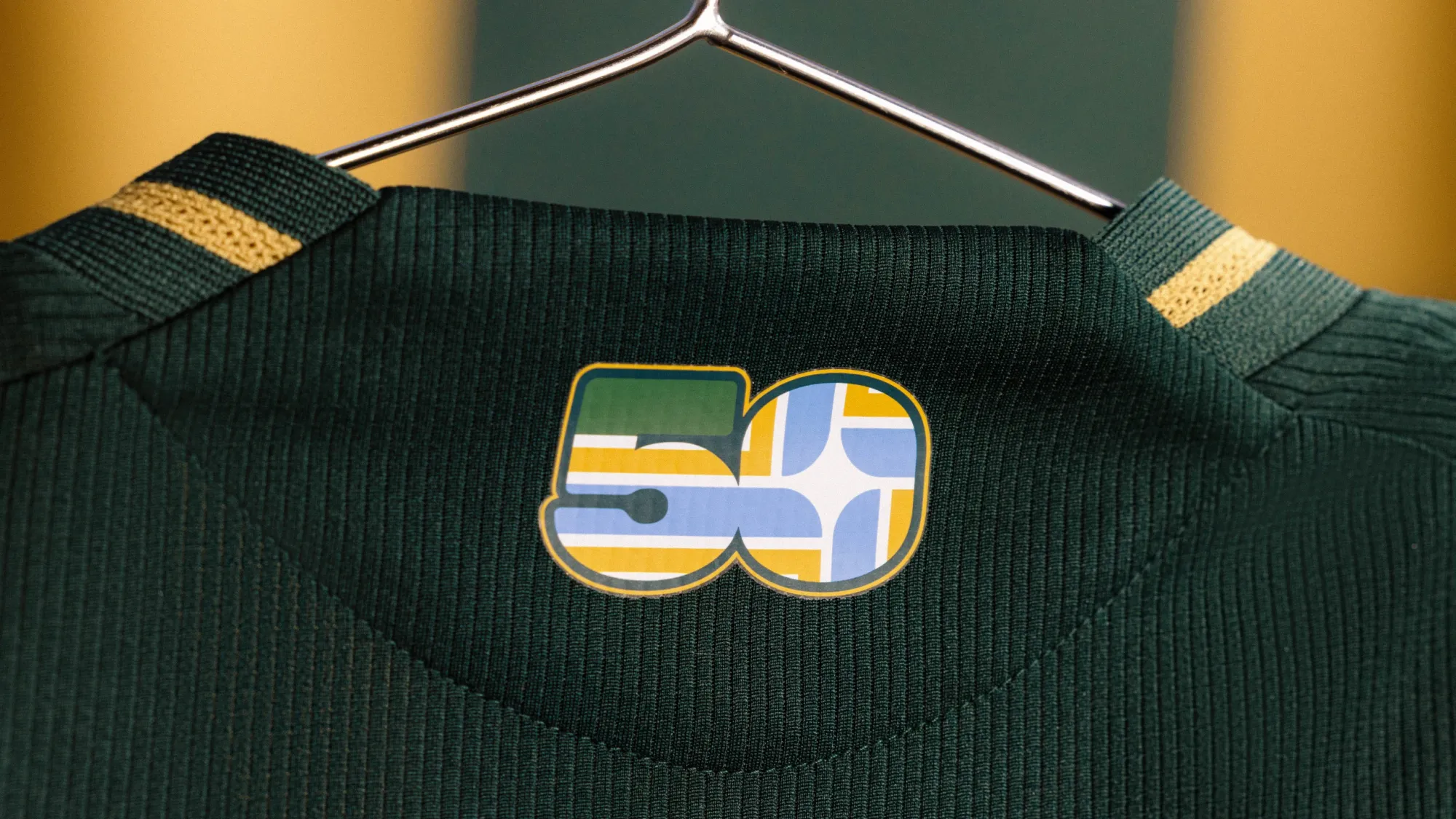
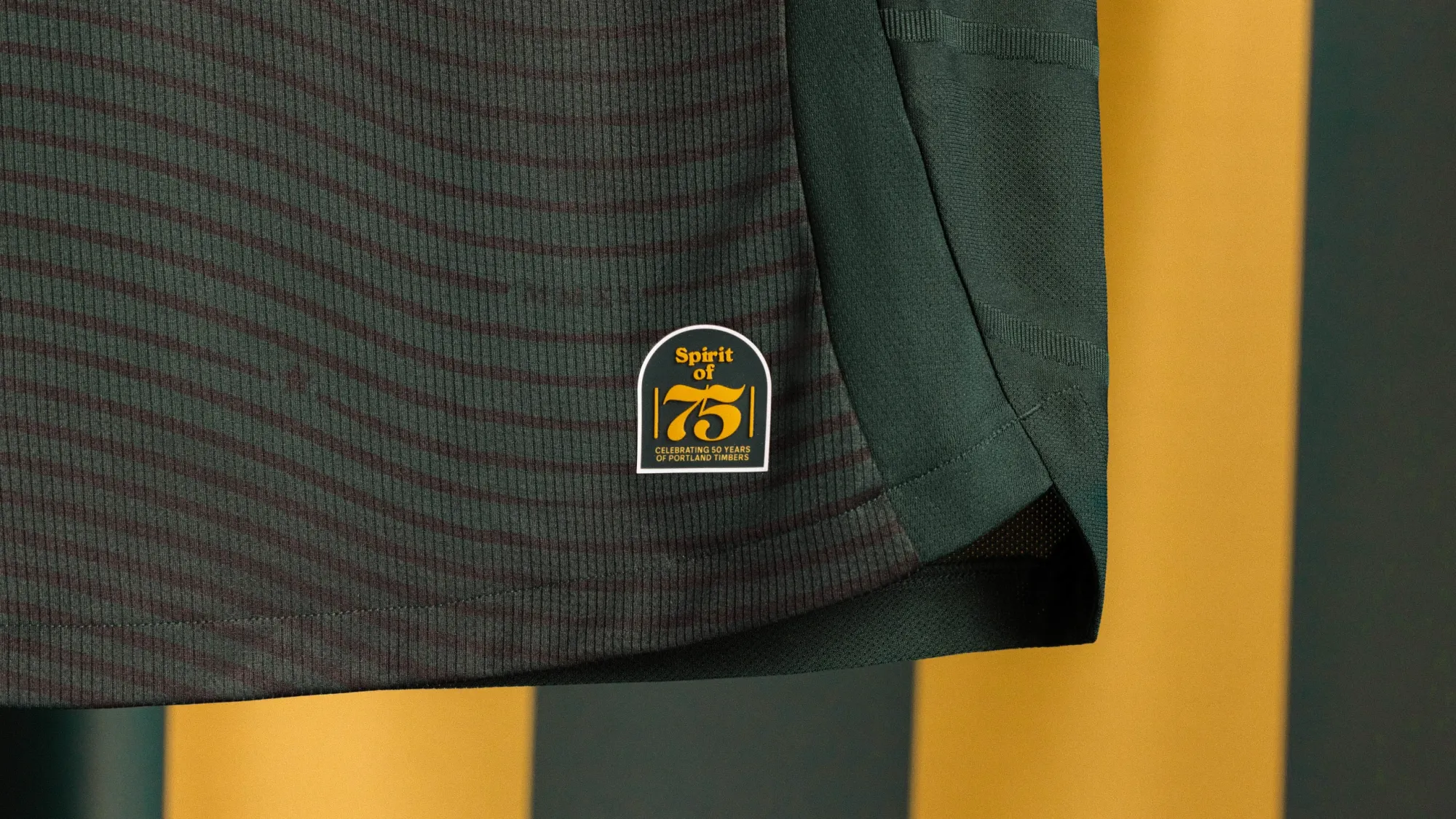
I'm not sure how, but Portland consistently put out top-tier kits every year. They haven't missed with a home kit in a decade, and their 2025 edition is up there with the best of them, a fitting tribute to their 50th anniversary.
Their dark-green-and-gold color scheme gives them an advantage off the bat, but the tree-ring detailing here is simply spectacular. This is not only one of the best new launches this year, but one of the best in recent memory.
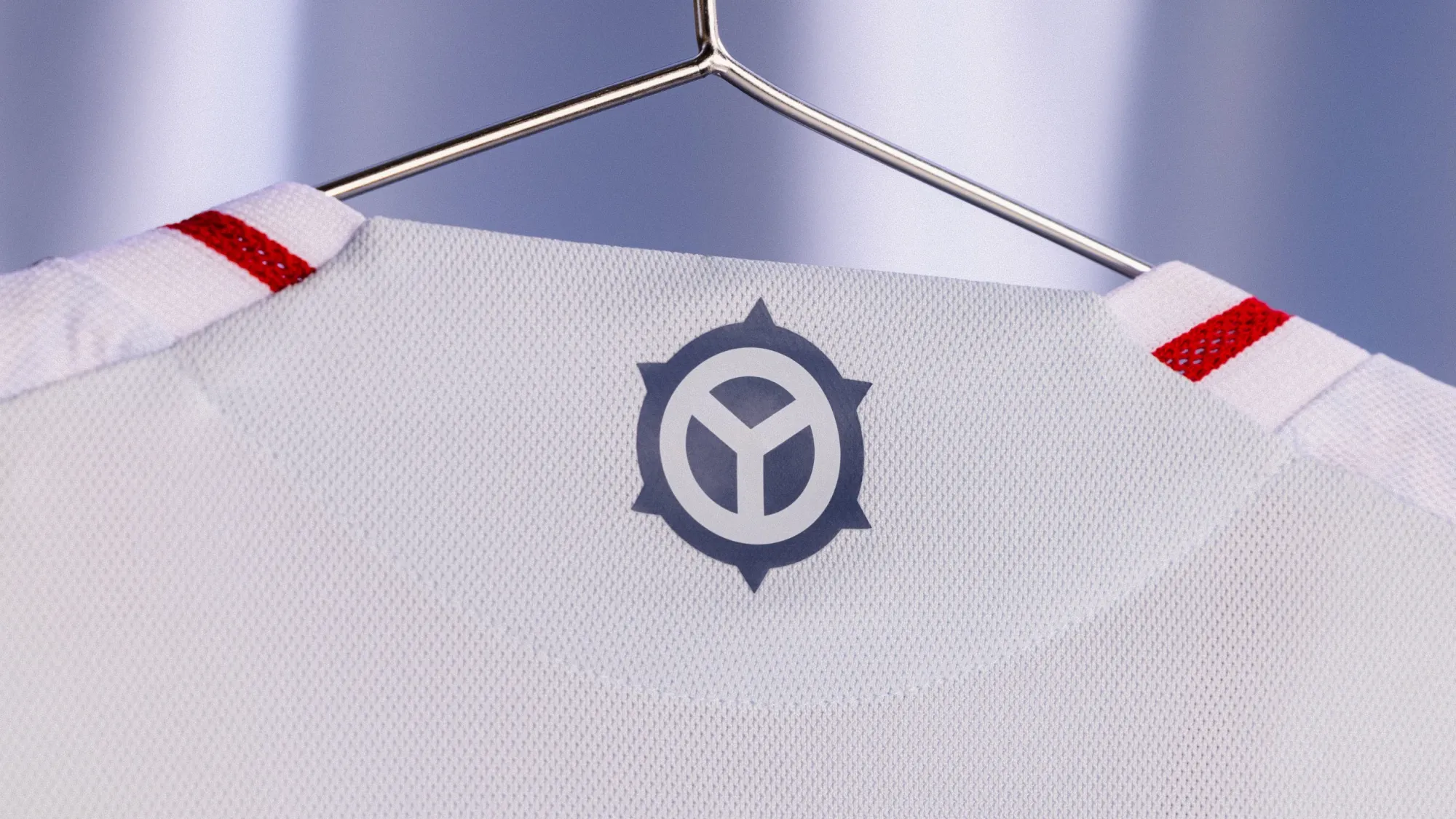
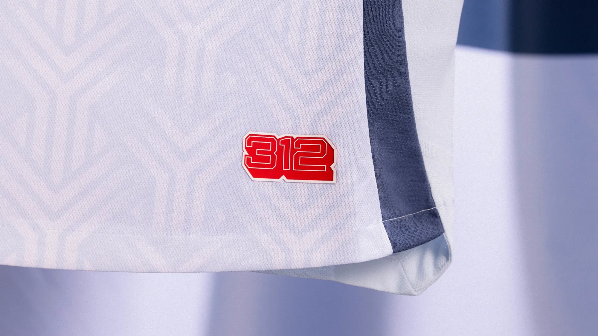
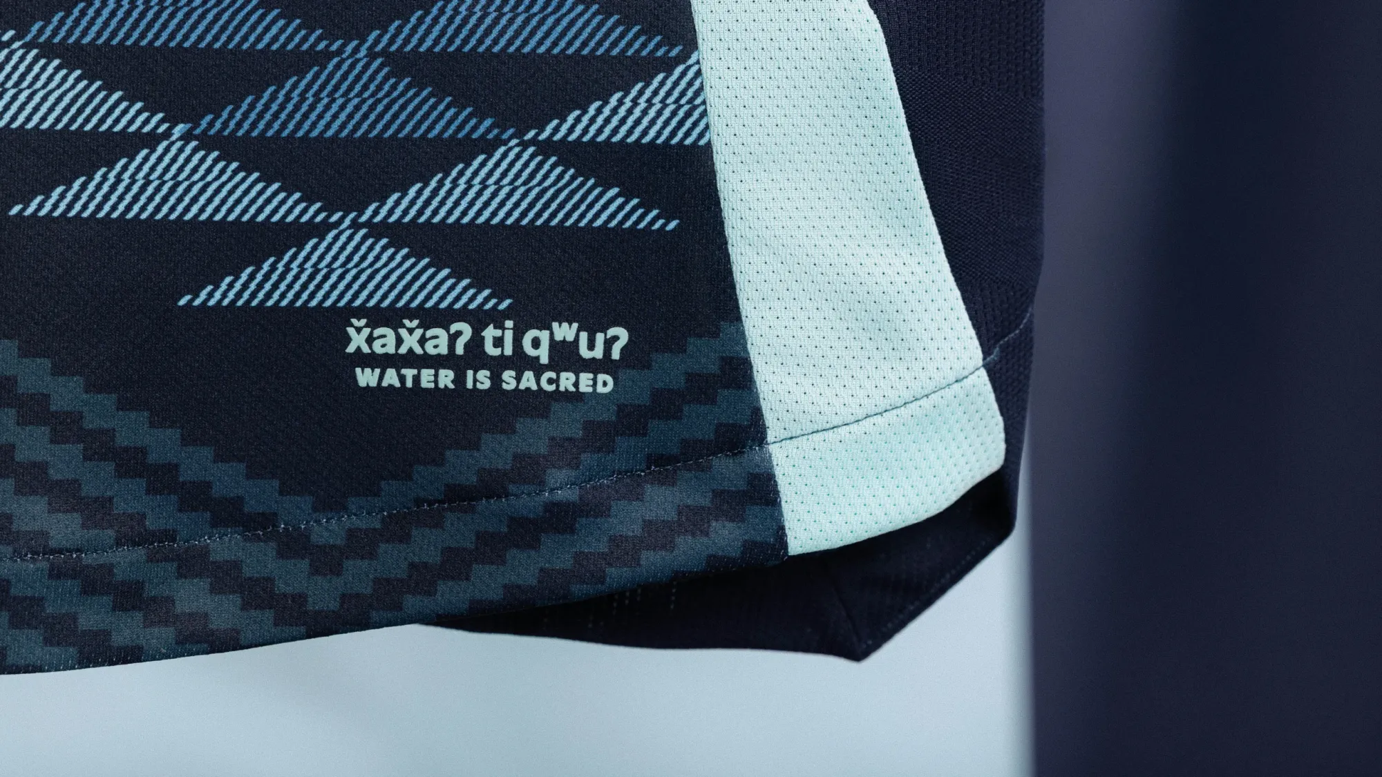
1 – Seattle Sounders "Salish Sea Kit"
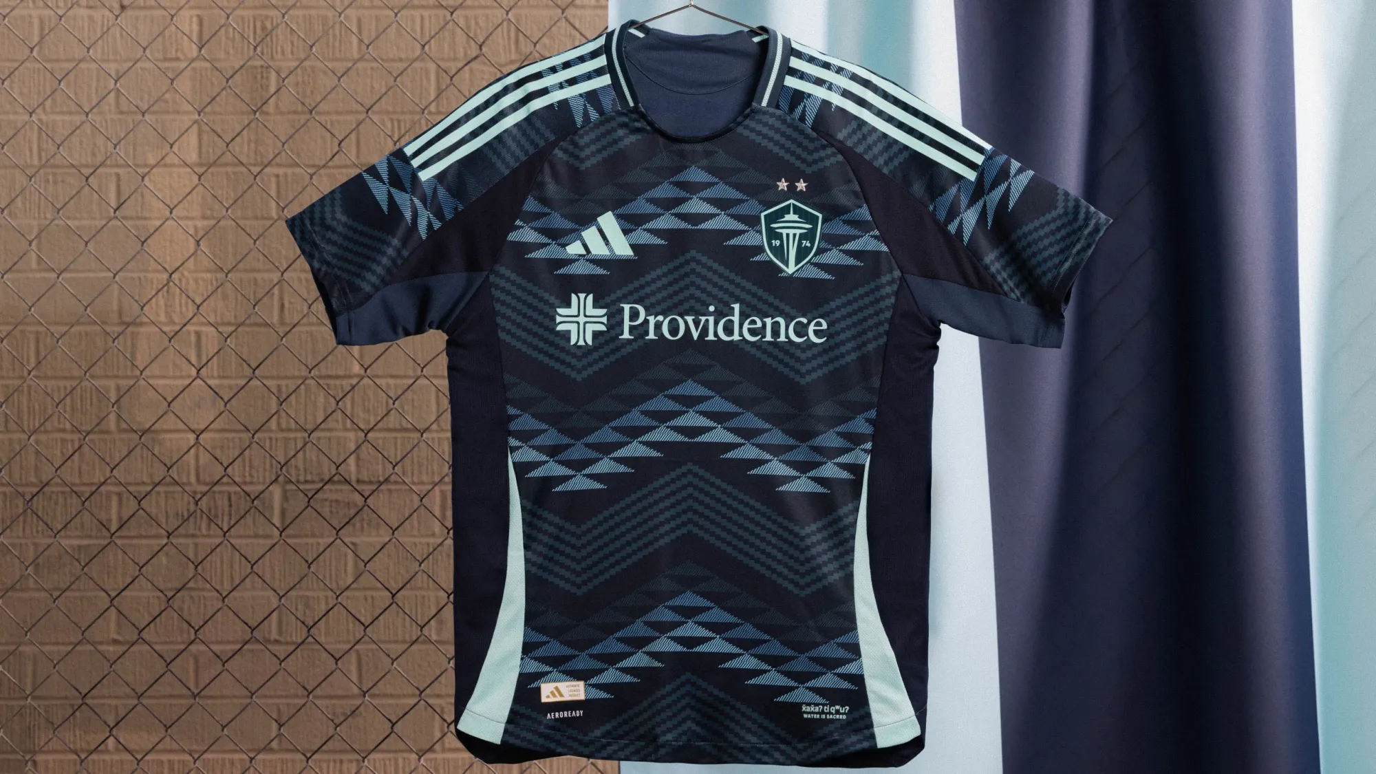
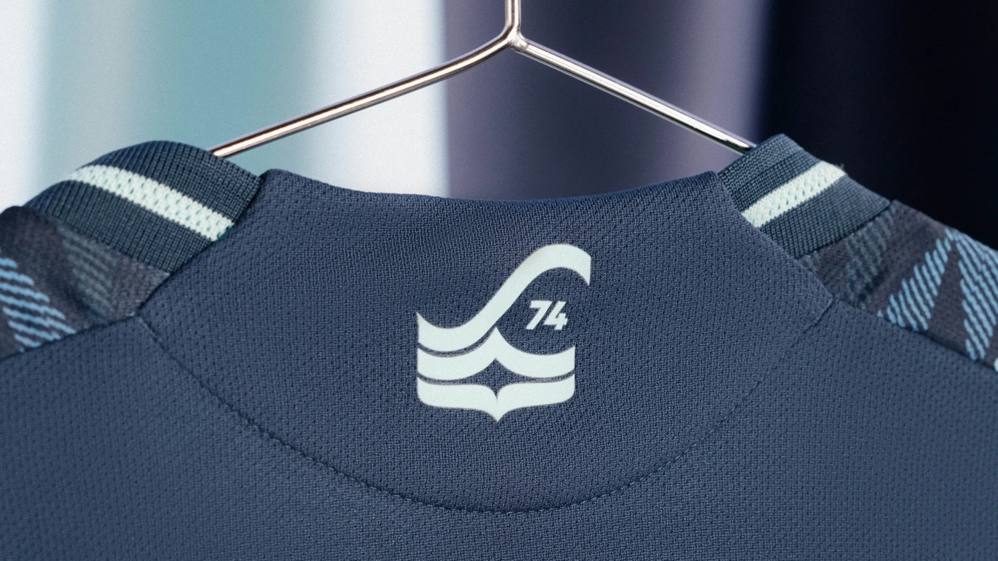
Um. Yes.
The Sounders are consistently the best team in MLS at putting out kits that both align with their brand and actually have a story element. The "Salish Sea Kit" is no exception, and the explainer video makes it even better, showing the collaboration between local Coast Salish artists and their generational weaving techniques to make something that is ultra-local and ultra-meaningful.
x̌ax̌aʔ ti qʷuʔ // Water Is Sacred
— Seattle Sounders FC (@SoundersFC) February 13, 2025
Introducing The Salish Sea Kit 🌊 pic.twitter.com/WQO7y0AN50
Well done, Seattle. Well done.
